Why Chinese Calligraphy Mistakes Matter More Than You Think
You can write a Chinese character correctly and still produce terrible calligraphy. That distinction trips up nearly every beginner. Language learners worry about stroke count, stroke order, and whether a character is recognizable. Calligraphy practitioners face a different challenge entirely: making each stroke alive, balanced, and expressive with a brush in hand.
This article is not about fixing your everyday handwriting or memorizing how to translate English in Mandarin Chinese characters onto paper. It is about the brush-based errors that silently undermine your work, the ones you cannot see until someone points them out.
Why Calligraphy Mistakes Are Different From Writing Mistakes
Calligraphy errors split into two distinct categories. The first affects legibility: wrong stroke order, missing components, or malformed radicals that make a character unreadable. Most guides stop here. The second category, and the one that separates a practitioner from a hobbyist, affects aesthetic quality. These are errors in pressure, speed, angle, and spatial proportion that produce technically correct but visually lifeless characters.
Research published in PLOS ONE confirms that aesthetic evaluation of Chinese characters depends heavily on script style, with properties like prototypicality and visual balance influencing how viewers perceive beauty in brush writing. In the vernacular meaning of "good calligraphy," both legibility and aesthetic harmony must coexist.
The Traditional Framework for Evaluating Brush Writing
So how do you know what correct brush execution actually looks like? Chinese calligraphy pedagogy has answered this question for over a thousand years with a single character: 永 (yong, meaning "eternal"). The Eight Principles of Yong (永字八法) use this one character to teach the fundamental techniques for all basic strokes in regular script.
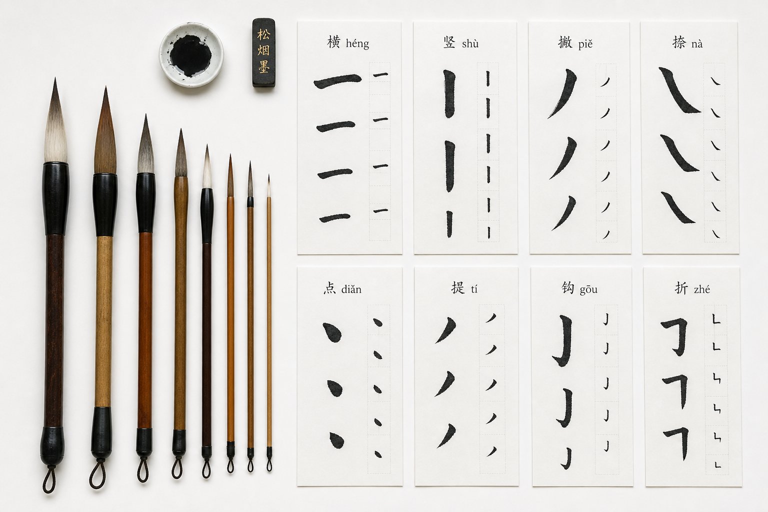
The character 永 contains eight essential strokes: the dot (ce), horizontal (le), vertical (nu), hook (ti), upward flick (ce), long left-falling stroke (lue), short left-falling stroke (zhuo), and right-falling stroke (zhe). Within just five written strokes, it encapsulates eight distinct brush principles with no repetition.
This framework, likely originating during the Later Han Dynasty with calligrapher Cui Ziyu and passed down through masters like Zhong You and Wang Xizhi, remains the starting point for identifying what goes wrong in aesthetic Chinese handwriting. Each principle carries a metaphorical name that describes how the stroke should feel: the dot leans like a massive boulder, the horizontal pulls like reins on a horse, the vertical holds force like a drawn bow.
Every common mistake in Chinese calligraphy traces back to a violation of these principles, whether in brush technique, stroke quality, character structure, or practice habits. The errors that follow are the ones most practitioners make without realizing it, organized from the most fundamental to the most subtle.
Brush Technique Errors That Undermine Your Foundation
Every stroke in Chinese calligraphy begins before the brush touches paper. It begins with how you hold the brush, how much ink you load, and how you move your hand through space. These foundational mechanics determine whether your strokes carry life or fall flat. Yet most practitioners focus exclusively on what the finished character looks like, ignoring the physical technique that produced it. The result? Repeating the same invisible errors hundreds of times without improvement.
Four fundamental brush technique errors account for the majority of quality problems in beginner and intermediate calligraphy. Each one leaves a distinct fingerprint on paper, and each requires a different correction.
Brush Angle and How It Shapes Every Stroke
Imagine dragging a flat-edged marker across paper at different tilts. The angle completely changes the mark it leaves. A calligraphy brush works the same way, except the consequences are far more nuanced.
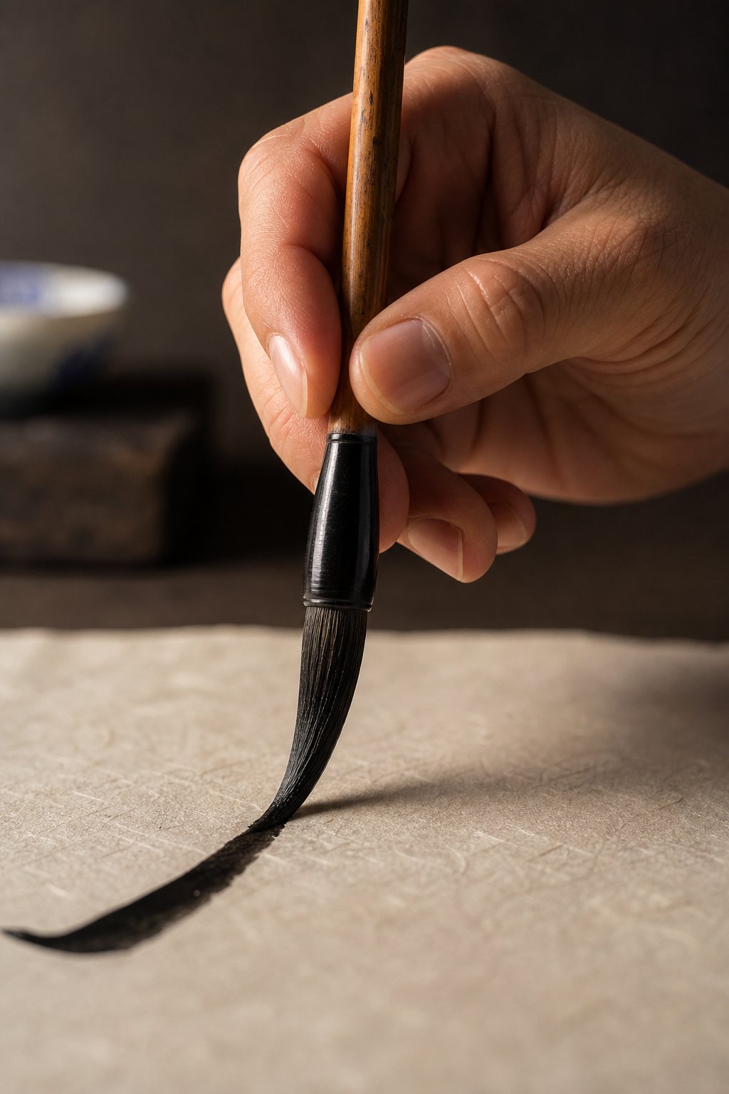
The core distinction here is between center-tip technique (中锋, zhong feng) and side-tip technique (侧锋, ce feng). With center-tip, the brush is held nearly vertical so the tip travels within the middle of the stroke. The ink spreads evenly on both sides, producing smooth, controlled lines with consistent edges. With side-tip, the brush tilts so the tip traces one edge while the belly of the brush creates the other. This produces strokes with one smooth side and one rougher, more expressive side.
Here is where beginners go wrong: they use side-tip unintentionally. Holding the brush at too shallow an angle causes the tip to drag along one edge, leaving ragged, uneven strokes that look scratchy and weak. The opposite error, holding the brush too steeply with excessive vertical pressure, produces strokes that are too thin and lack body. The brush barely contacts the paper, and the resulting lines feel pusillanimous, timid and without presence.
Center-tip is the default for regular script (kaishu). Side-tip has legitimate uses in certain expressive strokes and in running script, but it should be a deliberate choice, not an accident of poor posture or grip.
Pressure Control and Ink Loading Errors
Pressure is how you speak through the brush. Traditional calligraphy pedagogy describes this as the interplay of Press (按, an) and Lift (提, ti). Pressing the brush down spreads the tip against the paper, creating thicker marks. Lifting reduces contact, thinning the line. Every single stroke in calligraphy involves a choreography of pressing and lifting, sometimes within the span of a single centimeter.
The most common pressure mistake is applying too much force. Beginners often press so hard that the brush belly flattens completely against the paper, producing bloated, shapeless strokes that bleed outward. You lose all control over the edges, and the stroke looks swollen rather than strong. The opposite error, barely touching the paper, creates threadlike lines that lack bone structure. These strokes appear hesitant and fragile, as if the writer was afraid to commit.
Ink loading compounds these problems. When you dip the brush too deeply or fail to remove excess ink on the edge of the inkstone, the brush becomes oversaturated. The first strokes will bleed uncontrollably, pooling at every pause and feathering at every edge. Conversely, writing too long without reloading produces dry, scratchy strokes where the paper texture shows through. Neither extreme is inherently wrong in expressive calligraphy, but beginners rarely produce these effects intentionally. Proper loading means saturating the brush to about two-thirds of its length, then gently pressing the tip against the inkstone to shape it and remove excess before writing.
Speed Mistakes That Destroy Stroke Character
Speed is the least discussed and most damaging of the four technique errors. Every stroke in Chinese calligraphy has a beginning form, a body, and an ending form. The beginning often involves a concealed tip entry, where the brush briefly moves opposite to the stroke direction before reversing. The ending may involve a pause, a press, or a controlled lift. These micro-movements require specific timing.
When you hurtle through strokes too quickly, those beginning and ending forms disappear. The stroke starts abruptly and ends abruptly, looking chopped off rather than intentionally shaped. You will notice this most clearly in horizontal strokes that lack the subtle thickening at each end, or in dots that appear as mere flicks rather than three-dimensional marks.
Moving too slowly creates the opposite problem. The hand trembles, ink pools at pause points, and strokes develop a shaky, uncertain quality. Calligraphy requires confident, decisive movement. The brush should move at a pace that allows control without hesitation, fast enough to maintain smooth lines but slow enough to execute each transition deliberately.
The right speed varies by stroke type. A long sweeping left-falling stroke (撇, pie) accelerates as it descends. A dot requires a quick entry followed by a brief pause. Learning to vary speed within and between strokes is what gives calligraphy its rhythmic quality and helps assuage the stiffness that plagues early practice.
- Incorrect brush angle: Unintentional side-tip produces strokes with one ragged edge and one smooth edge, or excessively thin lines that lack body.
- Inconsistent pressure: Too much force creates bloated, bleeding strokes; too little produces weak, threadlike lines without bone structure.
- Poor ink loading: Oversaturation causes uncontrolled bleeding and pooling; insufficient ink creates dry, scratchy marks with visible paper texture.
- Wrong speed: Rushing eliminates beginning and ending stroke forms; moving too slowly produces shaky, hesitant lines with ink pooling at pause points.
These four errors interact with each other. A brush held at the wrong angle requires more pressure to produce adequate line width, which leads to oversaturation problems, which tempts the writer to move faster to avoid bleeding. Fixing one in isolation often reveals the others. The key is diagnosing which error is primary by examining the specific symptoms your strokes leave on paper, then addressing them in sequence rather than all at once.
Stroke Quality Problems That Mark Amateur Work
Brush angle, pressure, ink loading, and speed set the stage. But even when those fundamentals are reasonably correct, individual strokes can still carry telltale defects that immediately signal beginner-level work. These are not errors of technique in the broad sense. They are specific visual flaws in the shape, weight, and finish of each stroke, the kind a trained eye spots in a fraction of a second.
Think of it this way: a musician can hold the instrument correctly and still produce a note quaver that sounds unsteady. In calligraphy, the equivalent is a stroke that technically goes in the right direction but lacks the internal structure that gives it life.
Hooks, Dots, and Turns That Reveal Beginner Habits
Hooks are where most beginners first expose their habits. A proper hook stroke (钩) requires a decisive directional change: the brush pauses briefly at the turning point, builds slight pressure, then lifts off in a new direction with controlled speed. When you jerk through this transition too quickly, the hook looks sharp and spiky, like a thorn rather than a purposeful redirection. When you round it off lazily, the hook loses its angular identity entirely and melts into a curve. Neither version carries the crisp, intentional energy that defines a well-executed hook.
Dot strokes (点) suffer from a different problem. Beginners treat them as simple blobs, a quick tap of the brush and nothing more. A proper dot has three phases: entry, body, and exit. The brush enters at an angle, presses briefly to create volume, then lifts with direction, leaving a mark that suggests movement even in its stillness. A munted dot, one that looks crushed or shapeless, usually results from pressing straight down without any angular entry or from lifting too abruptly without guiding the brush off the paper.
Turns (转折) present yet another challenge. In regular script, turns at corners should maintain their angular character. You will notice that beginners often round these transitions because they fail to pause and redirect. The brush simply sweeps through the corner, converting what should be a structured angle into a soft curve. This lowkeyness in execution, where the stroke quietly loses its defining sharpness, erodes the architectural quality that gives kaishu its visual strength.
Tapering and Stroke Endings That Lack Refinement
How a stroke ends matters as much as how it begins. Horizontal strokes in regular script typically finish with a subtle press followed by a controlled lift, creating a slight thickening at the terminus. Beginners often let strokes trail off weakly, the brush simply running out of momentum rather than concluding with intention. The stroke looks like it gave up rather than stopped.
This connects directly to two foundational concepts: hidden tip (藏锋) and exposed tip (露锋). With hidden tip, the brush reverses direction slightly at the start or end of a stroke, tucking the tip back into the body of the line. The result is a rounded, contained beginning or ending with no visible point. With exposed tip, the brush enters or exits without concealment, leaving a sharp, visible point.
The beginner mistake is not choosing one over the other. It is applying them inconsistently or accidentally. A stroke that should begin with hidden tip instead shows a scratchy, exposed entry because the writer did not reverse direction. Or a stroke meant to end with an exposed taper instead finishes with a blunt, abrupt stop because the writer lifted too quickly. Mastering these two concepts means controlling exactly how much of the brush tip is visible in the final mark.
| Stroke | Correct Quality | Common Defect | Technique Causing the Error |
|---|---|---|---|
| Dot (点/侧) | Droplet shape with angular entry, visible body, and directional exit | Shapeless blob or flat smudge | Pressing straight down without angle; lifting without direction |
| Horizontal (横/勒) | Even thickness with subtle thickening at both ends; slight upward slant | Trailing off weakly at the end; uneven edges | No pause-and-press at terminus; unintentional side-tip |
| Vertical (竖/努) | Straight with controlled taper or rounded ending; consistent width | Wobbly line that drifts left or right; abrupt blunt stop | Wrist instability; lifting too fast without guiding the brush |
| Hook (钩/趯) | Decisive angular redirection with controlled lift-off | Too sharp and spiky, or too rounded and soft | Jerking through the turn; failing to pause before redirecting |
| Rising (提/策) | Thick base tapering to a clean point; upward energy | Uniform thickness or ragged point | Not pressing at the start; rushing the lift without acceleration |
| Left-falling long (撇/掠) | Starts thick, accelerates, tapers to a fine point | Blunt ending or inconsistent thinning | Decelerating instead of accelerating; lifting too early |
| Left-falling short (短撇/啄) | Quick, decisive stroke like a bird pecking; sharp and compact | Too long or too soft; lacks snap | Moving too slowly; treating it like the long left-falling stroke |
| Right-falling (捺/磔) | Gradual widening with a flattened, wave-like ending | Uniform width throughout or abrupt cutoff | Not increasing pressure progressively; lifting without the final horizontal press |
Each defect in this table traces back to a specific moment of lost control: a pause skipped, a direction change ignored, or a lift executed without intention. The strokes themselves are simple. What separates polished work from amateur output is whether each stroke carries its complete internal structure from entry to exit. And that structure only becomes visible when you understand how strokes relate to each other within a character, how their proportions and positions create harmony or tension across the full composition.
Stroke Order Mistakes That Break Calligraphic Flow
Individual stroke quality gives each mark its character. But the sequence in which those marks appear on paper determines whether a character feels like a unified composition or a collection of disconnected parts. Stroke order in calligraphy is not the same memorization exercise you learned in a language class. It is physical choreography, a path your hand follows that directly shapes ink behavior, rhythm, and the invisible connections between strokes.
Most practitioners treat stroke order as a fixed rule to follow blindly. That assumption creates problems the moment you move beyond regular script into more fluid styles, or when you encounter characters where different traditions prescribe different sequences.
When Stroke Order Rules Change for Calligraphy Scripts
In regular script (kaishu), standard stroke order applies almost universally. The general principles are straightforward: top to bottom, left to right, horizontal before vertical, outside before inside, close frames last. These rules exist because they build structure step by step, each stroke supporting the next in a logical progression that maintains balance and proportion.
But here is where beginners get tripped up. They assume these textbook rules apply identically across all script styles. They do not.
Running script (xingshu) introduces partial stroke connections and simplified transitions. When strokes link together, the most efficient path between them sometimes differs from the standard kaishu sequence. A calligrapher writing xingshu may reorder certain strokes to maintain continuous brush contact, reducing unnecessary lifts that would interrupt flow. This is not carelessness. It is a deliberate adaptation where structure loosens to accommodate controlled movement.
Cursive script (caoshu) pushes this further. Strokes merge, abbreviate, and transform so dramatically that the original kaishu order sometimes becomes physically impossible to maintain. In caoshu, the character can become one continuous gesture where the brush rarely lifts from the paper. Applying rigid textbook order to this style produces stilted, disconnected writing that misses the entire point of cursive expression.
The mistake is not learning standard stroke order. You absolutely need that foundation. The mistake is treating it as an unchangeable law rather than a principle that adapts to context. Beginners who rigidly apply kaishu sequencing to xingshu or caoshu end up begging the question of why their running script looks stiff. The answer is almost always that they are forcing a structural sequence onto a style that demands fluid adaptation.
How Wrong Stroke Order Disrupts Ink Behavior and Rhythm
Why does sequence matter so much in brush calligraphy when the final character looks the same regardless of order? Because it does not look the same. Not with a brush.
When you write with a pen, stroke order affects learning and muscle memory but leaves minimal visible trace. With a brush loaded with ink, every transition between strokes creates evidence. The brush must travel from the end of one stroke to the beginning of the next. If the order is correct, that travel path is short and natural. The brush moves efficiently, maintaining consistent ink saturation and rhythm throughout the character.
When the order is wrong, the brush travels inefficiently. It crosses back over completed strokes, hovers awkwardly while you figure out where to go next, or pauses too long in one spot. These disruptions show up as ink pooling at hesitation points, gaps where the brush ran dry from excessive travel, or inconsistent stroke weight where rhythm was broken and restarted. You will notice that correct stroke order should feel smooth, with the hand moving in a natural path that reduces unnecessary repositioning and supports continuous motion.
Think of it like a queue: meaning each stroke waits its turn in a sequence designed for maximum efficiency. Disrupt that queue and the entire system slows down, producing visible artifacts of confusion on paper. The character might be technically correct in form, but it lacks the rhythmic coherence that marks practiced calligraphy.
This is especially apparent in multi-component characters. Writing the right side before the left, or the interior before the frame, forces your hand into contorted paths that break the natural i-before-the-e logic of sequential construction. The brush loses its momentum, and that loss registers as inconsistency in the finished work.
Regional Variations That Complicate Correctness
Adding another layer of complexity, stroke order is not universally standardized. The governments of mainland China, Taiwan, Hong Kong, and Japan have each published official stroke order standards that agree on most characters but diverge on specific cases. These differences are not trivial for calligraphy practitioners who study copybooks from multiple traditions.
A few notable divergences:
- The grass radical (艹): Japan and mainland China join both sides and write it in three strokes, while traditional calligraphic order treats it as four separate strokes (vertical-horizontal-horizontal-vertical).
- The 𠂇 component (as in 左 and 右): Mainland China and Taiwan write the horizontal stroke first in all cases. Traditional calligraphic order differentiates based on etymology and character structure.
- The character 必: Japanese standard writes the top dot first, while traditional order begins with the left-falling stroke (丿).
- Vertical before horizontal intersections: The Japanese standard sometimes places a vertical stroke before intersecting horizontals if the vertical does not pass through the lowest horizontal, influenced by semi-cursive script conventions.
For calligraphy practitioners, the key distinction is between governmental educational standards and what is called "traditional" or "calligraphic" stroke order. The educational standards were simplified for schoolchildren and do not always reflect the sequences used by historical masters. If you are studying a classical copybook from Wang Xizhi or Ouyang Xun, the stroke order embedded in their brush movements may differ from what a modern textbook prescribes.
The practical takeaway: match your stroke order to your source material and script style. If you practice kaishu from a mainland Chinese copybook, follow the PRC standard. If you study classical works or Japanese shodo, follow the conventions of that tradition. The mistake is not picking one standard over another. It is mixing standards inconsistently or assuming that one government's educational guidelines represent the only correct approach to brush calligraphy across all contexts.
Stroke order errors compound with every other mistake discussed so far. Wrong sequence disrupts rhythm, which disrupts speed control, which degrades stroke quality. But even perfect stroke order cannot save a character whose internal components are sized and positioned incorrectly, which brings us to how radicals transform depending on where they sit within a character's architecture.
Radical Transformation Mistakes in Character Positions
A character with perfect stroke quality can still look fundamentally wrong if its internal components are shaped incorrectly for their position. Chinese radicals are not static building blocks. They shapeshift. The same radical written as a standalone character takes on a completely different form when compressed into the left side, flattened across the top, or widened along the bottom of a compound character. Beginners who ignore these transformations produce characters that feel bloated, cramped, or structurally incoherent.
This is one of the most persistent common mistakes in Chinese calligraphy because it sits at the intersection of knowledge and execution. You need to know that a radical changes form, and you need the brush control to render that altered form correctly within a tight space.
Left Side Radical Compression and Common Sizing Errors
When you write 水 (water) as a standalone character, it occupies a full square with balanced horizontal and vertical strokes. Place it on the left side of a character like 河 (river) or 酒 (alcohol), and it transforms into 氵, three drops of water stacked vertically. The original five-stroke character compresses into three quick dots. As Skritter's analysis of radical transformations notes, this is perhaps the first case students learn, and it appears in liquids and things related to liquids.
Some transformations are even more dramatic. Consider these common left-side changes:
- 火 (fire) becomes 灬: The roaring flames flatten into four dots placed beneath a character, as in 热 (hot) or 煮 (cook). Beginners who write the full upright fire radical on the left create a component that fights for space with the right side.
- 心 (heart) becomes 忄: Three strokes replace the original four, compressing the heart into a narrow vertical form that fits snugly on the left, as in 情 (emotion) or 快 (fast). A second variant, ⺗, appears at the bottom of characters like 想 (think), looking confusingly similar to 小.
- 犬 (dog) becomes 犭: The full character reshapes so dramatically that it looks nothing like the original. This appears in animal-related characters like 狗 (dog) and 猫 (cat).
- 人 (person) becomes 亻: The wide-legged standalone form narrows into a single vertical stroke with a leftward tick, as in 他 (he) or 你 (you).
- 玉 (jade) becomes ⺩: This is perhaps the most confusing radical of all because it looks identical to 王 (king). Characters like 玫瑰 (rose) contain the jade radical, not king, despite appearances.
The calligraphy-specific mistake goes beyond simply knowing these alternate forms exist. Even practitioners who recognize 氵 as the water radical often write it too wide, giving it the same horizontal spread as a standalone character. In brush calligraphy, left-side radicals must compress to roughly one-third of the total character width, leaving two-thirds for the right component. Writing the left side too large is like trying to fit two people through a doorway side by side. Something has to give, and usually it is the right component that gets awkwardly squeezed.
Top and Bottom Radical Adjustments Beginners Miss
Positional transformation is not limited to left-right compression. Radicals placed on top of a character flatten horizontally, spreading wider while reducing their height. Radicals placed on the bottom do the opposite: they widen to create a stable visual base, like the foundation of a building supporting everything above.
Imagine stacking two boxes. If the top box is too tall, the whole structure looks top-heavy and unstable. The same principle applies to top-bottom characters. The radical 草 (grass) as a top component (艹) flattens into a low, wide canopy. The radical 心 at the bottom of 想 spreads its dots outward to anchor the character. Beginners who give top components too much vertical space create characters that look like they are about to topple forward.
Enclosure radicals present their own challenge. Components like 口 (mouth frame in characters like 国) or 门 (gate in characters like 间) must be sized to contain their interior elements without crowding or leaving excessive empty space. Too tight, and the enclosed strokes feel suffocated, with no breathing room between the frame and its contents. Too loose, and the character looks hollow, as if the interior is floating disconnected from its boundary.
The sizing judgment for enclosures requires planning before you write. You need to anticipate how much space the interior component needs and size the outer frame accordingly. This is where beginners fail most often: they start the enclosure without considering what goes inside, then either cram the interior into too small a space or realize too late that the frame is oversized.
Here are the most commonly miswritten radical transformations practitioners should memorize:
- 水 → 氵 (left position): Five strokes compress to three dots; must occupy no more than one-third of character width.
- 火 → 灬 (bottom position): Upright flames flatten to four horizontal dots; should spread to match the width of the component above.
- 心 → 忄 (left) or ⺗ (bottom): Two completely different alternate forms depending on position; the bottom form adds an extra dot compared to 小.
- 人 → 亻 (left) or 𠆢 (top): Narrows vertically on the left; flattens into a wide tent shape on top, as in 会 or 全.
- 刀 → 刂 (right position): Moves to the right side and straightens into two vertical strokes; must remain narrow to avoid dominating the character.
- 手 → 扌 (left position): The hand radical compresses and its bottom horizontal stroke tilts upward into a rising stroke.
- 足 → ⻊ (left position): Compresses slightly with the bottom horizontal stroke tilted, as in 跑 (run).
These transformations are not arbitrary simplifications. They evolved over centuries of calligraphic practice to solve a spatial problem: how to fit multiple meaningful components into a single square frame while maintaining visual harmony. Every writing system that uses compound characters faces this challenge. Just as scripts like Malayalam developed conjunct forms where consonant clusters reshape to fit together, Chinese radicals reshape to coexist within a shared space.
Proper radical transformation is ultimately an aesthetic issue as much as an accuracy one. A character where every component occupies its correct proportional space feels balanced and unified. A character where a left-side radical sprawls into territory meant for the right component, or where a top radical towers over a compressed bottom, feels visually unstable regardless of whether it remains technically legible. This spatial awareness, knowing not just what to write but how much space each part deserves, is what separates calligraphy from character reproduction.
And spatial awareness does not stop at individual components. It extends to the entire character as a unified composition, where every element must relate proportionally to every other element within the square frame.
Proportional and Structural Errors in Character Layout
Knowing how radicals transform is only half the spatial puzzle. The other half is understanding how those components relate to each other within the full character frame. Two perfectly written components can still produce an ugly character if their sizes, positions, and spacing are wrong. This is where calligraphy separates from mere character reproduction: structural awareness, the ability to see the whole composition before your brush touches paper.
When you look at a well-written character, it sits comfortably within an invisible square. Every component occupies its correct proportion of that square, and the internal spacing between strokes feels even and deliberate. Beginners rarely achieve this because they write stroke by stroke without planning the overall architecture first.
Characters That Are Too Wide, Too Narrow, or Unevenly Spaced
Picture writing the character 谢 (thank). It has three vertical components side by side: the speech radical (讠), the body component (身), and the inch radical (寸). If you give each one equal width, the character looks cramped and mechanical. If you let the middle component sprawl, the outer parts get squeezed against the edges. The correct approach assigns proportional width based on each component's visual weight and stroke density.
This planning failure shows up constantly in left-right characters. Beginners start writing the left component without considering how much space the right component needs. By the time they reach the right side, they either compress it into whatever space remains or let it overflow the character's natural boundary. The result is a lopsided composition where one side dominates.
Top-bottom characters suffer from a different version of the same problem. Components stack vertically, and beginners often give the top element too much height, leaving the bottom component flattened and cramped. Or they misjudge the horizontal alignment, placing the top component slightly left or right of center so the character appears to lean.
Internal spacing errors are subtler but equally damaging. In characters with multiple parallel strokes, like 目 (eye) or 書 (write), the horizontal lines should be evenly distributed within the available space. Beginners tend to cluster strokes toward the top or bottom, leaving uneven gaps that make the character feel unbalanced. Consistent internal spacing creates visual rhythm. Inconsistent spacing creates visual noise.
Balance and Center of Gravity in Complex Characters
Every character has a visual center of gravity, a point around which its weight feels balanced. When that center shifts too far in any direction, the character appears to lean, float, or sink. You will notice this most clearly in asymmetrical characters where one side carries more strokes than the other.
Consider 飘 (to float). The left component 票 is dense with strokes, while the right component 风 is relatively open. If you give both sides equal width, the character feels heavy on the left. Skilled calligraphers compensate by slightly enlarging the lighter component or adjusting stroke weight to create visual equilibrium. Beginners write both sides mechanically, producing characters that feel like they are tipping over.
Understanding structural types helps you anticipate these proportional challenges before you begin writing:
| Structural Type | Example Characters | Correct Proportional Ratio | Typical Beginner Error |
|---|---|---|---|
| Left-right (equal) | 林, 朋, 竹 | 50/50 width, matching height | One side written larger; components at different vertical positions |
| Left-right (unequal) | 谢, 做, 湖 | Narrow left (30-40%), wider right (60-70%) | Left radical too wide, crowding the right component |
| Top-bottom (equal) | 想, 器, 票 | 50/50 height, centered alignment | Top component too tall; horizontal misalignment between halves |
| Top-bottom (unequal) | 字, 花, 景 | Shorter top (30-40%), taller bottom (60-70%) | Top element given too much vertical space; bottom feels crushed |
| Full enclosure | 国, 回, 困 | Frame sized to interior with even margins on all sides | Frame too tight (interior cramped) or too loose (interior floating) |
| Semi-enclosure (top-left) | 厅, 病, 房 | Enclosing strokes extend beyond interior; interior slightly offset | Interior placed too far inside, leaving dead space at the opening |
| Semi-enclosure (bottom) | 凶, 画, 函 | Base wide enough to support all upper strokes | Base too narrow, making the character look top-heavy and unstable |
| Three-part horizontal | 谢, 树, 做 | Components sized by stroke density: dense parts get more space | Equal division regardless of complexity; dense components feel crushed |
The ratios in this table are guidelines, not rigid formulas. Different calligraphers and script styles allow variation. But the underlying principle holds: each component's allocated space should reflect its visual complexity and stroke density. A component with two strokes does not need the same room as one with eight.
Structural awareness is ultimately about seeing the character as a unified design rather than a sequence of individual strokes. Before your brush moves, you should already know where each component sits, how much space it occupies, and how the parts relate to each other within the square frame. This kind of pre-visualization is a mental skill, and it depends heavily on physical conditions that most practitioners overlook: how you sit, where your paper is positioned, and how your body relates to the writing surface.
Posture and Physical Setup Mistakes to Correct First
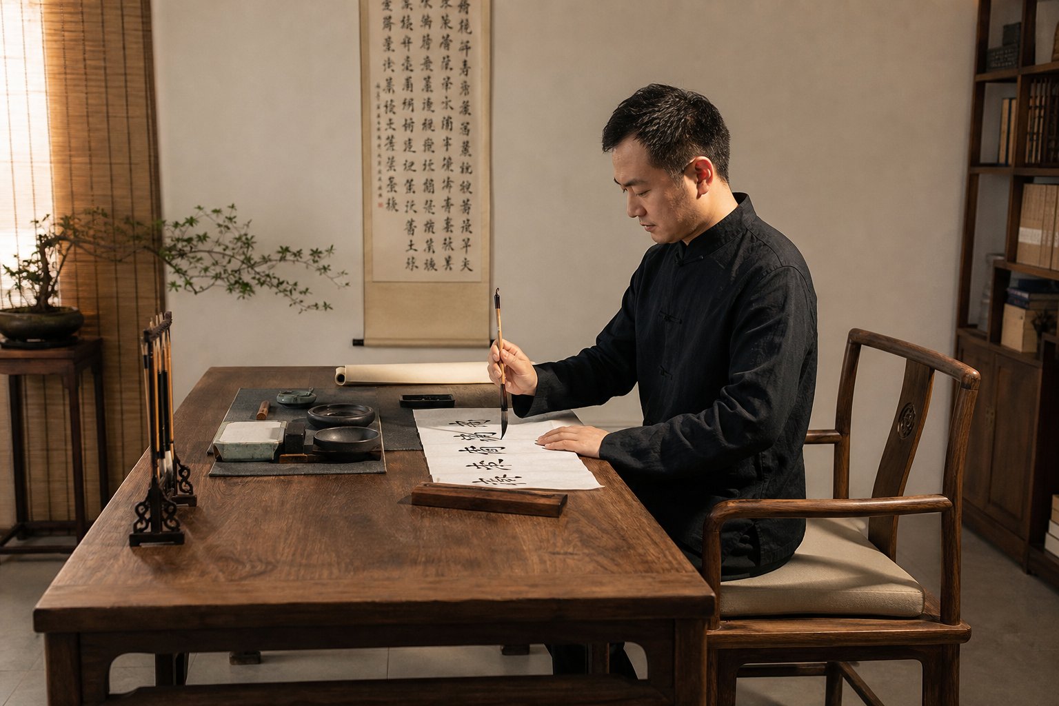
Your body is the engine behind every stroke. You can understand brush angle, pressure, and character structure perfectly, yet still produce inconsistent work because of how you sit, where your arm rests, and how far your hand is from the paper. These physical setup errors are invisible in the finished character but present in every session as fatigue, shakiness, and strokes that never quite reach the quality you know is possible.
Wrist Movement Versus Arm Movement and When Each Applies
Here is a question most beginners never ask: which part of your body should actually be moving when you write? The answer depends entirely on character size, and getting it wrong is one of the most common physical mistakes in brush calligraphy.
Traditional Chinese calligraphy recognizes three hand positions that determine your range of motion. Resting wrist (枕腕) places your wrist on the table or on your opposite hand for support. Suspended wrist (悬腕) lifts the wrist off the table while the elbow remains in contact. Suspended elbow (悬肘) raises both wrist and elbow completely off the surface, freeing the entire arm to move.
The general guideline for choosing between them:
- Small characters (roughly 0.5 to 1 inch): Resting wrist provides stability for fine detail work.
- Medium characters (1 to 4 inches): Suspended wrist gives enough reach and reach across the character without sacrificing control.
- Large characters (signboard or banner size): Suspended elbow, often while standing, allows full-arm sweeps necessary for bold strokes.
The mistake beginners make is writing everything from the wrist regardless of size. When you try to produce a 3-inch character using only wrist movement, your hand runs out of range partway through each stroke. You compensate by twisting your fingers or dragging your forearm, producing cramped, inconsistent lines. The brush tip cannot maintain center-tip position because your wrist is contorting to reach areas it was never designed to cover.
Grip height on the brush shaft compounds this problem. Gripping too low, near the ferrule, gives you fine control but restricts your movement to tiny wrist rotations. Gripping too high, near the top of the handle, frees your arm but makes precise strokes feel slippery and uncontrolled. For medium characters, grip the brush at roughly the midpoint of the shaft. For large characters, move your grip higher. Think of it like holding a pail by its handle: grip too close to the bucket and you cannot swing freely, grip at the very end and you lose stability.
Paper Setup and Body Position That Affect Output Quality
Chinese brush calligraphy requires a flat writing surface. This is non-negotiable. Unlike Western calligraphy or lettering, where some artists prefer a slanted drawing table, traditional brush calligraphy demands that the paper lie horizontal. The brush is held vertically, and gravity pulls ink straight down through the tip. Tilt the paper and you change how ink flows, how the brush contacts the surface, and how pressure translates into stroke width. Every angle you introduce is an angle you must compensate for.
Body distance matters just as much. Sitting too close forces you to hunch over the paper, restricting arm movement and tilting your line of sight so you cannot see the full character as you write. Sitting too far makes you lean forward and stretch, introducing instability. Your eyes should be roughly one to two feet above the paper, with a clear overhead view of the writing area.
Position the paper directly in front of your writing arm, not centered on your body. Right-handed writers should shift the paper slightly to the right so the brush moves naturally without the arm crossing the body's midline. Left-handed practitioners face additional challenges and may need to rotate the paper or adjust their approach angle.
Standing versus sitting changes everything. Standing naturally engages the suspended elbow position and allows full-body movement. It suits characters larger than about 4 inches. Sitting suits small to medium work where precision outweighs range of motion. The mistake is writing large characters while seated, which forces your arm into awkward positions, or writing tiny characters while standing, where your body sways introduce unwanted variation. The brush tip becomes as sensitive as a cat tongue to every micro-movement of your torso when you stand, so reserve that position for work that benefits from bold, sweeping gestures.
Before each practice session, run through this setup checklist:
- Confirm your table surface is flat and level, with no tilt or wobble.
- Sit with your back straight, both feet flat on the floor, and your shoulders relaxed.
- Position the paper in front of your writing arm, not your body's center.
- Match your hand position to your intended character size: resting wrist for small, suspended wrist for medium, suspended elbow for large.
- Adjust your grip height on the brush shaft to match the character size and hand position.
- Ensure adequate lighting from above or from the opposite side of your writing hand to avoid casting shadows on your work.
- Keep your ink, water, and brush rest within easy reach so you do not twist or lean during writing.
- If standing, position your feet shoulder-width apart with your weight evenly distributed.
These physical foundations seem basic, but neglecting even one of them introduces compensatory habits that degrade your output over time. A crooked posture forces uneven pressure. A tilted surface alters ink flow. A mismatched hand position limits your stroke range. Fix the body first, and many stroke-level problems resolve on their own.
Physical setup creates the conditions for good calligraphy. But conditions alone do not guarantee improvement. The mental habits you bring to each session, how you study models, how you structure practice, and how you approach progression between styles, determine whether those conditions translate into actual skill development.
Practice Habits and Mental Errors That Stall Progress
You can set up your body perfectly, load your brush correctly, and understand every structural principle discussed so far, yet still plateau for months or even years. The reason is rarely physical. It is mental. The habits you bring to each practice session, how you observe, how you study, and how you sequence your learning, determine whether repetition builds skill or simply reinforces errors.
Chinese calligraphy is often cited among the tough languages to learn in terms of written mastery, and much of that difficulty lives not in the brush mechanics but in the discipline of deliberate study. The mistakes below are invisible during practice. You only notice them when progress stalls and you cannot figure out why.
Rushing Through Characters Instead of Studying Models
The most damaging practice habit is also the most common: filling sheet after sheet with characters without spending meaningful time studying the model first. It feels productive. You finish a session with dozens of completed characters and a satisfying stack of used paper. But quantity without observation is just repetition of existing habits, good and bad alike.
The correct study method follows a four-step sequence that most beginners skip or compress:
- Observe: Look at the model character in your copybook (字帖) for at least 30 seconds before picking up the brush. Notice stroke angles, relative lengths, spacing between components, and where strokes are thick versus thin.
- Analyze: Identify the structural relationships. Which component is wider? Where does the center of gravity sit? How do strokes connect or relate to each other spatially? What is the proportional ratio between left and right, or top and bottom?
- Visualize: Close your eyes or look away from the model and mentally rehearse writing the character. Imagine the brush path, the pressure changes, the speed variations. This mental rehearsal primes your hand to execute what your mind has already mapped.
- Write: Only now does the brush touch paper. Write the character once with full attention, then compare it immediately against the model. Identify the specific differences before writing again.
This process feels painfully slow at first. You might produce only ten or fifteen characters in a session instead of a hundred. But each one carries genuine learning. The curation of quality over quantity is what separates deliberate practice from mindless repetition. Ten characters written with full attention teach more than a hundred written on autopilot.
A related mistake is skipping warm-up strokes entirely. Jumping straight into complex characters without first writing basic horizontals, verticals, and dots is like sprinting without stretching. Your hand has not calibrated to the brush, the ink, or the paper. The first several characters of any session will be inconsistent simply because your muscles have not found their rhythm. Spending five minutes on basic stroke drills, particularly the eight strokes contained in the character 永, warms up every fundamental movement pattern before you attempt full characters.
Self-Study Errors When Using Traditional Copybooks
A 字帖 (model copybook) is not just a collection of characters to copy. It is a teaching document. Each page demonstrates specific principles: how a master handles certain stroke combinations, how components relate within particular structural types, how rhythm and weight vary across a composition. Beginners who trace or copy mechanically, reproducing the outer shape without understanding the underlying logic, miss the entire pedagogical purpose of the copybook.
Imagine tracing a map without understanding geography. You can reproduce the coastline perfectly and still have no idea why rivers flow where they do. The same applies to calligraphy copybooks. You need to ask why the master made each choice: why this stroke is thicker, why that component sits slightly higher, why the spacing here is tighter than there. Copying without questioning produces imitation without comprehension.
Another persistent error is switching copybooks or styles too frequently. A practitioner studies Ouyang Xun's kaishu for two weeks, gets frustrated with the precision required, switches to Yan Zhenqing's bolder style, finds that difficult too, then jumps to running script because it looks more forgiving. This constant switching prevents mastery of any single approach. Each master's style has its own internal logic, and understanding that logic requires sustained, focused study over months, not days.
The deepest version of this mistake is avoiding regular script (kaishu) altogether. Beginners are drawn to the expressive freedom of running script or the dramatic gestures of cursive. Kaishu feels rigid and demanding by comparison. But as traditional pedagogy emphasizes, kaishu is not a step you pass through. It is the root. Without kaishu, xingshu becomes messy and caoshu becomes unreadable because there is no structural foundation supporting the expressive movement.
The traditional calligraphy learning sequence progresses from kaishu (regular script) to xingshu (running script) to caoshu (cursive script). Each stage builds on the control and structural awareness developed in the previous one. Skipping kaishu to practice expressive styles creates persistent bad habits that become harder to correct the longer they are reinforced, because the practitioner never develops the precision and structural discipline that more fluid styles depend upon.
This sequence exists for a reason. Kaishu demands that every stroke be visible, intentional, and correctly formed. There is nowhere to hide a mistake. That exposure forces you to develop precision, patience, and awareness that carry forward into every subsequent style. A practitioner who builds solid kaishu foundations can transition to xingshu with confidence because the underlying structure remains intact even as strokes begin to connect and simplify. A practitioner who skips kaishu and jumps to xingshu has begged the question of whether their flowing strokes are intentionally loose or simply undisciplined.
The practical recommendation is straightforward: choose one kaishu master, one copybook, and commit to it for a minimum of three to six months before introducing a second style. Study that copybook deeply rather than broadly. Understand its principles rather than merely reproducing its shapes. When you can write a character from that copybook without looking at the model and have it match the master's proportions, stroke weight, and spatial relationships, you have internalized the teaching rather than just copied the surface.
Mental discipline and physical technique are inseparable in calligraphy. The habits you build during study determine what your hands are capable of producing. But recognizing these errors is only the first step. Translating awareness into actual improvement requires targeted correction methods, specific drills designed to address each category of mistake at its root rather than patching symptoms one character at a time.
Deliberate Practice Methods to Fix Every Mistake
Awareness without action changes nothing. You can identify every error in your calligraphy, name the exact brush mechanic causing it, and still produce the same flawed strokes tomorrow if you lack a structured method for correction. The difference between a practitioner who improves steadily and one who plateaus indefinitely is not talent or time invested. It is whether practice targets specific weaknesses or simply repeats comfortable habits.
Each category of mistake discussed throughout this article has a corresponding drill designed to isolate and correct it at the root. These are not generic exercises. They are diagnostic tools that force your hand to confront exactly the movement pattern causing the problem.
Targeted Drills for Brush Control and Stroke Quality
Think of these drills as tongue twisters for your brush hand. Just as tongue twisters isolate specific phonetic combinations that trip up your mouth, each drill below isolates a specific brush movement that trips up your wrist, arm, or fingers.
The horizontal line drill (pressure consistency): Fill an entire sheet with horizontal strokes of identical length and width. No characters, no variation, just one stroke repeated fifty or a hundred times. Your goal is uniformity. Every line should show the same thickness, the same beginning form, and the same ending form. When you examine the sheet afterward, inconsistencies reveal exactly where your pressure control breaks down. Do the strokes get thinner as your brush dries? You are not reloading frequently enough. Do they wobble in the middle? Your arm is not moving smoothly. Do the endings vary between blunt stops and tapered trails? Your lift-off timing is inconsistent.
The circle drill (wrist flexibility): Draw continuous circles of varying sizes without lifting the brush. Start with small circles using wrist rotation, then gradually increase size until your elbow and shoulder engage. This drill reveals restrictions in your range of motion. If your circles become oval or angular at certain sizes, you have found the transition point where your wrist runs out of range and your arm has not yet taken over. Practice specifically at that size until the transition becomes seamless.
The dot grid exercise (spatial awareness): Draw a grid of evenly spaced dots across your paper, aiming for consistent size and equal spacing in both directions. This trains your eye-hand coordination for proportional placement. When you later write characters, the spatial judgment you develop here translates directly into better component positioning and internal spacing. Uneven dot grids reveal whether your spatial errors lean in a particular direction, left-heavy, top-heavy, or progressively drifting as you move across the page.
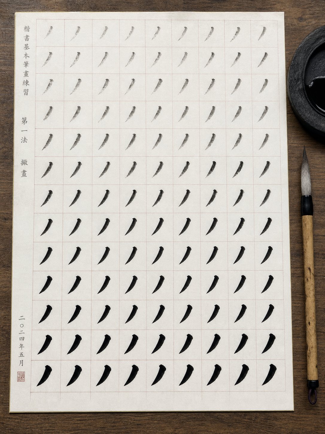
The single-stroke repetition method (stroke perfection): Choose one stroke type that your self-assessment identifies as weak. Write only that stroke for an entire practice session. Not the stroke within a character, just the stroke itself, isolated and repeated. Compare each attempt against the model. This level of isolation feels tedious, but it prevents you from hiding a weak stroke inside a character where other elements distract from the deficiency.
The 永 character as comprehensive warm-up: The yong character (永) remains the most efficient warm-up tool in calligraphy because it exercises all eight basic stroke types within a single character. Writing 永 five to ten times at the start of each session activates every fundamental brush movement: the dot, horizontal, vertical, hook, rising stroke, long left-falling, short left-falling, and right-falling. If any stroke feels off during this warm-up, you have immediately identified which movement pattern needs attention before you proceed to full practice.
Building a Structured Self-Correction Practice Routine
Drills fix individual mechanics. But lasting improvement requires a system for identifying which drill you need on any given day and tracking whether your corrections are actually holding over time.
Photograph and compare: After each practice session, photograph your best attempt at a character and place it side by side with the model copybook version. Use your phone's zoom to examine specific strokes at close range. This comparison reveals discrepancies your eye misses in real time. You will notice that a stroke you thought was straight actually curves slightly, or that your left-right proportions consistently skew in one direction. Keep these comparison photos in a folder organized by date. Over weeks, you can track whether specific errors are diminishing or persisting.
Isolate one error per session: The temptation is to fix everything at once. Resist it. If your horizontal strokes trail off weakly and your character proportions lean left, do not try to correct both simultaneously. Choose one. Spend the entire session focused on that single issue. Your brain can only consciously monitor one movement pattern at a time while the rest run on autopilot. Trying to fix multiple errors simultaneously means none of them get enough focused attention to change.
Calibrate expectations to script style: Not every imperfection is an error. Kaishu demands precision. Every stroke must be clearly formed, correctly proportioned, and individually distinct. A slight wobble or uneven taper in kaishu is a genuine defect. Xingshu tolerates more variation because its purpose is fluid expression. Strokes connect, simplify, and vary in weight more freely. What looks like an error in kaishu might be perfectly acceptable in running script. Caoshu goes further still, where individual stroke identity dissolves into continuous gesture. Calibrate your self-criticism to the style you are practicing. Holding xingshu to kaishu standards produces frustration without improvement, while applying caoshu looseness to kaishu practice prevents you from developing necessary precision.
The IPA meaning in linguistics refers to a standardized system for transcribing sounds. Calligraphy has its own equivalent: the eight principles of yong provide a standardized framework for evaluating stroke execution. Just as linguists use the International Phonetic Alphabet (what does IPA stand for in that context) to identify exactly which sound a speaker produces versus which sound they intended, you can use the yong framework to identify exactly which brush movement you executed versus which movement the model demands.
With that diagnostic framework in mind, here is a progressive correction sequence that moves from the most fundamental level to the most complex:
- Brush control fundamentals (weeks 1-2): Focus exclusively on the four technique errors: brush angle, pressure consistency, ink loading, and speed. Use the horizontal line drill and circle drill daily. Do not attempt full characters. Your only goal is producing consistent, controlled marks.
- Individual stroke quality (weeks 3-4): Introduce the eight basic strokes one at a time using the single-stroke repetition method. Compare each stroke against the yong character model. Correct entry forms, body consistency, and exit forms for each stroke type before moving to the next.
- Stroke combinations and transitions (weeks 5-6): Begin writing simple characters (five strokes or fewer) that combine the strokes you have practiced. Focus on how strokes relate to each other spatially. Use the dot grid exercise to develop proportional awareness.
- Radical transformation and component sizing (weeks 7-8): Practice characters with common radical transformations. Write the standalone radical, then the transformed version, comparing proportions. Focus on left-side compression and top-bottom flattening.
- Full character composition (weeks 9-10): Write complex characters with multiple components. Apply structural type awareness: plan proportional ratios before writing. Photograph and compare against your copybook model after every character.
- Rhythm and flow across multiple characters (weeks 11-12): Write short phrases or couplets. Shift attention from individual character quality to consistency across a line: uniform size, even spacing between characters, and consistent ink density throughout.
- Style-specific refinement (ongoing): Once fundamentals are solid, begin introducing stylistic variation. Study one master's copybook deeply. Identify the specific characteristics that define their style and practice reproducing those qualities deliberately.
This sequence is not rigid. If your self-assessment reveals that stroke quality is strong but proportional awareness is weak, spend more time on stages four and five. If brush control remains inconsistent after two weeks, stay there longer. The timeline is a guideline, not a deadline. Progress in calligraphy is nonlinear, and rushing through stages to reach "more interesting" work is itself one of the practice errors that stalls development.
The common thread across every correction method is isolation followed by integration. Isolate the problem, drill it in its simplest form until the correct movement becomes automatic, then reintegrate it into progressively more complex contexts. This is how lasting change happens: not by writing more characters, but by writing fewer characters with greater intention and sharper self-awareness. Every mistake identified in this article has a solution. The only question is whether you are willing to slow down long enough to apply it.
Frequently Asked Questions About Chinese Calligraphy Mistakes
1. What is the most common mistake beginners make in Chinese calligraphy?
The most common beginner mistake is incorrect brush angle, specifically using side-tip technique unintentionally. When the brush tilts too far, the tip drags along one edge of the stroke, producing ragged, uneven lines. This single error cascades into pressure and speed problems because practitioners compensate with force or rushing. Correcting brush angle to maintain center-tip position (zhong feng) resolves multiple downstream issues simultaneously and should be the first thing any beginner addresses.
2. How do I know if my stroke order is wrong in calligraphy?
Wrong stroke order in brush calligraphy leaves visible evidence on paper: ink pooling at hesitation points, inconsistent stroke weight where rhythm was broken, and gaps where the brush ran dry from inefficient travel between strokes. If your characters look technically correct but feel disjointed or lack rhythmic flow, stroke order is likely the cause. Compare your brush path against a model copybook and notice whether your hand travels smoothly or crosses back over completed strokes awkwardly.
3. Why does my Chinese calligraphy look stiff even when the characters are correct?
Stiff-looking calligraphy typically results from three combined issues: writing too slowly, applying uniform pressure throughout every stroke, and using only wrist movement regardless of character size. Each stroke should vary in speed and pressure, with decisive entries and intentional exits. Additionally, if you practice running script (xingshu) but rigidly apply regular script stroke order, the forced sequencing prevents natural flow between connected strokes, creating a mechanical appearance.
4. How long should I practice regular script (kaishu) before moving to running script?
Traditional pedagogy recommends a minimum of three to six months of focused kaishu practice with a single master's copybook before introducing running script. The benchmark is not time spent but skill achieved: when you can write a character from your copybook without looking at the model and match the master's proportions, stroke weight, and spatial relationships, you have internalized the structural foundation that running script depends upon. Skipping this stage creates persistent bad habits because xingshu looseness without kaishu discipline becomes mere sloppiness.
5. What is the best way to practice Chinese calligraphy by yourself?
Effective self-practice follows a four-step method: observe the model character for at least 30 seconds, analyze its structural relationships and proportions, mentally visualize the brush path before writing, then execute with full attention and immediately compare against the model. Photograph your work after each session and compare it side by side with the copybook to identify specific discrepancies. Focus on correcting one error type per session rather than attempting to fix everything simultaneously, and always begin with five minutes of warm-up strokes using the yong character to activate all eight fundamental brush movements.