Understanding Chinese Calligraphy and Its Five Major Styles
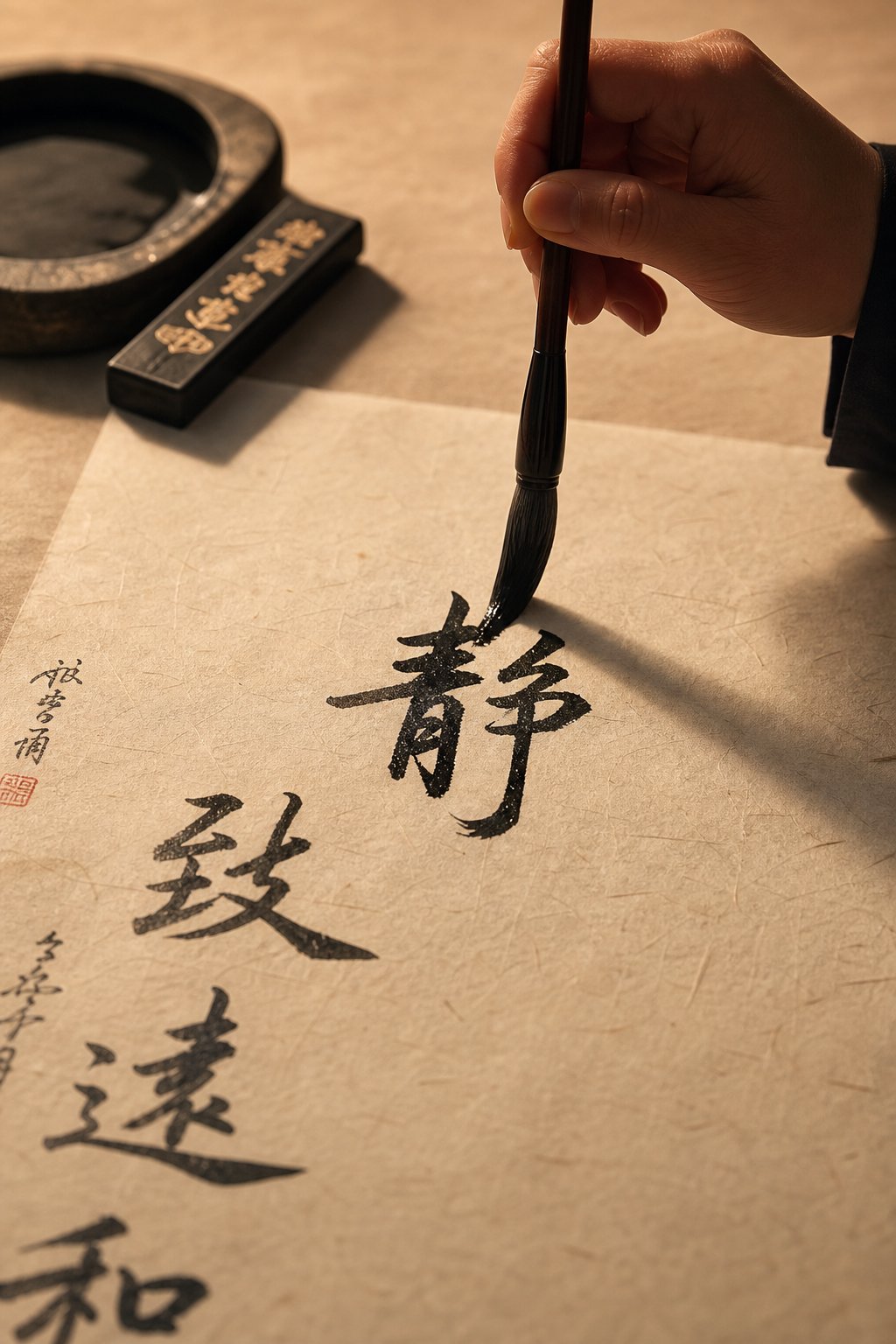
Imagine picking up a brush, dipping it in ink, and producing a single stroke that carries the weight of 3,000 years of artistic tradition. That is the essence of Chinese calligraphy (书法, shūfǎ) — far more than handwriting, and far more than decoration. The Chinese calligraphy definition goes beyond putting characters on paper. It is a disciplined visual art form where body movement, breath control, and aesthetic philosophy merge into every brushstroke.
What Is Chinese Calligraphy and Why Does It Matter
In Chinese culture, calligraphy was historically prized above all other visual art forms, including painting. The calligraphy chinese meaning of 书法 (shūfǎ) literally translates to "the method of writing," but that translation barely scratches the surface. What separates traditional chinese calligraphy from ordinary writing is the integration of the entire body into the act of creation. The brush becomes an extension of the writer's arm, channeling energy, emotion, and intention into each character.
You'll notice that calligraphic art demands a specific posture, a relaxed yet focused mind, and precise coordination between wrist, elbow, and shoulder. A single horizontal stroke might require the calligrapher to press down firmly at the start, glide with controlled speed through the middle, and lift with a deliberate flourish at the end. Every movement is intentional. Every pause carries meaning.
This is why calligraphy 中文 (Chinese calligraphy) was enshrined as one of the Six Arts (六艺, liuyi) in ancient Chinese education, alongside ritual, music, archery, chariot driving, and mathematics. It was not a hobby — it was a mark of refinement, learning, and moral character. The written Chinese language developed over three millennia and eventually evolved into five basic script types, all of which remain in use today.
The Five Core Scripts at a Glance
Chinese calligraphy styles fall into five major categories, each with its own visual character, historical context, and practical application. Here they are in chronological order of development:
- 篆书 (zhuanshu) — Seal Script: the oldest style still practiced, with elongated, symmetrical strokes rooted in ancient bronze inscriptions
- 隶书 (lishu) — Clerical Script: a flattened, wider style developed by government clerks during the Han dynasty for faster writing
- 楷书 (kaishu) — Regular Script: the clear, balanced standard used in print, education, and formal documents
- 行书 (xingshu) — Running Script: a fluid, semi-cursive style used for everyday handwriting that balances speed with legibility
- 草书 (caoshu) — Cursive (Grass) Script: the most abstract and expressive style, where characters merge and flow with artistic freedom
Think of these five types of calligraphy as a spectrum. On one end sits the architectural precision of seal and regular script. On the other, the wild expressiveness of cursive. Each style emerged from specific historical needs — political standardization, administrative efficiency, artistic ambition — and each rewards the practitioner with a different relationship between brush and paper.
Whether you are a curious reader exploring chinese calligraphy art for the first time or an aspiring practitioner deciding where to begin, these five scripts form the complete roadmap. The story of how they developed — from carved oracle bones to sweeping grass script — reveals not just the evolution of writing, but the evolution of an entire civilization's relationship with beauty, power, and self-expression.
Oracle Bone Script and Seal Script Origins
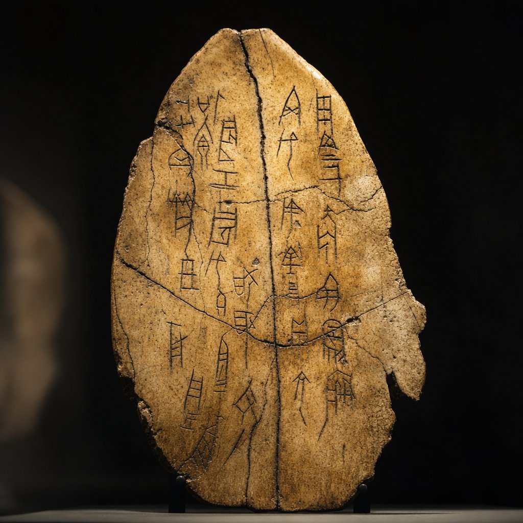
Every writing system has a genesis moment — a point where marks on a surface first carry meaning. For Chinese characters, that moment traces back more than 3,000 years to the Shang dynasty (c. 1600-1046 BCE) and the Yellow River valley, where diviners carved questions into animal bones and turtle shells.
Oracle Bone Script and the Birth of Chinese Writing
So what are oracle bones, exactly? The oracle bones definition is straightforward: they are pieces of ox scapula (shoulder blades) or tortoise plastrons inscribed with early Chinese characters and used for ritual divination. A diviner would carve a question into the bone — anything from when to plant crops to whether a military campaign would succeed — then apply a heated metal rod to the surface. The resulting cracks were interpreted as answers from Shangdi, the supreme ancestral deity of the Shang royal court.
Oracle bone script (甲骨文, jiǎgǔwén) represents the oldest verified form of Chinese writing. The characters are angular and pictographic, shaped by the constraints of carving into hard bone rather than brushing onto soft surfaces. About 40 percent of these inscriptions are still decipherable today, and roughly 200,000 fragments survive in museum collections worldwide. Oracle bones in ancient china served a dual purpose: they were tools of spiritual communication and, unintentionally, the earliest historical records of a civilization's daily concerns.
You'll notice something remarkable here. Many bone oracle script characters are recognizable ancestors of modern Chinese characters. The pictographic logic — a circle with rays for "sun" (日), a crescent for "moon" (月) — established a visual DNA that persists across millennia.
Seal Script and the Qin Dynasty Standardization
As Chinese civilization expanded beyond the Shang, writing moved from carved bone to cast bronze. The characters inscribed on ritual vessels during the Zhou dynasty (1046-256 BCE) grew more elaborate and rounded, forming what scholars call the Great Seal Script (大篆, dazhuan). These bronze inscriptions varied widely from region to region — each feudal state developed its own local writing conventions.
That fragmentation ended abruptly in 221 BCE when the state of Qin conquered all rivals and unified China under a single emperor.
Political unification demanded linguistic unification. The Qin government understood that a single empire could not function with seven different regional scripts, so Counsellor Li Si standardized all writing into one system: the Small Seal Script (小篆, xiaozhuan).
Small seal script is visually distinctive — characters are vertically elongated, symmetrical, and composed of even-width strokes with rounded turns. Every character fits within a uniform rectangular frame regardless of complexity. Li Si's standardization was not merely aesthetic; it was an act of political control, binding a vast empire through shared written language.
The finest surviving example of this chinese seal script is the Stele of Mount Yi (嶧山碑), traditionally attributed to Li Si himself and originally erected in 219 BCE. Its 15 columns of lesser-seal script calligraphy demonstrate the style's elegant uniformity — each character balanced, deliberate, and architecturally precise.
Seal script eventually fell out of daily use as faster writing methods emerged, but it never disappeared. Today you'll find it carved into personal name seals (chops), pressed onto official government stamps, and adapted into corporate logo designs. Its visual gravity and ancient associations give it an authority that no other script style quite matches.
The very efficiency problem that made seal script impractical for bureaucrats — its slow, meticulous stroke construction — would soon drive the invention of something faster and flatter, reshaping Chinese characters into a form much closer to what we recognize today.
Clerical Script as the Bridge Between Ancient and Modern
Speed killed seal script's dominance. Government clerks across the Han dynasty (206 BCE-220 CE) faced mountains of official documents, tax records, and legal correspondence — and the slow, symmetrical strokes of seal script simply could not keep pace. The solution was clerical script (隶书, lishu), a flatter, faster, and more practical style that transformed how chinese writings looked on the page and, more importantly, how quickly they could be produced.
How Clerical Script Emerged from Administrative Need
The Chinese name itself tells the story. Lishu literally means "servant script" or "clerk's script," and its invention is traditionally attributed to a prison officer who needed a quicker way to handle paperwork. As the Smithsonian's National Museum of Asian Art notes, clerical script was frequently used in preparing official records and documents, serving both public monuments and private correspondence throughout the Han era.
What made this shift possible? The spread of ink and brush as primary writing tools. Earlier scripts were carved into bone or cast in bronze — hard materials that demanded thin, uniform strokes. Brushes made of animal hair on bamboo strips (简牍, jiandu) allowed calligraphers to modulate line thickness at will. This was the moment calligraphy in ancient china began to be regarded as an art form, not merely a communication tool. The techniques of lifting (提, ti) and pressing (按, an) the brush emerged, giving writers expressive control over every stroke.
Identifying Clerical Script by Its Stroke Patterns
Imagine flipping seal script on its side. Where seal characters are tall and narrow, clerical script characters spread wide and sit low, creating a stable, grounded appearance. You'll recognize this ancient chinese calligraphy style by a few unmistakable features:
- Flattened horizontal structure — characters are wider than they are tall, the opposite of seal script's vertical elongation
- The "silkworm head and goose tail" (蚕头雁尾) — horizontal strokes begin with a rounded, heavy press (the silkworm head) and end with an upward sweeping lift (the goose tail)
- Modulated stroke width — unlike seal script's uniform lines, strokes vary from thick to thin based on brush pressure
- Top-line justification — all characters align along the top edge, creating an orderly visual rhythm
There is one elegant rule worth noting: in most characters, only one horizontal stroke receives the full goose-tail flourish. Traditional practitioners call this "two goose tails do not fly together" — a constraint that keeps the composition balanced rather than cluttered.
This style of traditional chinese writing represents the critical turning point between ancient pictographic forms and the angular, stroke-based characters used today. Clerical script broke away from the rounded, image-derived shapes of early chinese writing and introduced the flat, segmented structure that regular script would later refine into the standard we read in modern print.
Ancient china calligraphy reached a high point of formal beauty in Han-era stone steles like the Stele of Zhang Qian and the Stele of Cao Quan, which demonstrate the script's majestic, orderly appearance. Today, clerical script still appears on book titles, formal signage, and decorative inscriptions wherever a sense of classical authority is desired — proof that a style born from bureaucratic necessity can endure as lasting art.
Yet for all its visual elegance, clerical script still demanded careful, deliberate execution. The next leap in Chinese calligraphy would produce a style so clear and structurally precise that it became the universal foundation for learning — and the direct ancestor of every printed Chinese character you see on a screen or page today.
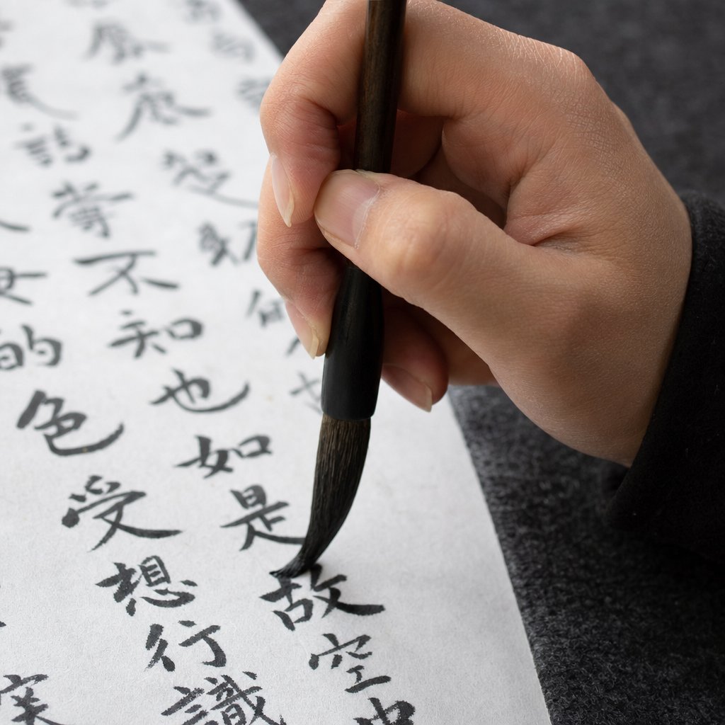
Regular Script and the Art of Structural Precision
That universal foundation arrived in the form of regular script (楷书, kaishu) — the chinese writing script that every calligraphy student picks up first and the style most people picture when they think of calligraphy chinese characters. Its name says everything: 楷 (kai) means "model" or "standard," and that is exactly what this script provides. Clear strokes. Balanced proportions. Complete legibility. No ambiguity.
Why Regular Script Is the Foundation for All Learners
What makes regular script the starting point rather than just one option among five? Structure. Every stroke has a defined beginning, a controlled middle, and a deliberate ending. Nothing merges. Nothing hides. Each character sits within an invisible square grid, and every component — horizontal, vertical, dot, hook, sweep — occupies its proper place with consistent spacing.
This transparency is precisely what makes it demanding. When every detail is visible, every flaw is too. A slightly uneven horizontal line, a hook that curves too early, a dot placed a fraction off-center — all of it shows. Regular script trains the hand and eye simultaneously, building the stroke control and structural awareness that later styles depend on. Without this discipline, running script becomes wobbly and cursive becomes chaos.
The core rules of the chinese writing format in regular script are straightforward:
- Separated strokes — each stroke is distinct, with no connections between them
- Consistent width — strokes maintain even thickness with controlled pressure
- Balanced spacing — components within a character are evenly distributed
- Defined endpoints — every stroke begins and ends with a deliberate brush action, never trailing off
These principles make regular script the most readable of all chinese character styles, which is why it became the basis for printed typefaces, textbooks, and government documents across the Chinese-speaking world.
Tang Dynasty Masters Who Defined Regular Script
Regular script emerged during the late Eastern Han dynasty, but it reached full maturity under the Tang (618-907 CE) — a golden age when calligraphy was both a civil service requirement and a high art. Two masters in particular shaped how generations would understand this chinese character font: Yan Zhenqing (709-785) and Liu Gongquan (778-865).
Yan Zhenqing's style is muscular and expansive. His strokes are thick, his structures broad, and his characters radiate a sense of power and moral gravity. His most celebrated work, the Duobao Pagoda Stele (多宝塔碑), written in 752 CE, remains one of the most copied practice texts for students worldwide. Later generations of calligraphers frequently copied this work and emulated Yan's bold approach to standard script.
Liu Gongquan took a different path. His characters are lean, angular, and architecturally tight — often described as having "bone structure" (骨力, guli) rather than flesh. Where Yan's brush presses wide, Liu's cuts narrow and precise.
| Characteristic | Yan Zhenqing (颜体) | Liu Gongquan (柳体) |
|---|---|---|
| Stroke weight | Thick, bold, muscular | Thin, sharp, bone-like |
| Structure | Broad and open, generous spacing | Compact and tight, angular framework |
| Emotional quality | Powerful, dignified, warm | Precise, austere, disciplined |
| Famous work | Duobao Pagoda Stele (多宝塔碑) | Mystical Buddha's Pagoda Inscription (玄秘塔碑) |
| Best suited for | Building confidence with bold strokes | Refining control and precision |
Together, these two masters represent the full range of regular script expression — one warm and expansive, the other cool and exacting. Most calligraphy teachers recommend starting with Yan's style to build confidence in brush pressure, then studying Liu's work to sharpen precision.
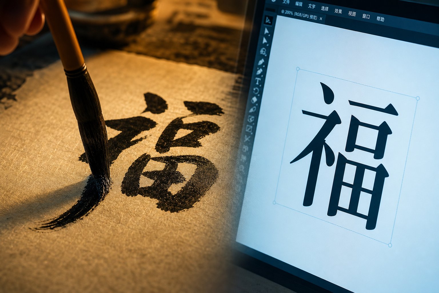
The influence of regular script extends well beyond the practice table. Modern chinese font writing — the typefaces you see on screens, in books, and on street signs — draws directly from kaishu's structural logic. Fonts like SimSun and KaiTi are digital translations of brush-written regular script, preserving the same proportional rules that Tang dynasty masters codified over a thousand years ago. Every time you read a Chinese text message or scan a restaurant menu, you are looking at the legacy of kaishu.
Still, precision has its limits. For personal letters, quick notes, and artistic signatures, writers throughout history craved something faster — a style that kept regular script's bones but let the brush flow without stopping between every stroke.
Running Script and the Balance of Speed and Beauty
That craving for speed without sacrificing legibility gave rise to running script (行书, xingshu) — the semi cursive script that has dominated everyday china handwriting for nearly two millennia. Picture regular script loosening its tie after work. The bones are still there, the proportions still recognizable, but the brush no longer lifts between every stroke. Characters breathe. Movements connect. Writing becomes rhythm.
Running Script for Fluid Everyday Writing
Running script sits at the midpoint of the chinese writing style spectrum. It borrows structure from regular script and borrows momentum from cursive, creating a balance that feels natural to both writer and reader. This is why it became the default mandarin writing style for personal correspondence, informal documents, and artistic expression across centuries of Chinese literary culture.
What defines this style technically? A few key brush behaviors:
- Connected strokes — the brush links adjacent strokes within a character rather than lifting after each one, creating visible threads of ink between movements
- Moderate speed with varied pressure — the writer moves faster than in regular script, pressing harder on downstrokes and lighter on transitions, producing a thick-thin contrast that gives characters visual energy
- Simplified forms — some strokes merge or shorten, but never to the point of losing character recognition
- Continuous rhythm — the writing flows with a pulse, alternating between moments of weight and moments of release
The result is beautiful chinese writing that remains fully readable while carrying the personality of the writer's hand. Unlike regular script, where individual style is subtle, running script reveals temperament openly — the speed of thought, the confidence of gesture, the mood of the moment. This is also why it became the preferred style for a chinese calligraphy signature, where personal identity and artistic flair merge in a few fluid strokes.
Within this category, practitioners distinguish between two variants. The slower, more structured version stays closer to regular script and is sometimes called "walking" (行). The faster, more abbreviated version leans toward cursive and is called "running." Both remain legible, but the emotional register shifts — one is composed, the other spontaneous.
Wang Xizhi and the Preface to the Orchid Pavilion
No discussion of running script is complete without Wang Xizhi (303-361 CE), the Jin dynasty master whose work defined this chinese style writing for all time. His Lantingji Xu (Preface to the Orchid Pavilion), written in 353 CE during a spring gathering of poets and scholars, has been called the finest work of running script ever to emerge from a calligrapher's brush.
The legend surrounding this piece only deepens its mystique. Wang Xizhi reportedly composed the preface while slightly tipsy, his brush moving with uninhibited grace. After sobering up, he attempted to rewrite it a thousand times — and none of the subsequent versions matched the original. The Tang dynasty emperor Taizong (598-649) became so obsessed with the work that, according to tradition, he had it buried with him as a funerary object. The original has never been seen since.
What survives are meticulous copies and rubbings made by court calligraphers, and even these reproductions have inspired what Qing dynasty epigrapher Weng Fanggang called an "Orchid Pavilion obsession" — a centuries-long artistic and literary aesthetic built around a single masterwork. The piece demonstrates everything running script can achieve: structural clarity, emotional warmth, rhythmic variation, and the unmistakable presence of a chinese signature style that belongs to one hand alone.
For practitioners, running script is where calligraphy starts to feel personal. Regular script teaches control. Running script teaches expression within control — the art of letting the brush move naturally while the mind stays aware. It is the style most people actually use when they write by hand, and the style that most clearly bridges practical communication with artistic identity. Yet even running script observes boundaries. For calligraphers who wanted to shatter those boundaries entirely — to turn writing into pure visual energy — a wilder path awaited.
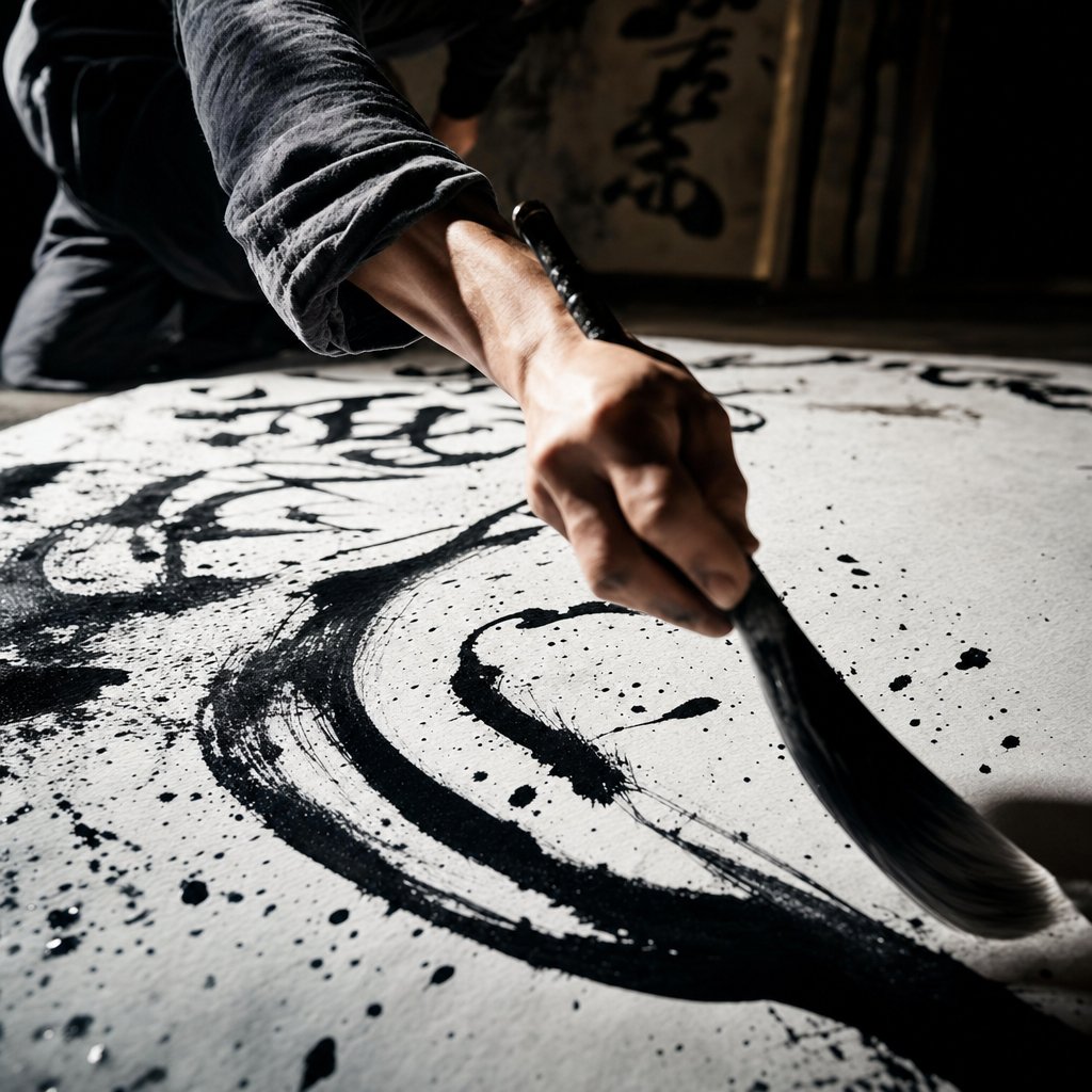
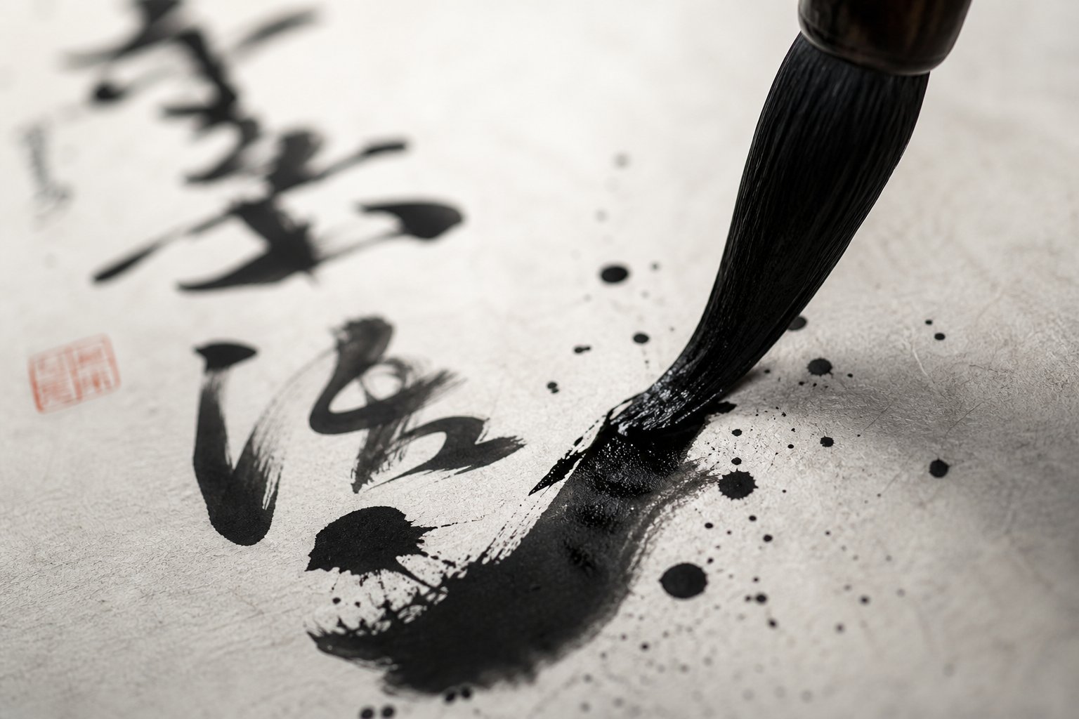
Cursive Grass Script as Pure Artistic Expression
That wilder path has a name: grass script (草书, caoshu). Literally translated as "grass writing," this chinese cursive script is the most expressive, most abstract, and most misunderstood of the five major styles. Where regular script prizes clarity and running script balances speed with legibility, cursive calligraphy abandons readability altogether in pursuit of something else entirely — raw emotional energy made visible through ink.
Grass Script and the Freedom of Artistic Expression
Imagine watching a dancer who has trained for decades in classical technique, then steps onstage and improvises. The discipline is invisible but essential — it lives in the body, freeing the performer to move without conscious calculation. That is the relationship between cursive chinese and the scripts that precede it. Grass script looks wild, but it demands total mastery of brush fundamentals before a single stroke makes sense.
The style developed during the Han dynasty (206 BCE-220 CE) and reached its period of greatest growth during the Tang dynasty (618-907). In caoshu, the number of strokes in characters are reduced to single scrawls or abstract abbreviations of curves and dots. Characters need not be the same approximate size, spacing follows no fixed rule, and entire phrases may be written without lifting the brush from the paper. The result is a continuous river of ink — surging, pooling, thinning, breaking — that records the calligrapher's physical and emotional state in real time.
Chinese cursive evolved through three distinct sub-categories, each pushing further from legibility:
- 章草 (zhangcao) — Draft Cursive: the earliest form, retaining some clerical script influences with characters still separated from one another
- 今草 (jincao) — Modern Cursive: characters begin connecting, strokes simplify further, and the writing gains continuous momentum
- 狂草 (kuangcao) — Wild Cursive: the most extreme form, where characters merge into unbroken chains of movement and legibility becomes secondary to artistic impact
Cursive script is valued more as visual art than as communication. A viewer does not need to read the characters to feel the energy, rhythm, and emotion embedded in the brushwork — much as one does not need to understand lyrics to be moved by a singer's voice.
The physical technique behind this artistic cursive differs dramatically from other styles. The brush moves fast — sometimes explosively so. Pressure shifts from feather-light to full-weight within a single stroke. The wrist alone cannot produce these movements. Practitioners engage the full arm, the shoulder, and even the torso, turning the act of writing into something closer to a physical performance. Strokes of varying thickness and modulation show a great variety of shapes, and the calligrapher has the fullest freedom of expressive movement of line.
Wild Cursive Masters Zhang Xu and Huai Su
Two Tang dynasty figures pushed cursive mandarin calligraphy to its absolute limit: Zhang Xu (c. 675-759) and Huai Su (737-799). Together they earned the nickname "Crazy Zhang and Drunken Su" (颠张醉素) — a phrase that captures both their artistic temperament and, reportedly, their preferred creative state.
Zhang Xu was said to write his wildest pieces after drinking heavily, sometimes dipping his hair directly into ink and dragging it across silk. His contemporaries described watching him work as witnessing a kind of possession — the brush moving with a speed and confidence that seemed to bypass conscious thought. No undisputed original works by Zhang Xu survive, but his influence echoes through every piece of mandarin cursive produced in the centuries after him.
Huai Su, a Buddhist monk from Changsha, matched Zhang Xu's intensity with a different energy. The Shanghai Museum holds his Ku Sun Tie — a note written to a friend whose brushstrokes are rounded and lively, exuding natural simplicity and archaic elegance. Among all surviving works attributed to this Tang dynasty calligrapher, this piece is the only one universally recognized as an undisputed authentic work by Huai Su. His larger masterpiece, the Autobiography (自叙帖), stretches over 700 characters of unbroken wild cursive — a sustained performance of breath, movement, and ink that remains one of the most celebrated examples of grass script in existence.
Why is cursive typically studied last? Because it requires everything the other four styles teach — the structural awareness of regular script, the rhythmic flow of running script, the historical vocabulary of seal and clerical forms — and then asks the practitioner to let go of visible control while maintaining invisible discipline. Without that foundation, cursive becomes mere scribbling.
This connection between disciplined spontaneity and visual power is exactly what drew 20th-century Western artists to Chinese calligraphy. The Guggenheim notes that Abstract Expressionists like Franz Kline were fascinated by East Asian calligraphy's balance of control and energy, order and dynamism — qualities most fully realized in grass script. The calligraphic brushstroke became an approach to abstract painting that focused on the spontaneous gesture of the artist's hand. Contemporary ink artists continue this dialogue, creating works that live somewhere between cursive chinese calligraphy and pure abstraction, proving that a tradition born in the Han dynasty still generates new creative possibilities.
Mastering any of these five scripts — from the architectural stillness of seal to the kinetic fury of cursive — demands the right tools. And the relationship between brush, ink, paper, and stone is not incidental. It is foundational.
Essential Tools and a Learning Path for Beginners
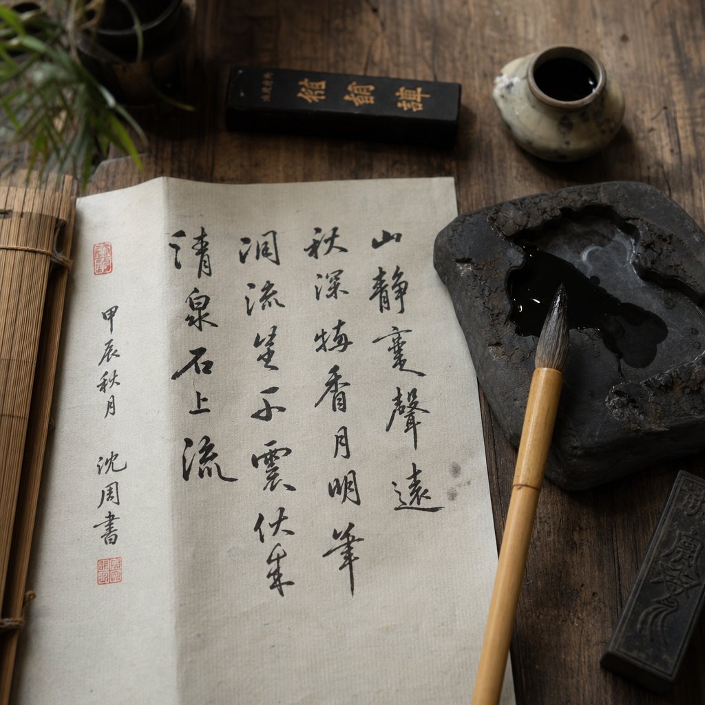
That foundation rests on four objects. In Chinese tradition, they are called the four treasures of the study (文房四宝, wenfang sibao) — brush, ink, paper, and inkstone. These are not interchangeable commodities. Each treasure comes in varieties that dramatically affect how ink meets paper, and choosing the right combination for each script style is one of the first real decisions a practitioner faces when learning to create chinese calligraphy.
The Four Treasures of the Study Explained
The brush (毛笔, maobi) is the most variable of the 4 treasures of the study. Brushes are made from animal hair — primarily goat, wolf (actually weasel), and combinations of both. Each type of hair has different qualities, and they are chosen based on the script style or the desired expression. Stiff wolf-hair brushes produce sharp, angular strokes with crisp edges. Soft goat-hair brushes hold more ink and create flowing, rounded lines. Mixed-hair brushes split the difference, offering moderate stiffness with decent ink capacity.
Ink comes in two forms: solid ink sticks ground on an inkstone with water, and pre-made eastern liquid ink sold in bottles. Grinding your own ink on a stone gives you precise control over consistency — thick, viscous ink for bold regular script strokes, or diluted washes for expressive cursive work where the brush barely touches the surface. The inkstone itself matters more than beginners expect. A fine-grained stone produces smoother ink with fewer particles, and antique inkstones from famous quarries in Guangdong and Anhui provinces remain highly valued collectors' items.
Paper is where things get interesting. Xuan paper (宣纸, xuanzhi) — the traditional calligraphy paper — comes in two main types. Sized (熟宣, shuxuan) paper has been treated with alum to reduce absorbency, keeping ink lines sharp and controlled. Unsized (生宣, shengxuan) paper is raw and highly absorbent, allowing ink to bleed and feather at the edges. You'll use sized paper when precision matters and unsized paper when you want expressive, organic effects.
Matching Tools to Each Calligraphy Style
Here is where the four treasures of study connect directly to the five scripts. Each style demands a specific tool configuration — the wrong brush or paper can make a difficult style nearly impossible. This matrix gives you a clear starting point for writing chinese calligraphy in any script:
| Style | Brush Type | Ink Consistency | Paper Type | Practice Approach |
|---|---|---|---|---|
| Seal Script (篆书) | Stiff wolf-hair, small to medium tip | Thick, concentrated | Sized xuan paper | Slow, even-pressure tracing of classical steles |
| Clerical Script (隶书) | Stiff or mixed-hair, medium tip | Medium-thick | Sized xuan paper | Focus on the "silkworm head, goose tail" pressure shifts |
| Regular Script (楷书) | Mixed-hair, medium tip | Medium-thick, consistent | Sized xuan paper or grid practice sheets | Stroke-by-stroke repetition from Yan or Liu models |
| Running Script (行书) | Mixed or soft goat-hair, medium tip | Medium, slightly fluid | Semi-sized or lightly absorbent paper | Copy Wang Xizhi passages, building connected rhythm |
| Cursive Script (草书) | Soft goat-hair, large tip with high ink capacity | Varied — thick to diluted within one session | Unsized xuan paper for expressive bleeding | Full-arm movement, speed drills after mastering other scripts |
Notice the pattern: as you move from seal to cursive, brushes get softer, ink gets thinner, paper gets more absorbent, and the body's involvement expands from wrist to full arm. The tools mirror the scripts' evolution from controlled precision to expressive freedom.
So where should a beginner actually start? The recommended learning progression follows a logic that builds skills cumulatively:
- Stage 1 — Regular Script (楷书): Learn fundamental stroke mechanics, pressure control, and character structure. Spend at least several months here before moving on. This is your foundation for everything else.
- Stage 2 — Running Script (行书): Once your strokes are stable, begin connecting them. Running script teaches rhythm, flow, and the transition from deliberate to intuitive movement.
- Stage 3 — Clerical Script (隶书): Step back historically to explore different pressure dynamics and the distinctive wave strokes. This broadens your technical vocabulary and deepens appreciation for how scripts evolved.
- Stage 4 — Seal Script (篆书): Study the oldest forms to understand character origins and develop patience with slow, even-pressure brushwork.
- Stage 5 — Cursive Script (草书): Only after internalizing control from all previous stages should you attempt the freedom of grass script. Without that foundation, cursive is just scribbling.
This progression addresses something most guides skip: you do not need to master all five styles to enjoy calligraphy. Many practitioners spend years happily working in just regular and running script. The path is not a race — it is a deepening relationship with brush and ink that unfolds at whatever pace feels right.
With the right tools in hand and a clear learning sequence mapped out, the natural question becomes: where do these ancient scripts actually show up in daily life? The answer is everywhere — from the seal stamped on a painting to the typeface rendering this sentence on your screen.

How the Five Styles Live On in Modern Culture
Look at any Chinese street corner, product label, or smartphone screen, and you are looking at calligraphy's living legacy. These five scripts did not retire into museums. They migrated into logos, typefaces, signage, and digital interfaces — each style carrying its original emotional register into contemporary contexts.
Where Each Style Appears in Modern Life
Each script occupies a distinct niche in modern visual culture, chosen for the specific feeling it communicates. Here is where you will encounter them:
- Seal Script (篆书) — personal name chops (chinese seal stamps used by artists and officials), corporate logos seeking ancient authority, official government stamps, and passport seals. The 2008 Beijing Olympics emblem drew directly from seal script aesthetics combined with traditional china seal motifs, merging thousands of years of cultural heritage with modern Olympic branding.
- Clerical Script (隶书) — book titles, formal architectural signage, newspaper mastheads, and decorative inscriptions on monuments. Its wide, stable structure reads clearly at large scale.
- Regular Script (楷书) — textbooks, government documents, street signs, digital interfaces, and virtually every standard Chinese font on your devices. This is the default.
- Running Script (行书) — personal letters, artistic signatures, restaurant names seeking a handcrafted feel, and brand identities that want warmth without losing readability. Famous examples include the calligraphic logos of Peking University and Beijing Tongrentang, where brush-written characters convey cultural depth and institutional heritage.
- Cursive Script (草书) — contemporary ink art exhibitions, gallery installations, film title design, and expressive branding for creative industries. Movie posters for films like Hero and Curse of the Golden Flower used cursive calligraphy elements to evoke cultural intensity that printed fonts cannot match.
From Brush to Screen and Chinese Typography Today
Every chinese calligraphy font on your phone or computer traces its DNA back to brush-written script. The two dominant categories of chinese typefaces — Heiti (sans-serif) and Mingti (serif) — both evolved from kaishu's structural logic. Heiti strips away brush-stroke details for clean digital readability. Mingti preserves subtle traces of brush entry and exit points, maintaining a connection to the hand that first shaped these characters centuries ago.
Creating a complete chinese calligraphy typeface is an enormous undertaking. Each font set requires at least 6,766 individual characters for simplified Chinese alone — and over 13,000 for traditional character sets used in Taiwan, Hong Kong, and Japan. This is why fonts for chinese calligraphy remain far fewer in number than Latin-alphabet typefaces. The sheer scale of the design challenge means that each new chinese calligraphy font represents years of work by entire teams of designers who study classical calligraphy to ensure every character maintains balance, legibility, and stylistic coherence.
Yet demand is growing. Companies like Taiwan-based JustFont have used crowdfunding to develop new typefaces that blend calligraphic warmth with modern minimalism, and china typography is increasingly recognized as a design discipline where ancient brush traditions inform digital innovation. Contemporary calligraphers are collaborating with type designers, bringing their understanding of stroke rhythm and spatial balance into font creation — a partnership that promises richer, more expressive digital text in the years ahead.
Chinese calligraphy remains a living art practiced by millions worldwide, not as nostalgia but as active creative engagement. From the seal stamped on a painting to the typeface on a billboard, from a monk's meditative brushwork to a designer's digital glyph — the five scripts continue to shape how Chinese visual culture communicates, persuades, and moves. Understanding them is not just an academic exercise. It is a key to reading the visual language of one of the world's oldest continuous civilizations, still writing its next chapter.
Frequently Asked Questions About Chinese Calligraphy Styles
1. What are the 5 styles of Chinese calligraphy?
The five styles are Seal Script (篆书, zhuanshu), Clerical Script (隶书, lishu), Regular Script (楷书, kaishu), Running Script (行书, xingshu), and Cursive/Grass Script (草书, caoshu). They developed chronologically over 3,000 years, each emerging from specific historical needs such as political standardization, administrative efficiency, or artistic expression. Seal script is the oldest and most architectural, while cursive is the most abstract and expressive.
2. Which Chinese calligraphy style should beginners learn first?
Regular script (楷书, kaishu) is universally recommended as the starting point. Its clearly separated strokes, consistent width, and balanced spacing make every technique visible and learnable. Regular script builds the foundational brush control and structural awareness that all other styles depend on. Most teachers suggest spending several months on kaishu before progressing to running script for fluidity, then exploring clerical and seal scripts for historical depth, and finally attempting cursive only after internalizing control from all previous stages.
3. What is the difference between running script and cursive script in Chinese calligraphy?
Running script (行书) maintains legibility while connecting strokes for faster writing. Characters remain recognizable, and the style balances speed with readability, making it ideal for everyday handwriting. Cursive script (草书) prioritizes emotional expression over communication. Characters are radically simplified, strokes merge continuously, and entire phrases may be written without lifting the brush. Cursive is valued primarily as visual art rather than readable text, and it requires mastery of all other styles before meaningful practice can begin.
4. What tools do you need to practice Chinese calligraphy?
You need the Four Treasures of the Study (文房四宝): a brush (毛笔), ink (either solid ink sticks or liquid ink), paper (xuan paper, 宣纸), and an inkstone for grinding solid ink. Tool selection varies by style. Stiff wolf-hair brushes suit angular seal and clerical scripts, while soft goat-hair brushes work better for flowing cursive. Sized xuan paper keeps ink lines sharp for precise styles, and unsized paper allows expressive bleeding for cursive work. Beginners typically start with a mixed-hair brush, medium-thick ink, and grid practice sheets.
5. Where is Chinese calligraphy used in modern life?
Each style occupies a distinct role today. Seal script appears on personal name chops, corporate logos, and official stamps. Clerical script is used for book titles and formal signage. Regular script forms the basis of all standard digital Chinese fonts, textbooks, and government documents. Running script appears in artistic signatures, restaurant branding, and personal correspondence. Cursive script features in contemporary ink art exhibitions, film title design, and creative branding. Modern Chinese typefaces like SimSun and KaiTi are direct digital translations of brush-written kaishu.