What Are Chinese Calligraphy Fonts and Why They Matter
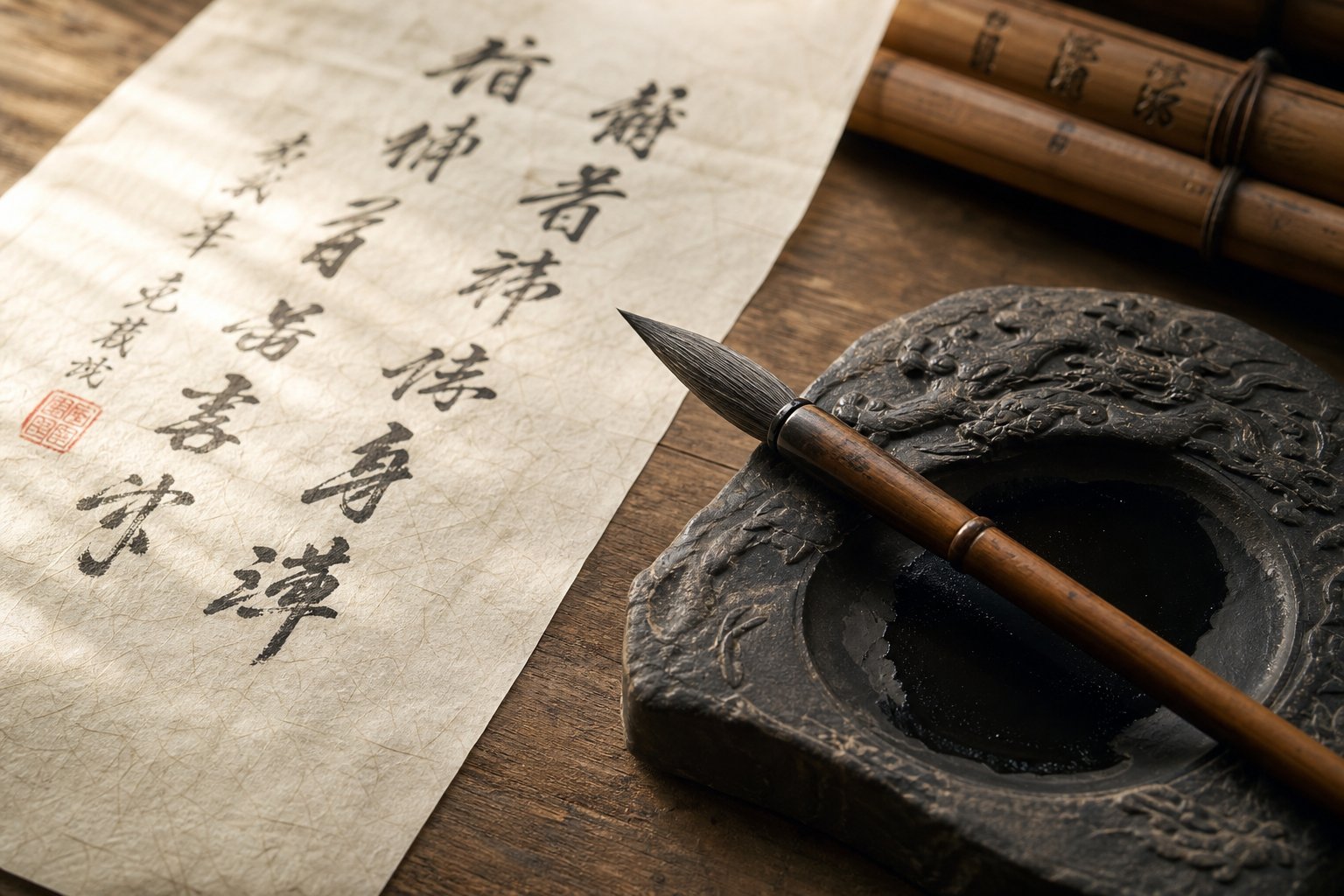
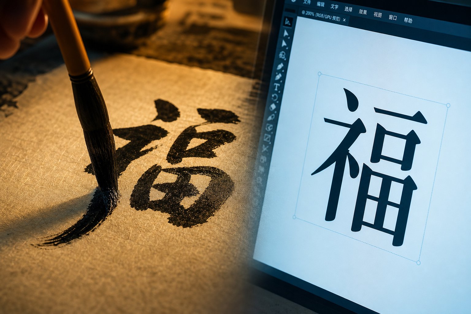
When you browse a font library and filter for Chinese text options, you will find hundreds of clean, uniform typefaces designed for body copy and user interfaces. Chinese calligraphy fonts are something different entirely. They digitize the aesthetic qualities of hand-brushed writing traditions that stretch back thousands of years, capturing the energy and imperfection of ink meeting paper in a format you can install and type with.
Think of it this way: a standard Chinese font is engineered for consistency. A Chinese calligraphy font is engineered for expression. The distinction matters because choosing the wrong category for a project can undermine the entire visual message, and designers make this mistake constantly.
What Makes a Font a Calligraphy Font
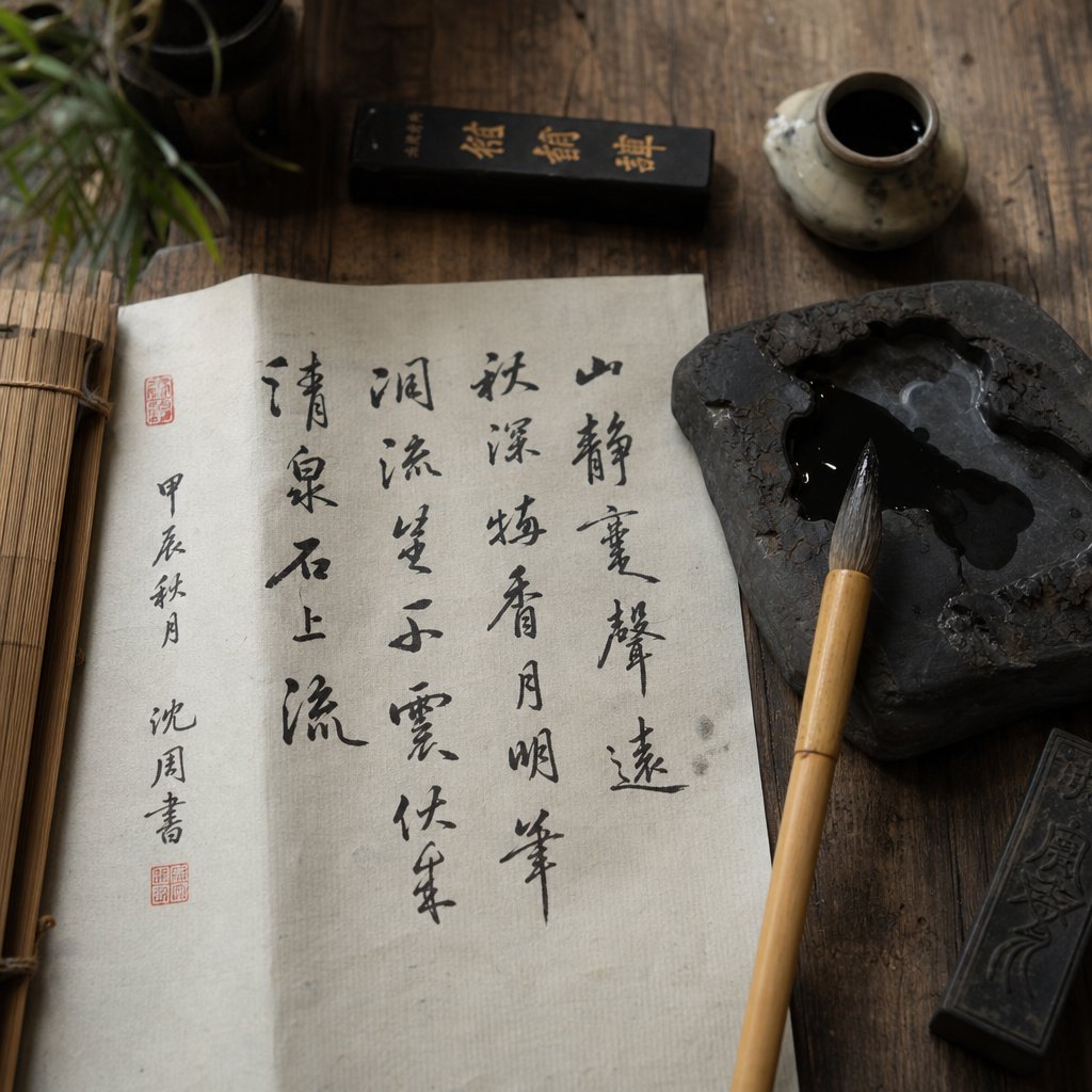
A few visual hallmarks separate a true calligraphy typeface from its mechanical counterparts. You will notice variable stroke width that mimics the pressure changes of a loaded brush, thicker on downstrokes and tapering at exits. Brush texture is often preserved, giving strokes a slightly rough or feathered edge rather than a mathematically smooth curve. Some fonts simulate ink bleed effects, where pigment spreads subtly into the surrounding space. Most importantly, there is an organic irregularity to the letterforms. Characters feel alive because no two strokes behave identically, just as they would not in real mandarin calligraphy written by hand.
These qualities stand in sharp contrast to the uniform stroke weight and mechanical precision found in standard digital typefaces. Creating a Chinese calligraphy font that preserves this handcrafted character across thousands of glyphs is an enormous undertaking. A complete Traditional Chinese typeface can require up to 14,000 characters and take two to five years to produce, with each glyph demanding meticulous attention to stroke balance and proportion.
Who Uses Chinese Calligraphy Fonts
The audience for these fonts is broader than you might expect:
- Graphic designers selecting display typefaces for headlines, posters, and brand identities that need cultural depth.
- Brand strategists building visual systems for products targeting Chinese-speaking markets.
- Tattoo seekers looking for an authentic mandarin calligraphy font style that reads correctly and carries the right aesthetic weight.
- Language learners studying stroke structure and wanting to see how traditional brush techniques translate into a Chinese font they can reference digitally.
- Cultural organizations producing materials that honor calligraphic heritage without commissioning original brushwork for every piece.
Chinese calligraphy fonts are where a 3,000-year-old art form meets modern design infrastructure, giving anyone with a keyboard access to visual traditions that once required years of brush training to produce.
This article covers the territory each of these audiences needs: the historical script styles behind modern fonts, how to distinguish calligraphy typefaces from standard Chinese character fonts, how to match a style to a specific project, and where to find quality options without falling into common traps. The differences between these categories are more consequential than most designers realize, and the next place to start is understanding the five historical scripts that gave rise to every digital calligraphy style available today.
The Five Historical Script Styles Behind Modern Fonts
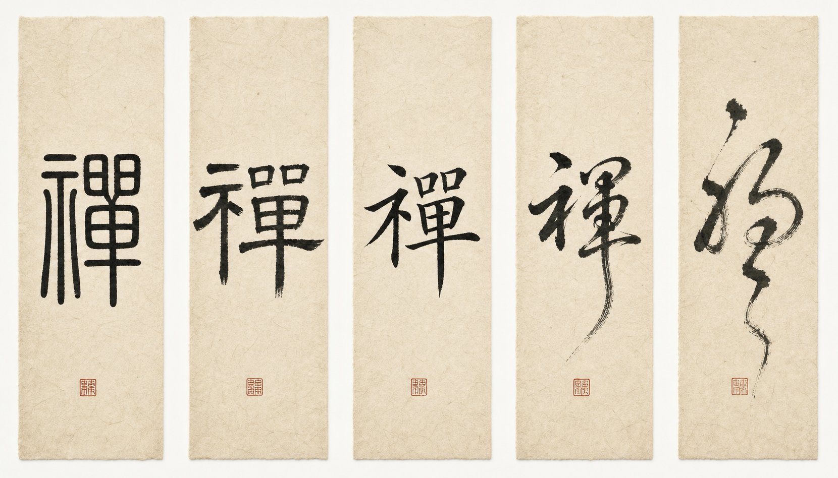
Every Chinese calligraphy font you encounter traces its DNA back to one of five historical chinese script styles. These are not arbitrary aesthetic categories. They represent distinct evolutionary stages of written Chinese, each developed under specific cultural pressures and each carrying its own visual logic. Understanding them is the difference between selecting a font that communicates exactly what you intend and accidentally choosing one that sends the wrong signal entirely.
The five core styles, known collectively as 五體 (wǔ tǐ), are Seal Script (篆書), Clerical Script (隸書), Regular Script (楷書), Running Script (行書), and Cursive Script (草書). They evolved roughly in that order over two millennia, though the last three developed in parallel. Each style handles calligraphy chinese characters differently in terms of stroke construction, speed of execution, and emotional register.
Seal and Clerical Scripts for Formal Contexts
Seal Script (篆書, zhuàn shū) is the oldest style still used in font design. It emerged during the Qin dynasty (221-206 BC) as an evolution from Oracle Bone Script and was carved into jade seals and bronze vessels for official authentication. Visually, you will recognize it by its thin, uniform-width strokes, strong left-to-right symmetry, and rounded forms that still resemble the pictographic origins of each character. There are no sharp corners. Characters tend to be taller than they are wide, with careful attention to the white space between strokes.
In modern font applications, Seal Script conveys antiquity, authority, and ceremonial weight. You will see it in corporate logos, official stamps, and luxury branding where the goal is to signal deep heritage. The tradeoff is legibility. Even native speakers often struggle to read Seal Script characters without context, which limits its use to display settings where recognition matters less than impression.
Clerical Script (隸書, lì shū) developed during the Han dynasty as government document volume exploded and scribes needed a faster, more practical writing system. Its most distinctive feature is the "silkworm head and wild goose tail" stroke, a horizontal line that begins with a rounded shape on the left and flares upward at the right end. Characters are flatter and wider than Seal Script, with clear horizontal emphasis and a wave-like rhythm to the strokes. The chinese character stroke order in Clerical Script introduced the modulated brush pressure techniques of lifting (提, tí) and pressing (按, àn) that would define all subsequent styles.
For designers, Clerical Script occupies a sweet spot between ancient gravitas and readable structure. It works well for headlines, certificates, and formal invitations where you want elegance without sacrificing comprehension.
Regular, Running, and Cursive Scripts Compared
The remaining three styles form a spectrum of speed and expressiveness. A famous quote from Song dynasty calligrapher Su Shi captures it perfectly: "Standard Script is like standing, Running Script is like walking, and Cursive Script is like running."
Regular Script (楷書, kǎi shū) reached its golden age during the Tang dynasty and remains the foundation of modern printed Chinese. Its strokes are executed separately, slowly, and with strict rules governing width and proportion. This makes it the clearest and easiest-to-read style, which is why it serves as the basis for mandarin stroke order instruction in schools and language-learning tools. When you see a standard textbook font, it is almost certainly derived from Regular Script.
Running Script (行書, xíng shū) relaxes those rules. Strokes connect slightly, execution speeds up, and characters gain a fluid quality while remaining recognizable. It is the most widely used handwriting style among native speakers today and translates into fonts that feel personal and approachable without sacrificing legibility. For brand identities that need warmth and human touch, Running Script fonts are often the strongest choice.
Cursive Script (草書, cǎo shū) pushes expression to its limit. Strokes merge into continuous brush movements, characters lose their angular structure, and the result resembles grass swaying in wind, which gives it the alternate name "Grass Script." Chinese cursive is the most emotionally charged of the five styles, prized for rhythm and personality. However, cursive chinese characters are notoriously difficult to read. Even native speakers require specialized training to decipher cursive mandarin text, and mandarin cursive fonts should be reserved for purely artistic or decorative contexts where legibility is not the priority.
| Script Style | Formality Level | Readability | Stroke Characteristics | Typical Modern Use Cases | Recognition Difficulty |
|---|---|---|---|---|---|
| Seal Script (篆書) | Very High | Low | Uniform width, curved, symmetrical, no sharp corners | Logos, official seals, luxury branding | High — even native speakers struggle |
| Clerical Script (隸書) | High | Moderate | Flat and wide, wave-like horizontals, modulated pressure | Headlines, certificates, formal invitations | Moderate |
| Regular Script (楷書) | Moderate-High | Very High | Separate strokes, square structure, strict proportions | Body text, textbooks, official documents, UI | Low — standard for literacy |
| Running Script (行書) | Moderate | High | Connected strokes, fluid movement, relaxed structure | Brand identities, personal stationery, signage | Low-Moderate |
| Cursive Script (草書) | Low | Very Low | Merged strokes, continuous movement, angular-free, rounded | Art prints, decorative display, expressive design | Very High — requires specialized knowledge |
This spectrum matters because font selection is really style selection. A designer who picks a Cursive Script font for a restaurant menu is making a fundamentally different communication choice than one who picks Regular Script, and the audience will respond accordingly. The style you choose determines not just how your text looks, but whether your audience can read it at all.
Of course, knowing which historical style a font references is only half the equation. The other half is understanding how these calligraphic styles differ from the standard digital typefaces that dominate everyday Chinese typography, a distinction that trips up even experienced designers working across scripts for the first time.
Chinese Calligraphy Fonts vs Standard Chinese Typefaces
Here is where most designers working with Chinese text for the first time get confused. They see a font labeled "Chinese" and assume it carries calligraphic character. In reality, the majority of chinese typefaces in any font library are standard utility families built for readability at small sizes, not for expressive display work. The difference between a standard chinese character font and a chinese calligraphy typeface is roughly the same as the difference between Helvetica and a hand-lettered script in the Latin world, except the cultural stakes are higher.
Standard typefaces prioritize uniform stroke weight, mechanical consistency, and predictable spacing across thousands of glyphs. A calligraphy font does the opposite. It preserves the organic pressure variation, brush texture, and rhythmic irregularity of real chinese font writing done by hand on paper.
Standard Typeface Categories Explained
Three families dominate everyday Chinese digital publishing, and none of them are calligraphic:
Song/Ming (宋体/明体) functions as the Chinese serif equivalent. Its defining features are thin, perfectly straight horizontal strokes, thicker verticals, and small decorative flourishes at stroke endpoints. These originated from woodblock printing during the Song Dynasty (960-1279 AD), where the horizontal grain of the wood made thin horizontals easy to carve while verticals needed extra thickness to resist breakage. SimSun and its successors have served as the default chinese language font in Windows systems for decades.
Hei/Gothic (黑体) is the sans-serif counterpart. Blocky, uniform stroke weight, no flourishes. Microsoft YaHei and Source Han Sans are the workhorses here, dominating UI design and screen-based reading. If you need a mandarin typeface for app interfaces or long-form digital content, Hei is almost always the right call.
Fangsong (仿宋体) sits between the two. It borrows Song's structure but tilts the horizontals slightly and softens the flourishes, creating a hybrid that reads as formal without feeling as rigid. Government documents and academic publishing lean on Fangsong heavily.
All three families share one trait: they suppress any trace of the human hand. That is by design. They exist to make fonts chinese characters render cleanly at body-text sizes across screens and print.
When Calligraphy Fonts Outperform Standard Typefaces
Standard typefaces excel at disappearing. Calligraphy fonts excel at commanding attention. The mistake is using one where the other belongs. A chinese handwriting font set as body copy in a mobile app will exhaust readers. A Hei font used as a brand logo for a traditional tea company will feel generic and culturally hollow.
Each category has clear territory:
- Standard typefaces work best for: body text in articles and books, UI elements and navigation, long-form digital reading, government and legal documents, any context where invisibility equals good design.
- Calligraphy fonts work best for: display headings and hero text, brand identities requiring cultural authenticity, premium packaging and label design, event invitations and ceremonial materials, artistic projects and editorial spreads, signage where visual impact outweighs reading speed.
Understanding this boundary is what separates intentional typographic choices from accidental ones. A designer who knows exactly why they are reaching for a chinese calligraphy typeface instead of a standard family will produce work that respects both the audience and the tradition behind the letterforms.
The distinction gets more nuanced once character sets enter the picture. A font might nail the calligraphic style perfectly but fail your project entirely because it only supports Simplified characters when your audience reads Traditional, or vice versa.
Simplified vs Traditional Characters in Font Selection
You found the perfect calligraphy font. The brush texture is gorgeous, the stroke rhythm feels authentic, and it matches your project's tone exactly. Then you type your client's copy and half the characters render as blank rectangles. What happened? You picked a font built for Simplified Chinese and fed it Traditional characters, or the reverse. This is one of the most common and most preventable failures in Chinese typography.
The split between Simplified and Traditional is not a stylistic preference. It is a structural divide. Simplified chinese writing symbols, introduced by mainland China in the 1950s and 1960s, reduce stroke counts to increase literacy rates. Traditional characters, retained in Taiwan, Hong Kong, and Macau, preserve the full historical complexity of each form. Many characters differ dramatically between the two sets. The word for "dragon" is 龙 in Simplified and 龍 in Traditional — same meaning, completely different glyph structure. A traditional chinese font will not contain the simplified form, and vice versa.
How Character Set Affects Glyph Coverage
When a font claims to "support Chinese," that label alone tells you almost nothing. The critical question is which encoding standard it covers. Mainland China enforces GB standards governing how Simplified Chinese characters should appear in fonts. A font built to the older GB2312 standard covers roughly 6,763 characters — enough for everyday Simplified text but missing rarer characters. The newer GB 18030 standard is far more comprehensive. On the Traditional side, Big5 encoding covers approximately 13,000 characters used in Taiwan and Hong Kong.
The problem intensifies with calligraphy fonts specifically. Because each glyph requires painstaking hand-crafted design to preserve brush authenticity, many calligraphic typefaces ship with limited coverage. A designer who does not verify glyph support before committing to a traditional chinese characters font risks discovering gaps mid-project when specific names, place references, or literary phrases fail to render.
How do you verify coverage? Open the font in a glyph viewer or type-testing tool and input your actual project text. Do not rely on preview samples alone. If you are working with chinese characters copy paste workflows — pulling text from client documents or translation files — test that exact content against the font before finalizing your layout. Many designers learn this lesson the hard way when a chinese writing copy and paste operation from a client brief produces blank squares in their carefully designed composition.
Choosing Fonts for Regional Audiences
Matching your font to your audience's geography is not optional. Readers immediately notice when characters appear in the wrong regional form, and the effect is similar to seeing British spellings in an American publication — except more jarring, because structural differences between Simplified and Traditional can make characters genuinely unrecognizable across systems.
- Mainland China, Singapore, Malaysia: Simplified Chinese (GB standard). Readers expect reduced stroke counts and standardized forms. Calligraphy fonts targeting this market should comply with GB encoding.
- Taiwan: Traditional Chinese following Taiwan's Standard Form of National Characters. Some stylistic details differ from Hong Kong conventions.
- Hong Kong and Macau: Traditional Chinese with regional glyph preferences that can differ subtly from Taiwanese forms. A traditional character set used in Taiwan may still look unusual to a reader in Hong Kong due to minor variant differences.
- International or pan-Chinese projects: Require fonts covering both Simplified and Traditional sets, or paired font files optimized for each region.
Some premium traditional chinese fonts solve this by shipping as paired packages — one SC (Simplified Chinese) file and one TC (Traditional Chinese) file, each optimized for its respective audience. This approach simplifies multilingual projects considerably, though it doubles your font management overhead. If your workflow involves chinese font copy and paste operations across regional versions of the same document, having matched SC and TC files from the same family ensures visual consistency even as the underlying character structures change.
The regional dimension adds a layer of complexity to font selection that goes beyond pure aesthetics. But once you have confirmed your character set coverage, the next decision is matching calligraphic style to project context — and that is where the real creative choices begin.
How to Choose the Right Calligraphy Font for Any Project
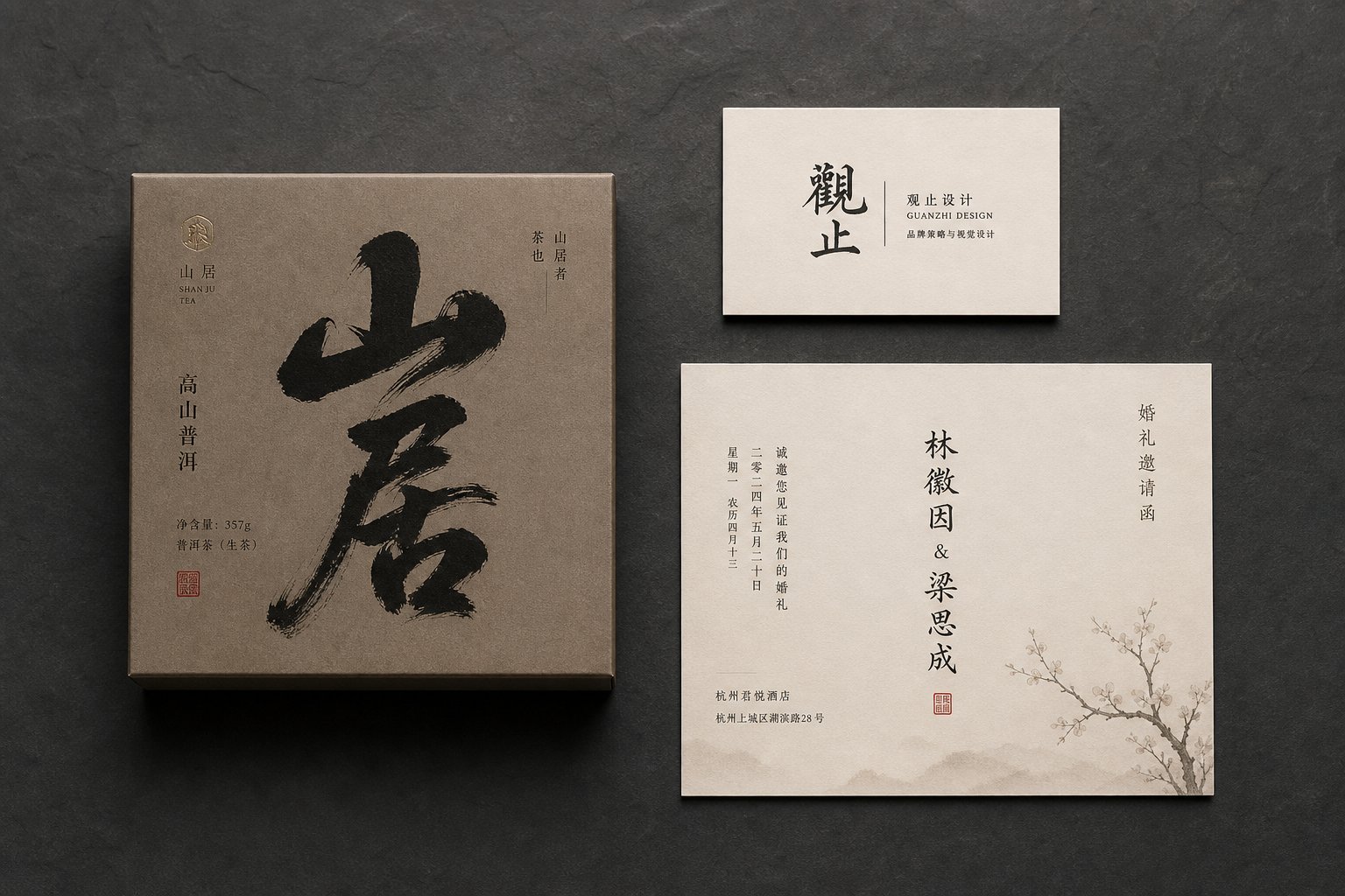
Knowing the five historical scripts and confirming your character set coverage gets you halfway there. The other half is matching a specific calligraphic style to the job it needs to do. A font that looks stunning on a tea packaging label can fail completely as a wedding invitation header, and a style that works for a luxury brand logo might be unreadable on a restaurant menu board. Context dictates everything.
The most reliable way to approach this decision is to start with your project's communication goal — formality, energy, legibility, cultural weight — and work backward to the script style that delivers it.
Calligraphy Fonts for Branding and Identity
Brand logos built around Chinese calligraphy need to balance two competing demands: cultural authenticity and instant recognition. Running Script (行書) hits this balance more consistently than any other style. Its strokes connect fluidly enough to feel handcrafted and personal, but characters retain enough structural clarity that viewers can read them at a glance, even at small sizes on business cards or app icons.
Stylized Regular Script works well too, particularly for brands that want to project stability and trustworthiness alongside cultural depth. Imagine a financial services firm or a heritage tea brand — the precision of Regular Script signals reliability while the brush texture signals tradition.
For brands targeting younger demographics or tech-forward markets, a minimalist chinese font approach strips calligraphic elements down to their essentials. You keep the variable stroke width and organic movement but reduce decorative flourishes, creating a chinese modern font aesthetic that feels contemporary without abandoning its roots. This approach has gained traction in lifestyle branding, where designers want cultural resonance without visual heaviness.
Selecting Fonts for Tattoos and Personal Use
Tattoo chinese writing is one of the most popular applications of Chinese calligraphy outside of professional design, and it is also where the most damaging mistakes happen. The stakes are permanent. A poorly chosen style or incorrect character can become a lifelong regret rather than a meaningful piece of body art.
The first rule: legibility at the intended size. As professional calligrapher Lan notes, choosing a generic computer font for a chinese sign tattoo is "basically the equivalent of tattooing your favorite quote in Times New Roman" — technically correct but emotionally hollow. Calligraphy tattoo fonts need to carry artistic weight while remaining structurally sound at skin scale.
Semi-Cursive (Running Script) is the safest recommendation for most brushstroke tattoo applications. It delivers expressive brush energy without sacrificing readability. Regular Script works for those who prioritize clarity and clean lines. Cursive Script looks dramatic in large format — a full back piece or ribcage panel — but becomes an illegible smear at wrist or ankle sizes.
Critical pitfalls to avoid with chinese words tattoo projects:
- Never rely on machine translation for character selection. Chinese is deeply contextual, and one English word can map to multiple Chinese meanings.
- Avoid mirrored or flipped characters — a common disaster when tattoo artists unfamiliar with Chinese stencil reversed images.
- Verify that the chinese brush font or calligraphy style you select does not distort stroke structure in ways that make characters incorrect or unreadable to native speakers.
Editorial and Packaging Applications
Packaging and editorial design offer more room to push into expressive territory because the surrounding layout provides context that aids recognition. Seal Script, nearly unusable for body text, becomes a powerful asset on premium packaging — think high-end spirits, luxury skincare, or artisanal food products. Its ancient, symmetrical forms signal heritage and exclusivity without needing to be "read" in the traditional sense. The characters function as visual seals of authenticity.
Clerical Script occupies similar territory for certificates, book covers, and editorial mastheads where structured elegance matters. Its distinctive horizontal wave strokes add visual rhythm to headlines without the legibility concerns of Seal Script.
For food and beverage branding — restaurants, tea shops, snack packaging — brush-style Running Script and energetic semi-cursive fonts create movement and appetite appeal. The visible brush energy suggests handmade quality and artisanal care, which is exactly the association these brands want to trigger.
Here is how the style recommendations rank by use case:
- Brand logos (legibility-first): Running Script or stylized Regular Script
- Premium packaging and luxury goods: Seal Script or Clerical Script
- Food and beverage branding: Brush-style Running Script
- Wedding invitations and formal events: Clerical Script or refined Regular Script
- Tattoos and personal expression: Semi-Cursive (Running Script) for most sizes; Cursive only for large-format pieces
- Digital marketing and social media: Minimalist calligraphic styles with clean edges for screen rendering
- Editorial headlines and book design: Clerical Script for gravitas; Running Script for warmth
Each of these recommendations assumes you have already verified character set compatibility with your target audience. Style and coverage work together — a gorgeous Seal Script font that only supports Simplified characters will not serve a Taiwanese luxury brand, no matter how visually appropriate the style might be.
Selecting the right style for your context is the creative decision. Making it work technically — managing file sizes, optimizing web performance, and navigating format compatibility — is the engineering challenge that comes next.
Technical Considerations for Chinese Calligraphy Fonts
You have picked the perfect calligraphic style, confirmed your character set, and matched the aesthetic to your project's goals. Then you try to load the font on a webpage and watch your performance metrics collapse. Chinese calligraphy fonts carry technical baggage that Latin typefaces simply do not, and ignoring it will wreck your implementation no matter how beautiful the design looks in a static mockup.
The core issue is scale. A typical Latin font contains a few hundred glyphs. A Chinese font supporting the GB2312 standard contains roughly 6,763 characters. A comprehensive font covering GB 18030 or Unicode CJK Unified Ideographs can exceed 70,000 glyphs. Each of those glyphs in a calligraphy font carries complex brush-texture outlines with far more vector points than a mechanically drawn standard typeface. The result? A single weight of a Chinese calligraphy font routinely lands between 10 and 30 MB uncompressed. Load two weights and you are asking visitors to download more data than most entire websites.
File Size and Web Performance Challenges
For print and desktop chinese font design work, large file sizes are manageable — you install the font locally and move on. Web projects are a different story. Shipping a 15 MB font file to every visitor is not viable. It blocks rendering, tanks Core Web Vitals, and drives bounce rates up on mobile connections.
Two strategies solve this:
- Subsetting: Strip the font down to only the characters your page actually uses. Tools like fonttools (pyftsubset) and Glyphhanger analyze your content and generate a subset containing just the needed glyphs. A homepage with 200 unique Chinese characters might produce a subset under 500 KB — a fraction of the full file.
- Dynamic font loading: Services like Google Fonts handle Chinese fonts by splitting them into dozens of small subsets organized by
unicode-range. The browser only downloads the slices containing characters present on the page. If you search for Google Fonts for Chinese options, you will find families like Noto Serif SC and ZCOOL XiaoWei that use this slice-loading approach automatically. For designers working in Google Docs, chinese Google Fonts available through the editor offer a limited but functional selection with built-in optimization — no manual subsetting required.
The tradeoff with subsetting is flexibility. A statically subset font cannot display characters you did not anticipate. For content-managed sites where editors might input any character, dynamic unicode-range splitting is the safer path. For fixed-content projects like landing pages or packaging mockups rendered to web, aggressive subsetting delivers the best performance.
Compatibility and Format Considerations
Font format choice determines where and how your calligraphy font performs. As web performance research confirms, WOFF2 is the modern default for web delivery — it applies Brotli compression to reduce file sizes significantly compared to raw TTF or OTF. For chinese font design workflows in desktop applications like Adobe Illustrator, Photoshop, or Figma, OTF and TTF remain the standard installation formats.
One complication specific to calligraphy fonts: complex brush-texture outlines with high point counts can render differently across applications. A stroke that looks beautifully textured in InDesign might appear slightly smoothed in Figma or lose fine detail when rasterized at screen resolution. Always test your chosen font in the actual production environment before committing to a layout.
| Format | File Size Efficiency | Browser Support | Best Use Context | OpenType Feature Support |
|---|---|---|---|---|
| OTF (.otf) | Moderate — uncompressed | Not recommended for web | Desktop design, print production | Full |
| TTF (.ttf) | Moderate — uncompressed | Supported but inefficient | Desktop apps, legacy systems | Partial to Full |
| WOFF (.woff) | Good — gzip compression | Universal (legacy fallback) | Web fallback for older browsers | Full |
| WOFF2 (.woff2) | Best — Brotli compression | All modern browsers | Primary web format | Full |
For nearly every web project, WOFF2 is all you need. As font format guides note, serving older formats alongside WOFF2 just makes every visitor pay a performance tax for browsers nobody uses anymore. The exception is enterprise environments locked to legacy systems — and even there, WOFF as a single fallback covers the gap.
A practical note on Google Fonts: while the calligraphy Google Fonts selection remains limited compared to commercial foundries, the platform handles the hardest technical problems — subsetting, format delivery, and caching — automatically. For projects where a google font中文 option meets your aesthetic needs, it eliminates the entire performance optimization workflow. The tradeoff is creative range. Commercial foundries offer far more expressive and authentic calligraphic styles, but you inherit the full technical burden of serving them efficiently.
Licensing adds one more layer. Some foundries prohibit subsetting or format conversion in their terms, which can make web optimization legally impossible without negotiating custom terms. Always verify that your license permits the modifications your delivery strategy requires before you start slicing a font into subsets.
These technical realities shape what is possible in production. But for designers who need calligraphic output without committing to a full font license or installation workflow, digital generation tools offer a different path entirely.
Generating Chinese Calligraphy Digitally
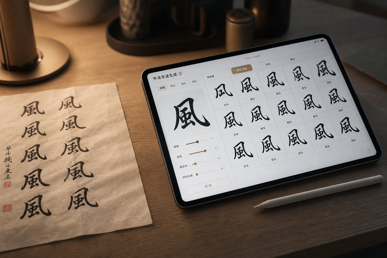
Not every project requires a licensed font file. Sometimes you need a quick preview of how a phrase looks in Cursive Script, a reference image for a tattoo consultation, or a one-off piece of calligraphic lettering for a social media graphic. This is where digital generation tools come in — platforms that let you type characters and receive calligraphic output without picking up a brush or installing anything.
A chinese calligraphy generator typically works in one of two ways. Traditional generators rely on pre-rendered stroke databases: a calligrapher writes every character in a given style, those samples are stored as images or vector paths, and the system assembles them on demand when you type input. Newer tools use AI-trained models that analyze stylistic patterns from sample characters and synthesize new glyphs by applying learned brush dynamics, stroke weight variation, and compositional rules across the full character set. The AI approach is gaining ground rapidly — platforms leveraging deep learning can extrapolate an entire typographic style from as few as eight to fifty handwritten samples.
Online Calligraphy Generators and Their Limitations
A chinese writing generator serves several legitimate purposes. Designers use them to compare how a brand name looks across Running, Clerical, and Seal Script before committing to a font purchase. Language learners study stroke aesthetics and brush rhythm by generating characters in historical styles they cannot yet produce by hand. Tattoo seekers create reference images to bring to their artist, previewing how specific characters render in different calligraphic traditions.
The limitations are real, though. Most font generator chinese tools output raster images (PNG or JPG), not installable font files. That means you get a visual reference, not a production-ready asset. The generated characters cannot be scaled infinitely, edited as live text, or reflowed in a layout. Consistency across a full document is difficult to maintain because each generation call may produce slightly different stroke weights or spacing. And character accuracy varies — general-purpose AI image generators still struggle with structurally correct Chinese characters, sometimes producing plausible-looking but fundamentally wrong stroke arrangements that a native reader would immediately flag.
For quick previews, mood boards, and conceptual exploration, these tools save hours. For production design work — packaging, brand systems, editorial layouts — they cannot replace a professionally crafted font file with verified glyph accuracy and consistent metrics across thousands of characters.
Creating Custom Calligraphy Fonts
What if you want your own handwriting or a specific calligrapher's brushwork turned into a usable digital font? This is where chinese calligraphy maker workflows come in, and the process is more accessible than it used to be — though still demanding for Chinese specifically.
The fundamental challenge is volume. A Latin handwriting font needs roughly 200-300 glyphs to be functional. A Chinese font needs thousands. Creating a full-coverage calligraphic typeface by hand remains a monumental undertaking, often requiring years of work. Tools like Zitijia AI (字体家) have shortened this dramatically by asking users to write a subset of characters — sometimes as few as fifty — and using AI to generate the remaining glyphs in a matching style, outputting an installable TTF file.
For most independent creators, the practical approach is building a subset font: a limited character set covering only the specific text your project requires. Here is the workflow from writing samples to final font file:
- Write your source characters. Use quality paper and a brush or brush pen. Write each character in a consistent style within a grid template. For AI-assisted tools, you may only need 8-50 characters; for manual digitization, you need every character your project will use.
- Scan or photograph at high resolution. 600 DPI minimum for print-quality output. Ensure even lighting and high contrast between ink and paper.
- Vectorize each glyph. Use auto-trace tools in software like Adobe Illustrator, FontForge, or Glyphs to convert raster scans into clean vector outlines. Clean up stray points and smooth curves while preserving brush texture.
- Assign glyphs to Unicode code points. Map each vectorized character to its correct Unicode position so the font renders properly when typed.
- Set metrics and spacing. Define character widths (typically uniform for Chinese), sidebearings, and vertical alignment. Chinese characters generally sit within a square em-box, simplifying this step compared to Latin fonts.
- Export and test. Generate TTF or OTF files and test across target applications. Verify that stroke details survive rasterization at intended display sizes.
The AI-assisted path collapses steps three through five into an automated pipeline, which is why tools that generate chinese calligraphy from minimal input samples have become popular among designers who need custom lettering without a multi-year production timeline. The tradeoff is control — AI-generated glyphs may not perfectly match the nuance of every hand-drawn character, and quality review remains essential before using the output in professional contexts.
Whether you generate calligraphy digitally for reference or create chinese calligraphy as a full custom font, these tools solve a specific problem: getting calligraphic output quickly. They do not solve the design challenge of making that output work alongside other typefaces in a real layout — particularly when your project requires Chinese and Latin text to coexist harmoniously on the same page.
Pairing Chinese Calligraphy Fonts with Latin Typefaces
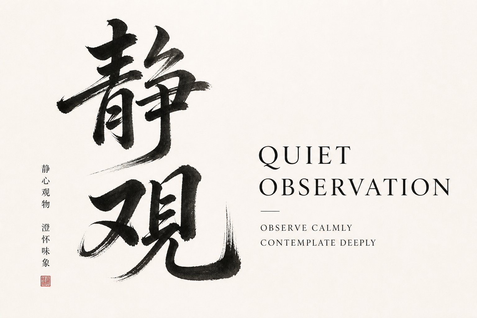
Bilingual layouts are where most cross-script typography falls apart. You have a beautiful calligraphic chinese lettering font for your headline, and right next to it sits an English tagline in whatever sans-serif was already in the brand kit. The two scripts look like strangers sharing a bus seat — technically occupying the same space but clearly not together. Pairing a chinese letter font with a Latin companion is a genuine design challenge, and most resources skip it entirely because the rules are not obvious.
The difficulty is structural. Chinese characters are monospaced and fill a square em-box uniformly. Latin letters are proportional, with varying widths and a baseline-plus-ascender-descender system that has no direct equivalent in Chinese. When you set both scripts at the same point size, the Latin text tends to appear too small because CJK characters maximize the em-square while Latin letters leave significant vertical space unused. Getting these two systems to feel visually unified requires deliberate decisions about weight, rhythm, and proportion.
Principles of Cross-Script Font Pairing
The core principle is shared visual DNA. You are not looking for fonts that look identical — that is impossible across scripts — but fonts that share underlying qualities like stroke contrast, overall texture, and emotional register.
Brush-style Chinese calligraphy fonts carry visible stroke modulation: thick-to-thin transitions, organic curves, and a sense of hand movement. Their natural Latin companions are humanist serif or calligraphic faces that share those same qualities. Think of pairing a Running Script mandarin font with a Latin typeface like Garamond, Minion, or a calligraphic italic — the stroke logic rhymes even though the scripts differ completely.
More geometric or structured Chinese styles — a clean Regular Script or a modernized Clerical face — pair better with rational Latin typefaces. A condensed grotesque sans-serif alongside bold calligraphic Chinese characters is actually a signature pairing in Hong Kong's visual culture, where energetic brushwork meets tight, functional Latin type on street signage and restaurant branding. The contrast is intentional: one script leads, the other supports.
This complementary approach — where the Chinese calligraphy commands attention while the Latin text plays a quieter role — often works better than forcing both scripts into the same visual register. When both compete for expressiveness, neither stands out. A calligraphy chinese alphabet headline paired with a restrained Latin subtitle creates hierarchy naturally.
Practical Pairing Recommendations
Beyond stylistic matching, the mechanical details of sizing and alignment determine whether your pairing actually works in layout. Here are actionable guidelines:
- Scale Latin text up 10-20% relative to the Chinese when both appear at the same nominal point size. Chinese characters fill their em-box edge to edge, while Latin letters sit smaller within theirs. Without this adjustment, English text looks undersized next to Chinese.
- Match optical weight, not numerical weight. A Regular weight Chinese font often appears heavier than a Regular weight Latin font because CJK characters have more strokes packed into the same space, increasing visual density. You may need to drop the Latin companion down a weight — or choose a slightly lighter Chinese variant — to achieve balance.
- Align to the optical center, not the baseline. Chinese characters align along their vertical center rather than sitting on a baseline. When mixing scripts inline, adjust vertical positioning so the Chinese characters appear centered relative to the Latin x-height rather than sitting awkwardly high or low.
- Evaluate rhythm and spacing together. Chinese fonts are monospaced; Latin fonts are proportional. Side by side, this creates different text textures. Tightening Latin tracking slightly or choosing a more evenly-spaced Latin face can reduce the visual friction between the two systems.
- Test at actual production sizes. A pairing that looks harmonious in a large mockup can break down at body-text sizes where brush details in the Chinese font compress and the Latin companion's proportions shift.
One shortcut worth knowing: modern Chinese font families increasingly ship with matched Latin character sets designed specifically to harmonize with the Chinese glyphs. These chinese fonts in english eliminate the pairing problem entirely — the foundry has already solved the weight, proportion, and rhythm relationships for you. If your project uses a premium calligraphic family that includes Latin glyphs, use them. The built-in coordination will outperform any manual pairing attempt in most cases.
For designers working with alphabet in chinese characters alongside English text — bilingual packaging, international brand systems, or educational materials showing calligraphy alphabet chinese forms next to romanized pinyin — these pairing principles are not optional refinements. They are the difference between a layout that feels professionally integrated and one that looks like two unrelated designs collided on the same page.
Pairing is the craft of making different scripts coexist. But before you can pair anything, you need to find fonts worth pairing — and the landscape of free versus commercial Chinese calligraphy options comes with its own set of traps and tradeoffs.
Where to Find Quality Chinese Calligraphy Fonts
The pairing is planned, the style is chosen, and the character set is confirmed. The remaining question is deceptively simple: where do you actually get a good font? The answer depends on what "good" means for your specific project — and the gap between a mediocre free download and a professionally crafted commercial typeface is wider in Chinese typography than in almost any other script.
Why? Because quality in a Chinese font is not just about how one character looks. It is about how thousands of characters maintain consistent stroke fidelity, spacing, and brush texture across an entire glyph set. A font that looks beautiful in a three-character preview can fall apart the moment you type a full paragraph. Knowing how to evaluate before you commit saves projects from typographic disasters that only surface at the worst possible moment.
Evaluating Font Quality Before Downloading
When you find a chinese font free download that looks promising, resist the urge to install it immediately. Run it through a few diagnostic checks first. You are looking for consistency across the full character set, not just the handful of showcase glyphs the designer chose to display.
Red flags that signal a low-quality font:
- Missing common characters. Type full sentences from your actual project content. If characters render as blank rectangles or fall back to a system font, coverage is incomplete. This is the single most common problem with free fonts for chinese calligraphy — they ship with partial glyph sets that cover demo text but fail in production.
- Inconsistent stroke weight. Compare characters with similar radical components. In a well-designed calligraphy font, the brush pressure logic should feel unified. If some characters look like they were drawn by a different hand — heavier, lighter, or with different texture — the font was likely assembled from multiple sources without harmonization.
- Poor spacing and metrics. Set a block of text and look at the overall texture. Chinese characters should sit within uniform em-boxes with consistent sidebearings. Uneven spacing creates a jittery, amateurish appearance that undermines the calligraphic elegance you are trying to achieve.
- Broken or missing punctuation. Chinese uses distinct punctuation marks (full-width periods, commas, quotation marks) positioned differently from their Latin equivalents. Many free fonts neglect these entirely or position them incorrectly.
- Licensing ambiguity. A font labeled "free" without clear license terms is a liability. Some free mandarin font options permit personal use only, prohibit commercial application, or restrict modification — including the subsetting required for web delivery. If you cannot find explicit licensing documentation, treat the font as unusable for client work.
The best chinese font for any project is one that passes all five checks against your actual content, not one that merely looks attractive in a curated specimen sheet.
Free vs Commercial Chinese Calligraphy Fonts
Free options have improved dramatically. Google Fonts now offers a growing selection of Chinese typefaces with open-source licenses, including calligraphic and handwriting styles like LXGW WenKai TC and Iansui — both based on the Klee calligraphic style with strong Traditional Chinese coverage. Community-driven projects have expanded character sets for popular display fonts, and some foundries release limited-weight versions of commercial families as promotional tools.
Still, the tradeoffs are real. A china font free download typically gives you one weight, limited style variety, and character coverage that may not extend beyond common-use sets. If your project requires rare characters, multiple weights for typographic hierarchy, or guaranteed commercial licensing with clear indemnification, free options often fall short.
Commercial foundries like justfont, DynaComware, and Arphic (iFontCloud) offer calligraphic families with full glyph coverage — often exceeding 13,000 characters for Traditional Chinese — multiple weights, matched Latin companions, and licensing terms that explicitly cover commercial use. Perpetual licenses from foundries like justfont range from approximately USD $100 to $500 per font, while subscription services like iFontCloud provide access to hundreds of fonts starting around USD $145 per year. For a mandarin font free download alternative, these costs may seem steep — but consider that a complete Traditional Chinese typeface can take two to five years to produce, with production costs reaching six figures.
| Criteria | Free / Open-Source Fonts | Commercial Fonts |
|---|---|---|
| Typical Glyph Count | 3,000-7,000 characters (varies widely) | 7,000-14,000+ characters (full coverage) |
| License Type | OFL, Apache, or unclear/restrictive | Perpetual buyout or annual subscription with explicit commercial terms |
| Style Variety | Limited — usually one weight, one style | Multiple weights, matched SC/TC versions, Latin companions |
| Quality Consistency | Variable — ranges from excellent (Google Fonts curated) to poor (unvetted uploads) | High — professional QA across full character set |
| Calligraphic Authenticity | Often simplified or AI-generated brush effects | Frequently based on master calligrapher source material |
| Support and Updates | Community-driven, no guarantees | Foundry-backed updates, bug fixes, expanded coverage |
The decision is not binary. Many designers use free fonts for exploration and prototyping, then invest in commercial licenses for final production. A chinese typeface download from Google Fonts works perfectly for a personal blog or internal presentation. A brand identity destined for packaging across multiple markets demands the coverage, consistency, and legal clarity that only a commercial family provides.
Wherever you source your fonts, the evaluation criteria remain the same: verify glyph completeness against your actual content, confirm stroke fidelity across the full character set, check spacing consistency in real layouts, and read the license before you ship anything. The best chinese fonts are not necessarily the most expensive or the most popular — they are the ones that match your project's style to its context, cover every character your audience needs, and respect the cultural weight that thousands of years of calligraphic tradition have embedded in every brushstroke.
Frequently Asked Questions About Chinese Calligraphy Fonts
1. What is the difference between Chinese calligraphy fonts and standard Chinese typefaces?
Standard Chinese typefaces like Song (serif) and Hei (sans-serif) prioritize uniform stroke weight and mechanical consistency for body text readability. Chinese calligraphy fonts preserve the organic qualities of hand-brushed writing, including variable stroke width from brush pressure, ink bleed texture, and natural irregularity. Standard typefaces are designed to disappear into content, while calligraphy fonts command visual attention and carry cultural weight, making them ideal for display headings, brand logos, and packaging rather than long-form reading.
2. How do I know if a Chinese calligraphy font supports Simplified or Traditional characters?
Check the font's encoding standard rather than relying on labels alone. Fonts built to GB2312 or GB 18030 standards support Simplified Chinese used in mainland China, Singapore, and Malaysia. Fonts using Big5 encoding cover Traditional Chinese for Taiwan, Hong Kong, and Macau. The most reliable method is typing your actual project text into a glyph viewer or font testing tool. If characters appear as blank rectangles, the font lacks coverage for that character set. Premium calligraphic families often ship paired SC and TC files for both systems.
3. Why are Chinese font files so much larger than English fonts?
A Latin font typically contains a few hundred glyphs, while a Chinese font supporting basic Simplified coverage (GB2312) requires roughly 6,763 characters. Comprehensive Unicode CJK fonts can exceed 70,000 glyphs. Calligraphy fonts compound this because each glyph carries complex brush-texture vector outlines with far more control points than mechanically drawn typefaces. A single weight often lands between 10 and 30 MB uncompressed. For web use, subsetting tools or dynamic unicode-range loading through services like Google Fonts can reduce delivered file sizes dramatically.
4. Which Chinese calligraphy script style is best for tattoos?
Running Script (semi-cursive) is the safest choice for most tattoo applications. It delivers expressive brush energy and artistic character while remaining structurally readable at skin scale. Regular Script works for those prioritizing clean legibility. Avoid full Cursive Script for small tattoos as it becomes an illegible smear at wrist or ankle sizes, though it can work for large-format pieces. Always verify character accuracy with a native speaker, avoid machine translation, and confirm the font does not distort stroke structure in ways that make characters incorrect.
5. Can I pair Chinese calligraphy fonts with English typefaces in bilingual designs?
Yes, but it requires deliberate adjustments. Match visual DNA rather than forcing identical aesthetics: brush-style Chinese fonts pair naturally with humanist serifs or calligraphic Latin faces like Garamond, while geometric Chinese styles work with modern sans-serifs. Scale Latin text up 10-20% since Chinese characters fill their em-box edge to edge while Latin letters sit smaller. Match optical weight rather than numerical weight, as Chinese characters appear heavier due to stroke density. Many modern Chinese font families now include matched Latin character sets that eliminate these pairing challenges entirely.