Two Ancient Traditions With One Shared Ancestor
Imagine picking up the same brush, dipping it in the same ink, and producing art that carries an entirely different soul. That's the reality when you compare Chinese vs Japanese calligraphy. These two forms of asian calligraphy art share a common ancestor stretching back over 3,000 years, yet they've grown into distinct traditions with their own philosophies, techniques, and definitions of beauty.
Why This Comparison Matters for Art Lovers and Learners
Whether you're drawn to mandarin calligraphy for its monumental precision or japanese calligraphy for its flowing elegance, understanding the differences helps you appreciate what you're seeing and choose the right path if you want to learn. The gap between chinese vs japanese writing goes far deeper than visual style. It touches on how each culture defines mastery, what role empty space plays on the page, and even how a calligrapher holds and moves the brush.
This guide breaks down 7 key differences: script systems, tools and materials, stroke technique, philosophical foundations, spatial composition, cultural role, and learning progression. Each reveals how a shared origin produced two living art forms with very different heartbeats.
A Shared Origin With Distinct Paths
Chinese calligraphy dates back to oracle bone inscriptions of the Shang Dynasty, making it one of the oldest continuous art traditions on earth. When cultural exchange brought writing to Japan around the 5th and 6th centuries, largely through Buddhist monks copying sutras, the Japanese initially followed Chinese styles closely. But because the Japanese language differs fundamentally from Chinese, new writing systems emerged. Hiragana and katakana gave writers tools to express Japanese sounds, and over centuries, a distinct tradition called shodo took shape.
Chinese calligraphy (shufa 書法) means "the method of writing." Japanese calligraphy (shodo 書道) means "the way of writing." One prizes method and structure; the other prizes the path and spiritual journey. This single linguistic distinction shapes everything from stroke execution to what "beautiful" means in each tradition.
The difference between chinese vs japanese characters isn't just about simplified versus traditional forms. It's about two cultures taking the same raw material, the brush and the ideograph, and building entirely different artistic worlds around them. What follows is a close look at exactly how those worlds diverge.
How We Evaluated Each Tradition
Comparing chinese and japanese writing traditions fairly requires more than placing two brushstrokes side by side. These are living art forms with centuries of scholarship behind them, so a casual glance won't reveal the difference chinese vs japanese writing carries beneath the surface. You need a structured lens.
Criteria for Comparing Two Living Art Forms
Our analysis draws from traditional teaching frameworks used in both countries: the classical curriculum of Chinese shufa academies and the dan/kyu progression system of Japanese shodo schools. We also address a question many learners ask early on: how to tell the difference between chinese and japanese writing when both use the same characters. The answer, it turns out, touches every criterion below.
Here are the seven dimensions we use throughout this comparison:
- Script systems and available writing styles
- Tools and materials, from brush construction to paper absorbency
- Stroke technique, including pressure, speed, and flow
- Philosophical foundations that define what mastery means
- Spatial composition and the role of empty space
- Cultural role in education, ceremony, and modern life
- Learning progression and how skill is measured
How We Structured This Analysis
Each section ahead gives equal depth to both traditions rather than filtering one through the other's standards. When you want to know how to tell difference between japanese and chinese writing, the real answer lives in all seven layers working together, not in any single visual cue. A shared kanji character can look nearly identical on paper yet carry different stroke orders, different simplification histories, and different aesthetic intentions depending on which tradition shaped it.
With these criteria in place, the first and most visible layer of distinction comes into focus: the scripts themselves.
Script Systems and Writing Styles Compared
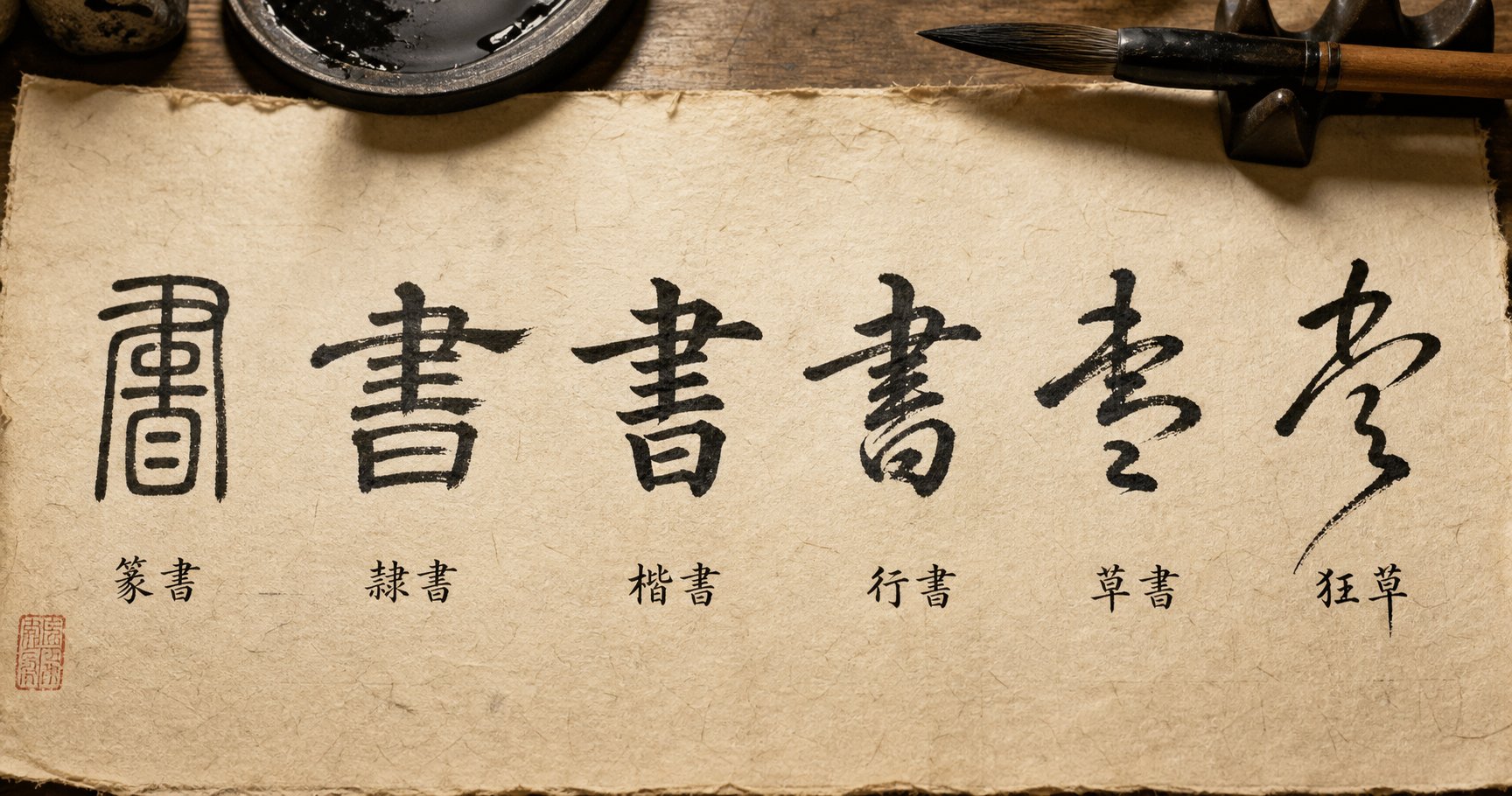
Here's where the difference between chinese and japanese script becomes immediately visible. Both traditions use brush and ink to form characters, but the range of scripts available to each calligrapher, and how those scripts function within the writing system, diverges sharply. Think of it this way: a Chinese calligrapher works within one character set expressed through five historical styles, while a Japanese calligrapher navigates three entirely separate writing systems, each with its own aesthetic personality.
Five Scripts of Chinese Calligraphy From Seal to Cursive
Chinese calligraphy organizes its history into five major script styles, each representing a stage in the evolution from ancient formality to expressive freedom. According to Eastern Stillness, the progression moves in one direction: structure to efficiency to expression.
- Seal Script (Zhuanshu 篆书) - The oldest standardized form. Strokes are even in thickness, rounded, and symmetrical, almost as if carved into stone. You'll still see it on personal name stamps and official seals today.
- Clerical Script (Lishu 隶书) - A turning point that made characters flatter, wider, and more readable. Its signature feature is the wave-like ending on horizontal strokes, giving each character a grounded, authoritative presence.
- Regular Script (Kaishu 楷书) - The foundation for all beginners. Clear, balanced, and disciplined, Kaishu teaches structure and control. It's the style you see in printed books and formal documents.
- Running Script (Xingshu 行书) - Where structure meets flow. Strokes partially connect, the brush moves faster, and characters remain readable while gaining a natural, smooth rhythm.
- Cursive Script (Caoshu 草书) - The peak of expression. Fast, abstract, and emotional, Caoshu merges and simplifies strokes to the point where only trained readers can decipher it. This is calligraphy as pure art.
Each style builds on the one before it. A calligrapher who skips Kaishu and jumps to Caoshu ends up with messy writing rather than expressive writing, because the underlying structure never took root.
Three Writing Systems in Japanese Shodo
Japanese calligraphy faces a unique challenge: the Japanese language uses three distinct writing systems, and a skilled calligrapher must handle all of them. As noted by Calligraphy Tokyo, Japanese shodo encompasses five script styles (Tensho, Reisho, Kaisho, Gyosho, and Sosho) that parallel the Chinese five, but it also incorporates hiragana and katakana, two phonetic syllabaries that have no Chinese equivalent.
Kanji, the borrowed Chinese characters, follow the same five-style progression. But hiragana, with its soft, curving strokes derived from simplified cursive kanji, introduces an entirely different aesthetic. Kana calligraphy prizes flowing connections between characters, delicate line variation, and a lyrical rhythm that feels closer to music than architecture. Katakana, more angular and compact, serves a different visual role again.
This means a Japanese calligrapher's toolkit is broader in one sense: they move between logographic and phonetic systems within a single piece. A poem might combine kanji written in bold Kaisho with hiragana trailing in graceful, connected curves, creating a visual contrast that Chinese calligraphy simply doesn't produce.
Same Character Different Treatment
When you look at japanese vs chinese characters that share the same origin, you'll notice they aren't always identical on paper. Three factors create the gap between chinese kanji vs japanese kanji:
Simplification divergence. Both China and Japan simplified their traditional characters, but they did so independently and differently. Pandanese illustrates this clearly: the traditional character 圖 (drawing) became 图 in simplified Chinese but 図 in Japanese shinjitai. The traditional 鐵 (iron) became 铁 in China and 鉄 in Japan. Most of the time, the Japanese simplified version retains more strokes than its Chinese counterpart.
Stroke order variations. Even when japanese vs chinese letters look identical in their final form, the order in which strokes are executed can differ. These differences affect the internal rhythm of writing and, in running or cursive styles, change how strokes connect and flow into each other.
Aesthetic treatment. Chinese calligraphers tend to treat each kanji as a self-contained unit with internal balance. Japanese calligraphers, especially when mixing kanji with kana, often adjust the weight and size of kanji to harmonize with the lighter hiragana surrounding them. The same character gets a different visual treatment depending on its context within the writing system.
When comparing japanese kanji vs chinese in a calligraphic context, these differences compound. A character that looks nearly identical in printed form can feel entirely different when brushed by a Chinese versus Japanese calligrapher, because simplification history, stroke habits, and compositional context all leave their mark.
| Chinese Style | Japanese Equivalent | Visual Characteristics | Typical Use |
|---|---|---|---|
| Seal Script (Zhuanshu) | Tensho | Even stroke width, rounded, symmetrical, archaic appearance | Seals, stamps, formal artwork |
| Clerical Script (Lishu) | Reisho | Flat, wide characters with bold horizontal strokes and wave-like endings | Plaques, signs, official inscriptions |
| Regular Script (Kaishu) | Kaisho | Clear, squared strokes with defined start and end points | Formal documents, beginner practice, printed text |
| Running Script (Xingshu) | Gyosho | Partially connected strokes, fluid movement, still readable | Personal letters, poetry, everyday writing |
| Cursive Script (Caoshu) | Sosho | Highly abbreviated, sweeping continuous lines, abstract | Artistic expression, advanced calligraphy |
| No equivalent | Hiragana | Soft, curving, flowing connections between characters | Native Japanese words, grammatical particles, poetry |
| No equivalent | Katakana | Angular, compact, sharp strokes | Foreign loanwords, emphasis, technical terms |
Notice the last two rows. Hiragana and katakana give Japanese calligraphy a dimension that Chinese calligraphy simply doesn't have. They introduce phonetic beauty alongside logographic meaning, and mastering both requires a calligrapher to shift between fundamentally different stroke logics within a single composition.
Scripts define what a calligrapher can say. But the tools in their hand, the brush, the ink, the paper, determine how those scripts come to life on the page.
Tools and Materials That Define Each Practice
A calligrapher's tools aren't accessories. They're collaborators. The brush responds to pressure, the ink reveals intention, and the paper records every hesitation or burst of confidence. While calligraphy china and calligraphy japan share the same basic toolkit, the specific design choices within each tradition reflect fundamentally different artistic priorities.
In the Chinese tradition, these core tools carry a revered collective name: the Four Treasures of the Study (文房四宝 wen fang si bao) — the brush (笔 bi), ink (墨 mo), inkstone (砚 yan), and paper (纸 zhi). Dating back over 2,000 years, these items have represented Chinese culture internationally and were even featured in the 2008 Beijing Olympics opening ceremony. Japan adopted this same framework, calling it bunbo shiho (文房四宝), but adapted each element to suit its own calligraphic needs.
Brushes Built for Different Strokes
Pick up a traditional Chinese calligraphy brush and you'll notice its length. Chinese brushes tend to have longer handles and longer, more tapered brush heads. They come in a wide range of stiffness levels: stiff weasel hair (狼毫 langhao) for sharp, precise strokes, soft sheep hair (羊毫 yanghao) for expressive ink loading, and combination brushes (兼毫 jianhao) that blend both qualities. This variety exists because calligraphy in chinese encompasses five distinct script styles, each demanding different brush behavior.
Japanese brushes share many of these categories but include specialized designs you won't find in the Chinese toolkit. Kana brushes, built specifically for writing hiragana, feature shorter, finer tips that produce the delicate, thread-like lines kana calligraphy demands. The brush head is often smaller and softer, allowing the calligrapher to create flowing connections between characters with minimal pressure variation. For kanji work, Japanese brushes closely resemble their Chinese counterparts, though they tend to be slightly shorter overall.
Ink Preparation as Meditation
Both traditions use solid ink sticks ground against an inkstone with water, a ritual that doubles as mental preparation. The difference lies in composition. Chinese ink sticks, particularly the famous Huimo (徽墨) from Anhui province, use pine soot or oil soot bound with animal glue and may be perfumed with musk, clove, or medicinal aromatics. These inks have been produced for over 2,000 years, with archaeological evidence dating them to at least 256 BC.
Japanese sumi ink follows a similar production method but historically favors pine soot (shoenboku) for a cooler, slightly bluish-black tone, or oil soot (yoenboku) for a warmer, deeper black. The grinding process itself differs subtly: Japanese practitioners often grind more lightly and for a shorter duration, producing a thinner ink suited to the faster, more fluid brushwork of kana styles. Chinese calligraphers frequently grind to a thicker, more saturated consistency that supports the dense, deliberate strokes of kaishu and lishu.
Paper That Shapes the Art
Paper might be the most underestimated variable. Chinese xuan paper (宣纸), a UNESCO-recognized intangible heritage, is handmade in a 200-step process using bark from the blue sandalwood tree. Its defining quality is high absorbency in its raw (sheng xuan) form, which means ink spreads and feathers the moment it touches the surface. This demands confidence. There's no room for hesitation because the paper records everything instantly.
Japanese washi, made primarily from kozo (mulberry), mitsumata, or gampi fibers, tends to be less absorbent and more forgiving. Its smoother surface allows the brush to glide with less resistance, supporting the flowing, connected strokes of kana calligraphy. Some washi varieties are sized (treated with a starch solution) to reduce ink spread further, giving calligraphers more control over fine lines.
This difference in paper behavior shapes technique from day one. A student learning on xuan paper develops a decisive, committed stroke because the paper punishes hesitation. A student on washi develops sensitivity to speed and connection because the paper rewards smooth, continuous movement.
| Category | Chinese Tradition | Japanese Tradition | Key Difference |
|---|---|---|---|
| Brush length | Longer handles, longer tapered heads | Shorter handles, compact heads for kana | Chinese brushes accommodate larger characters and varied script styles |
| Brush hair types | Weasel, sheep, rabbit, badger, horse, combinations | Similar range plus specialized fine-tip kana brushes | Japan adds kana-specific designs not needed in Chinese calligraphy |
| Ink composition | Pine soot or oil soot, animal glue, aromatic additives (musk, clove) | Pine soot (shoenboku) or oil soot (yoenboku), animal glue | Chinese inks often include medicinal aromatics; Japanese inks tend toward purer formulations |
| Ink consistency | Ground thick for dense, saturated strokes | Ground thinner for fluid, fast brushwork | Reflects the difference between deliberate structure and flowing rhythm |
| Paper type | Xuan paper (宣纸) from sandalwood bark | Washi from kozo, mitsumata, or gampi fibers | Xuan is more absorbent; washi is smoother and more forgiving |
| Paper behavior | High ink spread, demands decisive strokes | Controlled absorption, supports flowing connections | Paper trains fundamentally different stroke habits |
| Inkstone | Carved stone (Duan, She, Tao varieties), often ornate art objects | Similar stones, generally simpler in decoration | Chinese inkstones are more commonly treated as collectible art |
Every element in this toolkit reinforces the tradition's core values. Chinese tools reward precision, commitment, and density. Japanese tools reward flow, sensitivity, and lightness. The materials don't just serve the art — they teach it.
Yet tools only set the stage. What truly separates these traditions is what happens the moment brush meets paper: the mechanics of the stroke itself.
Stroke Technique From Pressure to Speed
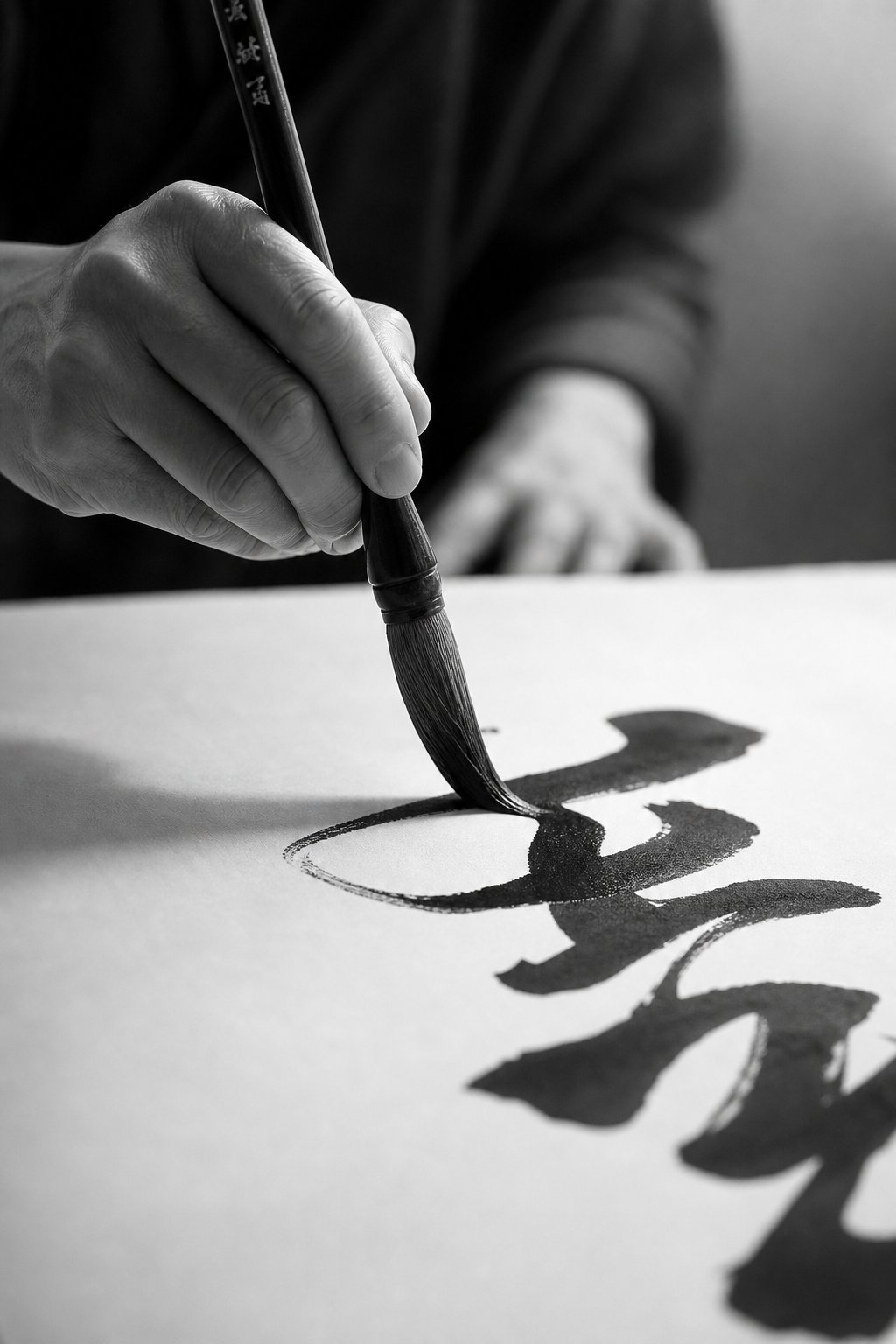
You can hand two calligraphers the same brush, the same ink, and the same character to write. If one trained in Beijing and the other in Kyoto, the strokes will feel different before the character is even half-finished. The mechanics of how brush meets paper, how pressure builds and releases, how speed accelerates or holds steady, reveal the deepest technical divide between these traditions.
Chinese Stroke Discipline and the Eight Principles of Yong
Chinese calligraphy writing styles treat every stroke as a three-act structure: a deliberate entry, a controlled middle passage, and a defined exit. Pick up any teaching manual and you'll encounter the Eight Principles of Yong (永字八法), a classical framework built around the single character 永 (meaning "eternal"). This one character contains all eight fundamental stroke types: the dot, horizontal, vertical, hook, rising, left-falling, short left-falling, and right-falling. Master these eight movements and you hold the building blocks for every character in the language.
What makes this approach distinctive is its emphasis on internal energy. Each stroke must carry qi, a sense of life and force that readers can feel even in a static image. A horizontal line isn't just a line. It enters the paper like a bird landing on a branch, presses through with gathered strength, and lifts off with intention. Chinese calligraphy characteristics like bone structure (gufa), flesh (the ink's fullness), and sinew (the connective tension between strokes) are evaluated in every serious critique. The calligrapher's body stays relatively still, with power originating from the wrist and fingers in precise, measured movements.
Speed, in this context, is secondary to structure. A kaishu character might take thirty seconds or more as the calligrapher pauses between strokes, resets posture, and ensures each element occupies its correct position within the invisible grid. Even in faster styles like xingshu, the underlying architecture remains visible. You're watching controlled acceleration, not spontaneous release.
Japanese Rhythm and the Breath Between Strokes
Japanese shodo shifts the center of gravity from structure to breath. As practitioners at Gohitsu Shodo Studio describe it, "your breath concentrates in your abdomen — the energy created there is then projected to the brush. Each breath connects to each stroke. Big bold strokes are the results of long deep exhalations." The stroke isn't just a visual mark. It's a physical record of a single breath cycle.
This breath-centered approach changes everything about execution. Where Chinese calligraphy asks you to pause, reset, and begin each stroke as a discrete unit, shodo art often treats the spaces between strokes as active moments of inhalation. The brush lifts but the movement doesn't stop. There's a continuous rhythm, almost musical, that carries through an entire character or line of kana. Connections between strokes matter as much as the strokes themselves.
In Zen-influenced calligraphy, this philosophy reaches its peak. The goal becomes mushin (no-mind), a state where the calligrapher lets go of the desire to produce anything perfect. As the same source explains, "to produce calligraphy that's a product of this state of no-mind one must completely let go of the desire to produce anything at all." The result is brushwork that feels alive, spontaneous, and unrepeatable, qualities that Japanese aesthetics prize above technical precision.
Pressure Speed and Flow Differences
When you watch both traditions side by side, the contrast in tempo is striking. Chinese calligraphy, particularly in kaishu and lishu, moves at a deliberate pace. The brush presses firmly at stroke beginnings, maintains consistent pressure through the body, and lifts with a controlled flick or tuck at the end. Speed increases in xingshu and caoshu, but even cursive Chinese calligraphy retains a sense of gathered, intentional force behind each movement.
Japanese calligraphy, especially in kana and sosho styles, embraces velocity as an expressive tool. The brush dances across washi with varying speed: slowing for emphasis, accelerating through connections, sometimes barely touching the paper to create gossamer-thin lines called kasure (掠れ), where the brush runs dry and leaves broken, textured traces. These "flying white" moments are considered beautiful rather than flawed, evidence of the calligrapher's living energy moving faster than the ink can follow.
For learners weighing which tradition to study, each approach offers distinct advantages and challenges:
Pros of the Chinese Stroke Approach
- Clear, systematic progression from basic strokes to complex characters
- Measurable benchmarks — you can compare your work directly against classical models
- Builds strong foundational control that transfers to any script style
- Develops patience and precision applicable beyond calligraphy
Cons of the Chinese Stroke Approach
- Can feel rigid and repetitive for learners seeking creative expression early on
- Progress is slow and demands years before reaching expressive styles
- Less room for personal interpretation at beginner and intermediate levels
Pros of the Japanese Stroke Approach
- Engages the whole body and breath, making practice feel meditative from day one
- Encourages personal expression and emotional authenticity earlier in the learning process
- Kana calligraphy offers a gentler entry point with flowing, forgiving strokes
- The connection to mindfulness and Zen practice adds a spiritual dimension
Cons of the Japanese Stroke Approach
- Without strong fundamentals, "expressive" work can become undisciplined
- Harder to self-assess without a teacher, since beauty is more subjective
- Requires learning multiple writing systems (kanji, hiragana, katakana) simultaneously
Neither approach is superior. They simply optimize for different outcomes. Chinese stroke discipline builds architecture. Japanese stroke rhythm builds presence. And as many experienced calligraphers in both traditions will tell you, the highest level of mastery eventually requires both: structure internalized so deeply that it can be released without thought.
Technique, though, doesn't exist in a vacuum. Behind every stroke decision sits a philosophical framework that tells the calligrapher what matters, what beauty looks like, and what the brush is ultimately for.
Philosophy That Drives Every Brushstroke
A brush can be trained to produce perfect strokes. But what decides which strokes are worth producing? That question sits at the philosophical core of both traditions, and the answers couldn't be more different. The chinese calligraphy definition embedded in its very name, shufa (書法), points toward method, law, and discipline. The japanese calligraphy meaning carried in shodo (書道) points toward a path, a spiritual journey without a fixed destination. These aren't just linguistic quirks. They're worldviews that shape every decision a calligrapher makes.
Confucian Discipline and the Scholar's Brush
Throughout the history of chinese calligraphy, the brush has been inseparable from moral cultivation. Calligraphy was one of the Six Arts (六艺 liuyi) that every educated person in ancient China was expected to master, alongside ritual, music, archery, charioteering, and mathematics. It wasn't decorative. It was formative. The act of writing was believed to reveal a person's inner character, their discipline, patience, and integrity, as clearly as a mirror reveals a face.
This Confucian framework treats calligraphy as xiuyang (修养), self-cultivation through sustained practice. A calligrapher studies classical models by Wang Xizhi, Yan Zhenqing, or other ancient masters not to copy their style but to absorb their spirit. Decades of faithful repetition aren't seen as stagnation. They're seen as deepening. The Chinese perspective treats the act of writing as a reflection of the writer's character, where historically only educated elites could fully engage with the art. Even today, calligraphy scrolls displayed in homes convey wisdom, blessings, or philosophical ideas, carrying forward that literati tradition.
Mastery, in this context, means refinement. You don't transcend the classical models. You internalize them so completely that your brushwork radiates their accumulated wisdom while carrying your own qi. The standard is external and historical: does your work honor the tradition that produced it?
Zen Buddhism and Wabi-Sabi in Shodo
Japanese calligraphy took a different philosophical turn. When Zen Buddhism became deeply embedded in Japanese culture, it reshaped what the brush was for. Writing became a practice of presence, not preservation. The word shodo places calligraphy alongside other "ways" — chado (tea ceremony), kendo (sword), judo (the gentle way) — all disciplines where the physical act serves as a vehicle for spiritual awakening.
Where Chinese calligraphy asks "does this honor the masters who came before?" Japanese calligraphy asks "does this express the calligrapher's authentic state of mind in this unrepeatable moment?" The influence of wabi-sabi aesthetics means that imperfection isn't failure. A stroke that trails off unexpectedly, a character slightly off-center, ink that runs dry mid-movement — these can be beautiful precisely because they're honest. They record a living moment rather than reproducing an ideal.
As the Japanese tradition emphasizes, shodo is deeply connected to mindfulness and self-cultivation. Repeating strokes is not just practice but a way to calm the mind. The calligrapher's spiritual state matters as much as their technical skill, sometimes more.
How Philosophy Shapes What Beautiful Means
These philosophical roots create two entirely different definitions of beauty. In Chinese calligraphy, a beautiful piece demonstrates mastery of structure, energy contained within form, and a visible lineage connecting the calligrapher to thousands of years of tradition. It's beauty through accumulated refinement. In Japanese calligraphy, a beautiful piece captures something alive and transient, a breath, a feeling, a moment of clarity that can never be repeated.
Chinese calligraphy measures mastery by how deeply a calligrapher has absorbed centuries of classical tradition. Japanese calligraphy measures mastery by how completely a calligrapher can let go of everything, including the desire to produce something masterful.
Neither philosophy is more valid. They simply answer different human needs. One offers the comfort of belonging to something larger and older than yourself. The other offers the freedom of being fully present in a single, unrepeatable instant.
These philosophical differences don't stay abstract. They become visible the moment you look at how each tradition arranges characters on the page, how much space surrounds them, and what that space is meant to say.
Composition and the Power of Empty Space
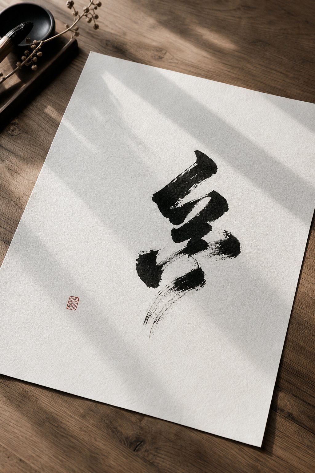
Look at a finished piece of east asian calligraphy and your eye goes straight to the ink. But experienced calligraphers in both traditions will tell you the real composition happens in the space where the brush never touches. What separates japanese art vs chinese art on the page isn't just how characters are formed — it's what the artist does with everything around them.
Ma and Negative Space in Japanese Composition
In Japanese calligraphy, empty space isn't leftover. It's an active compositional element called ma (間), a concept that translates roughly as "interval," "pause," or "the space between." But those translations barely scratch the surface. Ma is the silence between musical notes that gives rhythm its shape. It's the breath between brushstrokes that makes each one resonate.
Imagine a single kanji character placed off-center on a large sheet of washi, surrounded by generous white space. In the Japanese aesthetic, that emptiness isn't wasted paper. It amplifies the character's presence, gives it room to breathe, and invites the viewer's imagination to participate. As the concept's kanji symbol suggests — composed of the characters for "door" and "sun" — ma evokes light filtering through an opening, the beauty found in what's left unoccupied.
In Japanese calligraphy, ma is reflected in the rhythm of brushstrokes and the spaces between them. The pauses as the brush glides across the paper, along with the open spaces surrounding the characters, carry as much meaning as the inked strokes themselves. This balance between action and stillness creates harmony and allows each character to breathe fully. A crowded composition, by contrast, feels suffocating — it violates the principle that emptiness is where meaning gathers.
Density and Balance in Chinese Layout
Chinese calligraphy approaches space through a different philosophical lens. Rather than treating emptiness as an independent aesthetic force, the Chinese tradition sees black ink and white paper as complementary opposites — yin and yang in visual form. The classical principle is "counting white as black" (计白当黑), meaning the calligrapher must compose the empty spaces with the same intentionality as the strokes themselves.
Research into Wang Xizhi's masterwork The Orchid Pavilion reveals how precisely this balance operates. Quantitative analysis of the character "之" across twenty instances shows that white space consistently exceeds black space, yet the overall black-to-white ratio correlates strongly with visual complexity. The left portion of each character exerts the greatest influence on perceived density. Most characters maintain balanced proportions (roughly 1:1 black-to-white ratio), while select characters introduce dramatic asymmetry (ratios reaching 1:6) to create dynamic tension.
This isn't randomness. It's the principle of calligraphy in chinese art that Wang Songyu categorized as "correct" and "change" — harmony and proportionality as the foundation, with deliberate variation creating life within structure. Chinese compositions tend toward density. Characters fill the page more completely, columns sit closer together, and the interplay between filled and empty space creates a sense of gathered energy rather than open stillness.
How Each Tradition Frames the Page
These spatial philosophies ripple outward into how each tradition relates to surrounding elements. A Chinese calligraphy scroll rarely exists alone. It's typically accompanied by red seal impressions (印章 yinzhang) stamped at strategic points, colophons added by later collectors, and sometimes paired with painting in a unified composition. The page is a dense ecosystem where every element — text, seal, inscription, mounting — contributes to a layered visual conversation. More elements mean more relationships to balance, and Chinese aesthetics thrive on that complexity.
Japanese calligraphy, influenced by ma, tends toward isolation and restraint. A hanging scroll might feature a single line of characters with vast surrounding space, mounted on understated paper or silk. Seals are used more sparingly. The relationship between the calligraphy and its mounting (表装 hyouso) emphasizes breathing room rather than accumulation. When calligraphy appears alongside painting in Japanese art, the two elements often occupy separate zones rather than interweaving.
| Aspect | Chinese Calligraphy | Japanese Calligraphy |
|---|---|---|
| Spatial philosophy | Yin-yang complementarity — black and white as equal, interdependent forces | Ma (間) — negative space as an active, independent aesthetic element |
| Typical layout density | Dense, with characters filling columns tightly and multiple elements layered on the page | Open, with generous spacing and fewer elements per composition |
| Role of empty space | Composed with equal intention as ink; serves structural balance and dynamic tension | Treated as silence that amplifies meaning; invites viewer participation and contemplation |
| Relationship to other art forms | Integrated with painting, seals, colophons, and mounting in layered compositions | Isolated or minimally paired; mounting emphasizes breathing room over accumulation |
Whether a tradition fills the page or empties it, the underlying logic is the same: space is never accidental. It's always a decision. And those decisions carry forward into how each culture uses calligraphy beyond the studio — in classrooms, ceremonies, galleries, and the rhythms of daily life.
Cultural Role From Classroom to Gallery
Calligraphy doesn't live only on scrolls behind museum glass. In both China and Japan, it remains woven into education, ceremony, and commercial life — though each culture integrates it differently. The way a society teaches, ranks, and applies its calligraphic tradition reveals what that tradition means to people on a daily level, not just an artistic one.
Calligraphy in Schools and Daily Life
In Japan, shodo is a formal part of the national school curriculum. Students begin brush practice in elementary school and continue through middle school, learning kaisho fundamentals and progressing into gyosho. Calligraphy classes aren't treated as electives — they're embedded in Japanese language education as a core skill. Every January, students participate in kakizome (書き初め), the tradition of writing the year's first calligraphy, often a word or phrase representing personal goals for the coming year.
Chinese schools also include calligraphy within language education, though the approach has shifted over time. The Ministry of Education mandates calligraphy instruction in primary and middle schools, and universities increasingly offer courses in Chinese character culture as part of general education. A survey of 167 students across 41 Chinese universities found that over 80% believed courses related to Chinese characters were necessary at the university level. This push responds to what researchers call the "character amnesia crisis" — over 85% of respondents in a national survey acknowledged declining handwriting ability due to digital device reliance.
Ceremonial use differs too. Chinese families paste spring couplets (春联 chunlian) on doorframes during Lunar New Year, handwritten in bold regular or running script by local chinese calligraphers or family members. In Japan, calligraphy appears in tea ceremony scrolls (kakejiku), temple inscriptions, and seasonal greetings. Both cultures treat the brush as a living part of celebration, not a relic.
Ranking Systems and Measuring Mastery
Here's where the structural difference gets interesting. Japanese calligraphy schools use a dan/kyu ranking system nearly identical to martial arts. Students begin at kyu levels (10th kyu being the lowest) and advance through examinations to dan ranks, with 10th dan representing the highest achievement. Each school or association sets its own standards, but the framework gives learners clear milestones and a sense of progression.
Chinese calligraphy assessment follows a different model. Rather than a universal belt-like system, proficiency is measured through institutional frameworks: national calligraphy competitions, membership levels within organizations like the Chinese Calligraphers Association (中国书法家协会), and academic credentials. Acceptance into the Association, for instance, requires demonstrated excellence through juried exhibitions. The path is less linear but carries significant prestige — membership signals that a calligrapher's work has been recognized by peers steeped in chinese ancient calligraphy traditions stretching back millennia.
Modern Revival and Contemporary Artists
Both traditions are experiencing a revival that bridges heritage and contemporary culture. In China, calligraphy intersects with branding, digital media, and cultural policy. The government actively promotes calligraphy education as a vehicle for cultural confidence, and contemporary artists push boundaries by merging classical techniques with modern materials and scale. In Japan, kana calligraphy has found new audiences through fashion, interior design, and international exhibitions that highlight its lyrical beauty.
Modern applications in Chinese calligraphy:
- Brand identity and logo design for luxury and heritage brands
- Spring Festival couplets and ceremonial writing as commercial services
- Digital calligraphy fonts derived from historical masterworks
- Cultural tourism centered on calligraphy villages and museums
- Therapeutic and educational programs addressing the handwriting crisis
Modern applications in Japanese calligraphy:
- Product packaging and advertising using hand-brushed characters
- Fashion and textile design incorporating shodo aesthetics
- Performance calligraphy (書道パフォーマンス) at public events and competitions
- Mindfulness and wellness programs built around brush meditation
- Anime, manga, and game title design using dynamic brush lettering
What's striking is how each culture's modern applications mirror its philosophical roots. Chinese commercial calligraphy leans on authority, heritage, and cultural weight. Japanese commercial calligraphy leans on emotion, movement, and aesthetic impact. The brush adapts to new contexts, but the soul behind it stays consistent.
With both traditions alive in classrooms, galleries, and marketplaces, the practical question for learners becomes personal: which path fits your goals, your temperament, and your definition of mastery?
Full Comparison and Which Path Fits You
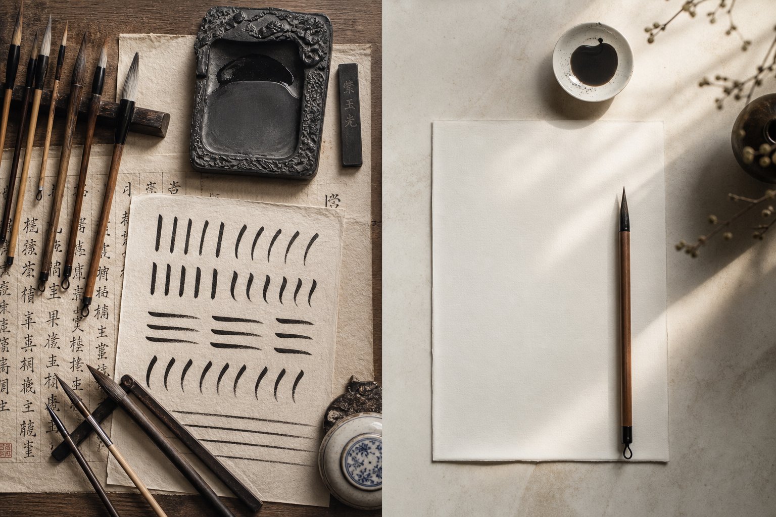
Seven layers of difference, from script systems to cultural role, paint a clear picture: chinese writing vs japanese writing traditions share DNA but express entirely different artistic philosophies. Before you commit time and energy to one path, it helps to see everything side by side in a single view. The table below distills the core distinctions covered throughout this guide, giving you a quick reference for understanding the difference between chinese and japanese writing at every level.
Complete Side-by-Side Comparison
| Category | Chinese Calligraphy (Shufa) | Japanese Calligraphy (Shodo) | Key Takeaway |
|---|---|---|---|
| Script systems | One character set (hanzi) expressed through five historical styles: seal, clerical, regular, running, cursive | Three writing systems (kanji, hiragana, katakana) with parallel script styles plus unique kana aesthetics | Japanese calligraphers navigate more writing systems; Chinese calligraphers go deeper within one |
| Tools | Longer brushes, thicker ink, highly absorbent xuan paper that demands decisive strokes | Specialized kana brushes, thinner ink, smoother washi paper that supports flowing connections | Tools in each tradition reinforce its core values: commitment vs. flow |
| Stroke technique | Three-part stroke structure (entry, body, exit); deliberate pace; power from wrist and fingers | Breath-centered rhythm; speed as expression; whole-body engagement; connections between strokes valued | Chinese strokes build architecture; Japanese strokes build presence |
| Philosophy | Confucian discipline and xiuyang (self-cultivation); mastery through decades of absorbing classical models | Zen Buddhism and wabi-sabi; mastery through letting go, embracing imperfection and the present moment | One measures mastery by depth of tradition absorbed; the other by authenticity of expression released |
| Composition | Dense layouts; yin-yang balance between ink and space; layered with seals, colophons, and painting | Open layouts; ma (negative space) as active element; minimal surrounding elements; isolation and restraint | Chinese compositions gather energy through density; Japanese compositions amplify meaning through emptiness |
| Cultural role | Embedded in language education; spring couplets; institutional prestige through juried exhibitions | Formal school curriculum (shodo classes); dan/kyu ranking; performance calligraphy; mindfulness practice | Both traditions are alive in daily life, but Japan structures progression like martial arts while China structures it through institutional recognition |
| Learning curve | Systematic progression from kaishu fundamentals through increasingly expressive styles; slow, measurable advancement | Multiple entry points (kanji or kana); earlier access to expressive work; harder to self-assess without a teacher | Chinese offers clearer benchmarks; Japanese offers earlier creative engagement |
This table also helps answer a question many newcomers ask: how to tell japanese from chinese writing when both use similar characters. The answer lives in all seven rows working together. A piece with kana characters mixed in is unmistakably Japanese. But even when only kanji appear, the spatial density, stroke rhythm, and compositional philosophy usually reveal which tradition shaped the work. Japanese pieces tend toward openness, breath, and flowing connections. Chinese pieces tend toward density, structure, and contained energy.
Which Tradition Suits Your Goals
Choosing between these paths isn't about which is "better." It's about which resonates with your temperament, your artistic goals, and what you want the practice to give you beyond the page.
Chinese calligraphy fits you if: you're drawn to structured discipline, historical depth, and systematic progression. If you find satisfaction in measurable improvement, enjoy studying classical models, and want to connect with one of humanity's oldest continuous art traditions, shufa offers a clear and deeply rewarding path. Personality-wise, it suits people who thrive on patience, precision, and the long game — those who find beauty in mastering something so thoroughly that it becomes second nature.
Japanese calligraphy fits you if: you're attracted to spiritual practice, expressive freedom, and aesthetic minimalism. If mindfulness matters to you, if you want your practice to feel meditative from day one, and if you're comfortable with subjective beauty rather than fixed standards, shodo offers a path that engages body, breath, and spirit simultaneously. It suits people who value presence over perfection and find beauty in the unrepeatable moment.
Many learners also find that knowing how to tell japanese from chinese writing deepens appreciation for both. You don't have to choose permanently. Some calligraphers study Chinese fundamentals first for structural grounding, then explore Japanese aesthetics for expressive freedom. Others start with kana calligraphy's gentle entry point and later tackle the discipline of Chinese kaishu. The traditions aren't rivals — they're complementary perspectives on what a brush can do.
Here are the factors to weigh, ranked by how much they typically influence a learner's satisfaction with their choice:
- Your definition of mastery — Do you want clear external benchmarks (Chinese) or internal, experiential growth (Japanese)? This single question predicts satisfaction more than any other.
- Your relationship with structure — Do you thrive within systematic frameworks, or do you feel constrained by them? Chinese calligraphy rewards those who love structure. Japanese calligraphy rewards those who want structure as a launching pad for freedom.
- Your interest in mindfulness — Both traditions are meditative, but Japanese shodo explicitly frames practice as a spiritual discipline alongside tea ceremony and martial arts. If that dimension matters to you, shodo integrates it from the start.
- Language connection — Are you studying Mandarin or Japanese? Practicing calligraphy in the language you're learning multiplies the benefit, reinforcing character recognition, stroke order, and cultural understanding simultaneously.
- Aesthetic preference — Look at finished works from both traditions. Which moves you? Dense, powerful compositions with layered elements? Or minimal, breathing compositions with open space? Trust your gut response.
- Access to instruction — Japanese calligraphy's dan/kyu system means structured classes are widely available, even online. Chinese calligraphy instruction varies more in format. Consider what's accessible where you live or study.
- Time horizon — Chinese calligraphy's sequential progression (kaishu before xingshu before caoshu) means expressive freedom comes later. Japanese calligraphy, especially kana, offers expressive satisfaction sooner. Neither is faster to "master" — but the emotional payoff arrives at different stages.
Whichever path you choose, you're picking up a brush that connects you to centuries of human effort to make meaning visible. The soul behind each tradition is different, but the invitation is the same: slow down, breathe, and let the brush teach you something about yourself that words alone never could.
Frequently Asked Questions About Chinese vs Japanese Calligraphy
1. What is the main difference between Chinese and Japanese calligraphy?
The core difference lies in philosophy. Chinese calligraphy (shufa) emphasizes method, structured discipline, and faithful transmission of classical models rooted in Confucian self-cultivation. Japanese calligraphy (shodo) emphasizes the spiritual path, drawing from Zen Buddhism and wabi-sabi aesthetics to prioritize authentic expression, breath, and the beauty of imperfection over technical perfection.
2. Do Chinese and Japanese calligraphy use the same characters?
They share kanji characters that originated in China, but the two traditions simplified them independently. For example, the traditional character for 'drawing' became two different simplified forms in each country. Beyond visual differences, stroke order can vary, and Japanese calligraphy also uses hiragana and katakana, two phonetic writing systems with no Chinese equivalent that introduce entirely different stroke aesthetics.
3. Which is easier to learn, Chinese or Japanese calligraphy?
Neither is objectively easier, but they offer different entry points. Chinese calligraphy provides a clear, systematic progression starting with regular script (kaishu) and measurable benchmarks for improvement. Japanese calligraphy offers multiple starting points, including kana calligraphy with its flowing, forgiving strokes that give beginners expressive satisfaction sooner. Your learning style and goals determine which feels more accessible.
4. How can you tell Chinese calligraphy apart from Japanese calligraphy?
Look for several clues working together. The presence of hiragana or katakana characters immediately identifies Japanese work. When only kanji appear, Japanese pieces tend toward open spacing, flowing stroke connections, and minimal surrounding elements. Chinese pieces typically feature denser layouts, contained energy within each character, and layered compositions with red seal impressions and colophons.
5. Can you study both Chinese and Japanese calligraphy at the same time?
Many calligraphers study both traditions sequentially rather than simultaneously. A common approach is building structural foundations through Chinese kaishu practice first, then exploring Japanese aesthetics for expressive freedom. Others begin with Japanese kana for a gentler entry and later tackle Chinese discipline. The traditions complement each other, with Chinese training strengthening architecture and Japanese training developing presence and rhythm.