Understanding Chinese Name Chops Before You Design
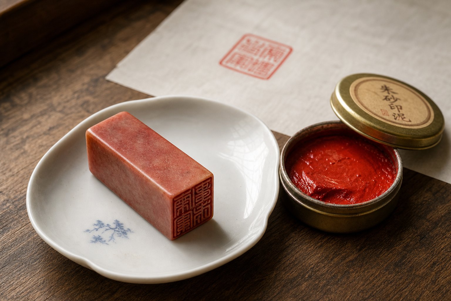
Imagine pressing a carved stone into red cinnabar paste, then stamping your identity onto a painting you spent weeks creating. That single impression tells viewers who you are, what tradition you respect, and whether you did your homework. A poorly designed Chinese chop stamp broadcasts carelessness just as loudly as a well-designed one signals authenticity.
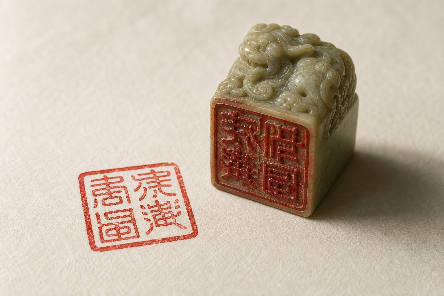
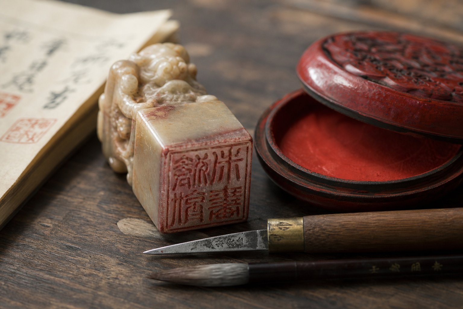
A Chinese seal, known colloquially as a chop, is a carved stamp containing Chinese characters used to prove identity on documents, artwork, and correspondence. The tradition stretches back thousands of years and remains a living practice. UNESCO inscribed the art of Chinese seal engraving on its Representative List of Intangible Cultural Heritage in 2009, recognizing it as a cornerstone of Chinese fine arts that expresses an entire culture's ideas about humankind and nature.
Here is what matters for you: the design phase is where authenticity is won or lost. Whether you plan to hand-carve soapstone, laser-engrave acrylic, 3D print a mold, or commission a professional carver, every fabrication method depends on the same upstream decisions about characters, script style, layout, and seal type. This guide focuses entirely on those design decisions, so it applies no matter how you bring the final object into existence.
It is also written specifically for non-Chinese speakers who want a result that holds up under informed scrutiny, not a tourist trinket.
Types of Chops and What Each Communicates
Not all Chinese chops serve the same purpose. The type you choose shapes everything from the characters you select to the shape of the stone itself. Traditional practice recognizes three main categories of personal seals:
- Name Chop (mingyin / xingming yin): This is the most common type. It carries your personal name and functions as your identity mark, similar to a signature. Name seals are almost always square and typically appear in pairs on artwork, one carved in yin style and one in yang style. They tell the viewer exactly who created or owns the piece.
- Studio Chop (zhaiguan yin): This seal carries the name of your private studio, workshop, or creative practice. Since the Tang Dynasty, artists and scholars have named their studios and used a dedicated seal to represent that creative space. Studio chops are generally rectangular and communicate your artistic identity rather than your legal name.
- Leisure Chop (xianzhang): Sometimes called a "free seal" or decoration seal, this type can contain a personal philosophy, a poetic phrase, a lucky saying, or even an image. Leisure chops can be any shape, from oval to irregular natural stone forms. They express personality and artistic sensibility rather than identity.
Each type carries different cultural weight and follows different design conventions. A name chop demands formal precision. A leisure chop invites creative freedom. Choosing the wrong type for your purpose is the first way a design can go sideways.
The design decisions ahead, from selecting characters to composing them within a frame, all depend on which category your seal falls into. That choice comes first, and everything else follows from it.
Step 1 Choose the Right Characters for Your Seal
Your seal type determines what kind of content belongs inside the frame. The characters you place there determine whether your chinese seal chop earns respect or raises eyebrows. This single decision carries more cultural weight than any other step in the design process, and it is the one most often rushed by beginners eager to move on to carving or ordering.
Think of it this way: a beautifully composed seal with nonsensical or culturally tone-deaf characters is like an elegantly framed diploma from a university that does not exist. The craftsmanship cannot rescue the content.
Full Name vs. Art Name vs. Transliterated Name
If you already have a Chinese name, whether given at birth, assigned during language study, or bestowed by a teacher, you have a head start. The question becomes which portion of that name to use. A full name (surname plus given name) is standard for formal name chops. A surname alone works for collectors' seals stamped on owned artwork. A given name alone is less common but acceptable for intimate, personal-use seals.
For artists and calligraphers, there is another option: the art name, or hao. This is a self-chosen pseudonym with deep roots in Chinese literary culture. Historical figures like Su Shi ("Householder of the Eastern Slope") and Tao Yuanming ("Mister Five-Willows") adopted art names derived from their residences, philosophies, or famous poetic lines. A hao carved into a seal chop communicates artistic identity rather than legal identity, and it gives non-Chinese speakers a path toward a name that carries genuine meaning rather than being a phonetic approximation.
If you do not have a Chinese name at all, you face a fork in the road: transliterate your existing name into Chinese characters based on sound, or choose an entirely new meaningful Chinese name.
How to Transliterate a Non-Chinese Name Into Characters
Phonetic transliteration maps the sounds of your name onto Chinese characters that approximate those syllables. "Michael" might become something like 迈克尔 (Mai-ke-er). The result is recognizably foreign, which is not inherently bad, but it does carry trade-offs. The characters chosen for their sound may have unrelated or awkward literal meanings when read by a native speaker. Some combinations sound natural; others feel clunky or unintentionally humorous.
Choosing a meaningful Chinese name, by contrast, involves selecting characters for their meaning, tonal beauty, and cultural resonance. This approach produces a name that reads naturally to Chinese speakers and can reflect your personality or values. The trade-off is complexity: you need guidance from someone fluent in Chinese naming conventions to avoid combinations that sound like existing words, carry negative connotations, or violate tonal patterns.
| Approach | Cultural Authenticity | Complexity | Best Suited For |
|---|---|---|---|
| Phonetic transliteration | Low to moderate | Low: standard mappings exist | Casual use, business seals, quick projects |
| Meaningful Chinese name | High | High: requires native speaker guidance | Artists, long-term use, formal name chops |
| Art name (hao) | Very high | Moderate to high: self-chosen but should follow conventions | Painters, calligraphers, poets, studio practice |
Where to Verify Your Character Choices
Regardless of which approach you take, verification is non-negotiable. A chinese chop seal is permanent once carved, and a character error lives on every impression you make. Here are reliable places to check your work:
- Native speakers with cultural literacy: Not just any bilingual friend, but someone familiar with naming conventions, classical references, and regional connotations.
- University East Asian studies departments: Faculty or graduate students in Chinese language programs can flag problems a dictionary cannot catch.
- Online calligraphy and seal-carving communities: Forums dedicated to Chinese seal art often welcome questions from learners and will point out issues with character choice or combination.
- Professional seal carvers: A reputable carver will discuss your character choices before cutting stone. If a carver does not ask questions about your name selection, that is a red flag.
Rushing this step is the single most common source of regret. Characters that look beautiful in isolation can clash in combination, carry unintended double meanings, or reference something embarrassing in colloquial speech. Spend the time here, and every subsequent design decision becomes easier because you are building on a solid foundation.
With your characters locked in, the next question is how those characters should look. The visual form of Chinese writing has evolved across millennia, and each historical script style sends a different signal about formality, era, and intent.
Step 2 Select a Seal Script Style
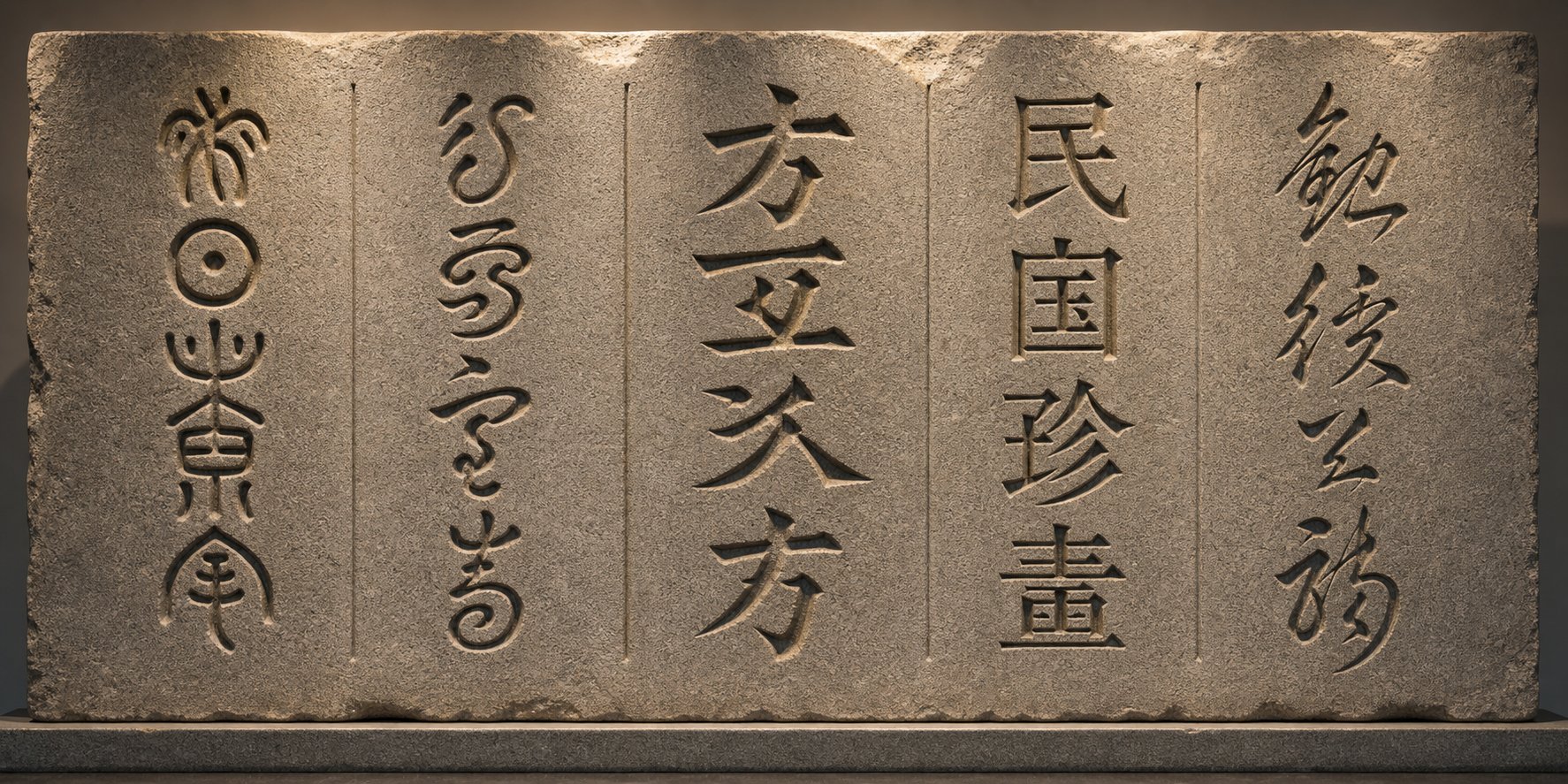
Chinese writing has worn many faces over three thousand years. Each historical script style carries its own visual personality, and the one you choose for your artist chop or name seal tells informed viewers exactly what era and level of formality you are referencing. Pick the wrong style and your seal reads like a wedding invitation set in Comic Sans.
Traditional Seal Script Styles Explained
You will encounter five main script styles when researching seal design. Not all are equally appropriate for every chop type, but understanding the full range helps you make a deliberate choice rather than a default one.
Dazhuan (greater seal script) is the oldest style still used in seal carving. Its characters vary in size depending on complexity, with more intricate characters appearing larger and simpler ones smaller. The forms are rounded, organic, and sometimes irregular, reflecting their origins in Zhou Dynasty bronze inscriptions. Dazhuan carries a sense of deep antiquity and is best reserved for seals that intentionally reference archaic tradition.
Xiaozhuan (lesser seal script) is the standard seal script and has been since the Qin Dynasty unified Chinese writing in 221 BCE. All characters are rendered in uniform size regardless of stroke complexity, with elegant, flowing curves and consistent stroke width. This is the script most people picture when they think of a traditional chop sign on a painting or document. For name chops, Xiaozhuan is the default and safest choice.
Lishu (clerical script) emerged as a simplified, more angular alternative to seal script for bureaucratic use. Characters tend to be wider than they are tall, with distinctive flared horizontal strokes sometimes described as "silkworm head and wild goose tail." Lishu works well for studio chops and leisure seals where you want a classical feel with slightly more legibility.
Kaishu (regular script) is the standard script of modern Chinese writing and the basis for printed typefaces. It is immediately readable by any literate Chinese speaker. Kaishu sacrifices the mystique of older scripts for clarity, making it suitable for seals where legibility matters more than antiquarian atmosphere.
Modern stylized options, including decorative and artistic interpretations, give printmaking chop artists room to experiment. These range from semi-cursive forms to entirely original compositions. They work for leisure chops but are inappropriate for formal name seals.
| Script Style | Visual Character | Readability | Recommended Use |
|---|---|---|---|
| Dazhuan (greater seal) | Irregular sizes, rounded, archaic | Very low for modern readers | Archaic-themed leisure chops, collectors |
| Xiaozhuan (lesser seal) | Uniform size, flowing curves, balanced | Low, but recognized as seal script | Formal name chops, artist seals (most traditional) |
| Lishu (clerical) | Wide, angular, flared strokes | Moderate | Studio chops, semi-formal seals |
| Kaishu (regular) | Square, crisp, modern | High | Seals prioritizing legibility, casual name chops |
| Modern stylized | Varies widely, artistic freedom | Variable | Leisure chops, experimental art seals |
Matching Script Style to Your Chop Purpose
Your script choice signals the formality and historical era your seal references. A Xiaozhuan name chop says "I understand and respect the tradition." A Kaishu name chop says "I want people to read this easily." Neither is wrong, but each sends a different message.
One critical warning: do not use modern simplified Chinese characters in a seal meant to look traditional. Simplified characters were introduced in the 1950s and 1960s as a literacy reform. Placing them inside a seal carved in Xiaozhuan or Dazhuan style is an anachronism that any knowledgeable viewer will catch immediately. It is the equivalent of putting a QR code on a medieval wax seal. If you are working in seal script, use the traditional forms of your characters. If you prefer simplified characters for readability, pair them with Kaishu or a modern stylized approach where they belong historically.
For most readers of this guide designing their first name chop, Xiaozhuan is the recommendation. It is the script style with the deepest association to seal carving, it looks unmistakably like a seal impression, and reference materials for character forms are widely available through dictionaries like the Shuowen Jiezi. Kaishu is a solid second choice when your priority is that viewers can actually read your name without specialized knowledge.
Script style determines the visual DNA of your seal. The next layer of that visual identity is whether your characters will appear as carved-away voids or raised surfaces, a choice that fundamentally changes how your impression interacts with the page.
Step 3 Decide Between Yin and Yang Seal Styles
You have your characters and your script style. The next decision changes the entire visual weight of your chop seal impression: will your characters appear as white voids against a field of red, or as red strokes against a clean white background?
Yin Seals vs. Yang Seals and Their Traditional Uses
In Chinese seal terminology, these two approaches have formal names. A Baiwen (white character) seal, also called a Yin seal, carves the characters themselves into the stone. When stamped, the background prints red and the characters remain white, the color of the paper showing through. A Zhuwen (red character) seal, also called a Yang seal, carves away the background and leaves the characters raised. The impression shows red characters on a white background.
Think of it in terms of what carries the ink. In a Yin seal, the flat surface around and between the strokes touches the paste. In a Yang seal, the strokes themselves touch the paste. The visual result is dramatically different even when the characters and script style are identical.
Traditionally, Yin seals carry more visual gravity. The large field of red creates a bold, weighty impression that commands attention. Yang seals feel lighter and more refined, with delicate red lines floating on the page. This difference is not just aesthetic preference. It follows functional conventions rooted in centuries of practice.
Traditional use pairs the two styles together on artwork. A formal name chop and stamp combination typically includes one Yin seal and one Yang seal placed near the artist's signature. As the Seal Society notes, having two Yin or two Yang seals together lacks balance and is visually less interesting. The pairing creates contrast, echoing the broader yin-yang principle of complementary opposites.
How to Decide Which Style Fits Your Purpose
If you are designing a single chop seal rather than a matched pair, your choice depends on purpose, context, and the visual environment where the impression will live. Here are scenarios where each style works best:
- Choose Yin (white characters, red background) when:
- You are making a formal name seal for signing artwork or documents
- The artwork or page has generous empty space that needs visual anchoring
- The surrounding colors are generally light, and you want the seal to hold its ground
- You want a bold, authoritative presence that reads as traditional and serious
- Choose Yang (red characters, white background) when:
- You are designing an art name seal, studio chop, or leisure seal
- The artwork is already visually dense or richly colored, and a heavy red block would overwhelm it
- You want a lighter, more elegant impression that complements rather than dominates
- Legibility is a priority, since individual strokes are easier to read as distinct red lines
- Design both (a matched pair) when:
- You plan to use your chop and seal on calligraphy or paintings following traditional placement conventions
- You want maximum flexibility across different contexts and compositions
- You are building a complete set of personal seals for serious artistic practice
One practical consideration that beginners overlook: Yin seals are generally more forgiving of slight imperfections in carving because the broad red field visually unifies the impression. Yang seals expose every wobble in a stroke, since each line stands alone against white space. If you are planning to hand-carve your first seal, a Yin design offers a bit more margin for error.
With the style locked in, your design brief is nearly complete in the abstract. Characters, script, and Yin or Yang. What remains is the spatial puzzle of arranging those elements inside the seal's physical boundaries, where stroke density, grid structure, and negative space determine whether your composition looks balanced or cramped.
Step 4 Compose Characters Within the Seal Frame
Characters chosen, script selected, Yin or Yang decided. You now face the spatial challenge that separates a polished chop stamp from an amateur one: fitting your characters into a confined square or rectangle so they look intentional, balanced, and unified rather than randomly dropped into a box.
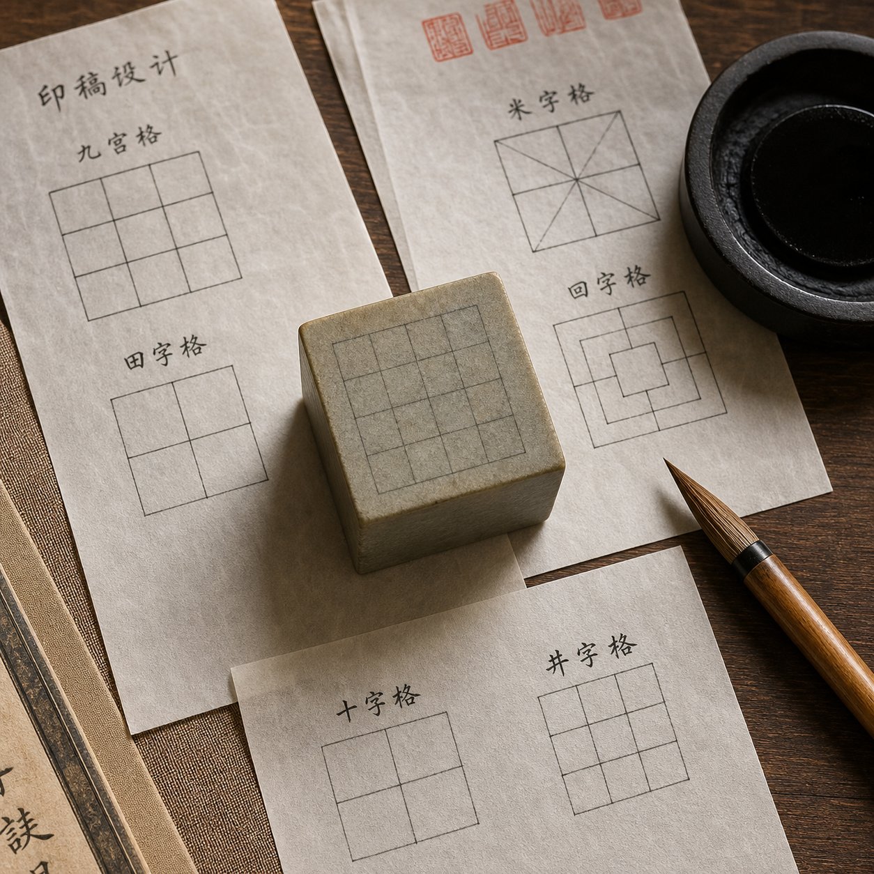
Traditional seal composition is not freehand. It follows a grid-based layout system that has governed Chinese character arrangement for centuries. The Journal of Arts and Humanities traces this grid consciousness back to the pre-Qin period, noting that the system matured in Han Dynasty inscriptions and has remained foundational to Chinese visual design ever since. In seal carving, the grid is invisible in the final impression but absolutely present in the design phase. It is the skeleton beneath the skin.
Grid Layouts for 2, 3, and 4 Character Seals
The number of characters in your seal dictates which grid configuration works. Imagine dividing your seal face into equal compartments, then placing one character per compartment. The reading order in a traditional seal runs top to bottom, right to left, mirroring classical Chinese text direction. Getting this wrong is one of the fastest ways to signal inexperience.
Here is how character count maps to layout:
| Character Count | Recommended Grid | Seal Shape | Reading Order |
|---|---|---|---|
| 2 characters | 1x2 (vertical stack) or 2x1 (side by side) | Square or tall rectangle | Right to left if side by side; top to bottom if stacked |
| 3 characters | 1x3 (single column) or L-shaped arrangement | Tall rectangle or square | Top to bottom in column; right column first if split |
| 4 characters | 2x2 (two columns, two rows) | Square | Top-right, bottom-right, top-left, bottom-left |
| 6 characters | 2x3 (two columns, three rows) | Tall rectangle | Right column top to bottom, then left column top to bottom |
The 2x2 grid is by far the most common because four-character names (surname plus two-character given name plus the character "yin" meaning seal) fit it perfectly. If your name has only two or three characters, you can either use a rectangular seal or add a conventional filler character like "yin" (seal) or "zhi yin" (seal of) to reach four.
Sounds straightforward? The grid gives you structure, but the real craft lives in what happens inside each cell.
Balancing Stroke Density Across Characters
Chinese characters vary wildly in complexity. A character like yi (one) has a single horizontal stroke. A character like long (dragon, traditional form) has sixteen strokes packed into the same square space. When these sit side by side in a seal, the dense character can visually overwhelm its simpler neighbor, making the composition feel lopsided.
Traditional seal carvers solve this through deliberate proportion adjustments. The principle is simple to state and difficult to execute: give complex characters slightly more room to breathe, and allow simple characters to expand or thicken their strokes to fill their allotted space. The goal is equal visual weight, not equal stroke count.
Practical techniques for achieving this balance:
- Stroke thickening: Simple characters get slightly thicker strokes so they carry comparable visual mass to their complex neighbors.
- Controlled expansion: A two-stroke character can stretch its strokes to occupy more of its grid cell, preventing the cell from looking empty.
- Slight boundary shifts: The invisible grid lines between characters can shift a few percent toward the simpler character, giving the complex one fractionally more territory.
- Decorative elongation: In seal script, strokes can be gracefully curved or extended to fill space. As master carver Chen Hongmian explains, sometimes a stroke will be curved or elongated to attain harmony with surrounding characters.
The famous example of Wu Changshuo's "Yuan Ding Mo Xi" seal illustrates this perfectly. The character ding has only two strokes, so Wu used a dramatically enlarged dot to represent it, achieving visual balance with the other three far more complex characters. Bold moves like this are what separate competent seal design from memorable seal design.
Using Negative Space and Border Thickness
Negative space in seal composition is called liu hong, literally "retained red" in a Yin seal, because the empty areas print as red ink. Far from being leftover gaps, these spaces are active compositional elements. They give the eye room to rest, separate characters from the border, and prevent the impression from looking congested.
Think of liu hong as the silence between musical notes. Without it, even beautifully formed characters blur into an unreadable mass. With too much of it, the composition feels sparse and unfinished. The balance point depends on your script style and seal type:
- Xiaozhuan (lesser seal script) benefits from moderate negative space because its flowing curves need room to resolve without touching the border or adjacent characters.
- Kaishu (regular script) can tolerate tighter spacing because its angular strokes create natural internal white space.
- Yin seals need careful attention to liu hong because the red background visually advances, making tight spaces feel even tighter in the final impression.
- Yang seals are more forgiving with spacing since the white background recedes and gives characters room to breathe optically.
Border thickness is the frame that holds everything together. A border too thin relative to the character strokes looks fragile and unintentional. A border too thick steals space from the characters and makes the seal feel heavy and cramped. The traditional guideline: border width should roughly match the average stroke width of your characters. This creates visual cohesion, as if the border and the characters belong to the same family.
Some seals intentionally break or erode their borders for an aged, organic look. This is a legitimate aesthetic choice for leisure chops, but for a formal name seal, keep the border consistent and complete. Broken borders on a name chop read as damage rather than style.
When you step back and evaluate your composition, ask three questions. Do all characters carry roughly equal visual weight? Does the negative space feel intentional rather than accidental? Does the border frame the characters without competing with them? If all three answers are yes, your layout is ready for the next critical step: flipping the entire design into its mirror image for transfer to the carving surface.
Step 5 Create and Verify the Mirror-Image Design
Your composition looks balanced on paper. Characters sit in harmony, negative space feels deliberate, and the border frames everything cleanly. There is one problem: what you are looking at is the impression, not the carving surface. Every chinese name stamp must be carved in reverse so that when pressed into ink paste and stamped, the result reads correctly. Skip this step or get it wrong, and your seal prints backward characters that announce the mistake to anyone who glances at it.
This mirror-image requirement applies universally. Hand carving, CNC routing, laser engraving, 3D printing a mold, it does not matter. The physical surface that contacts the ink paste is always a lateral inversion of the final printed impression. If you design your seal reading left to right in the correct orientation, the carved face must read right to left, with every stroke flipped along the vertical axis.
Why Every Chop Design Must Be Mirrored
Imagine writing your name on a rubber stamp and pressing it onto paper. The letters come out backward unless you carved them in reverse to begin with. A chinese seal stamp works identically. The carving surface is a mirror, and the impression is reality. Professional carvers internalize this so deeply that many design directly in mirror from the start, sketching reversed characters onto the stone face without needing an intermediate step. For beginners, though, designing in the correct reading orientation first and then deliberately flipping the layout is far safer.
The reason this step deserves its own place in the workflow is that errors here are catastrophic and irreversible. A misplaced stroke in your composition can sometimes be adjusted. A seal carved in the wrong orientation cannot be uncarved. The stone is wasted, the time is lost, and if you commissioned the work, the cost doubles. Verifying the mirror before committing to material is how professionals work regardless of their experience level.
Techniques to Verify Your Mirror-Image Layout
Several methods exist for confirming that your reversed design will produce the correct impression. They range from low-tech to digital, and using more than one provides a safety net against overlooked errors.
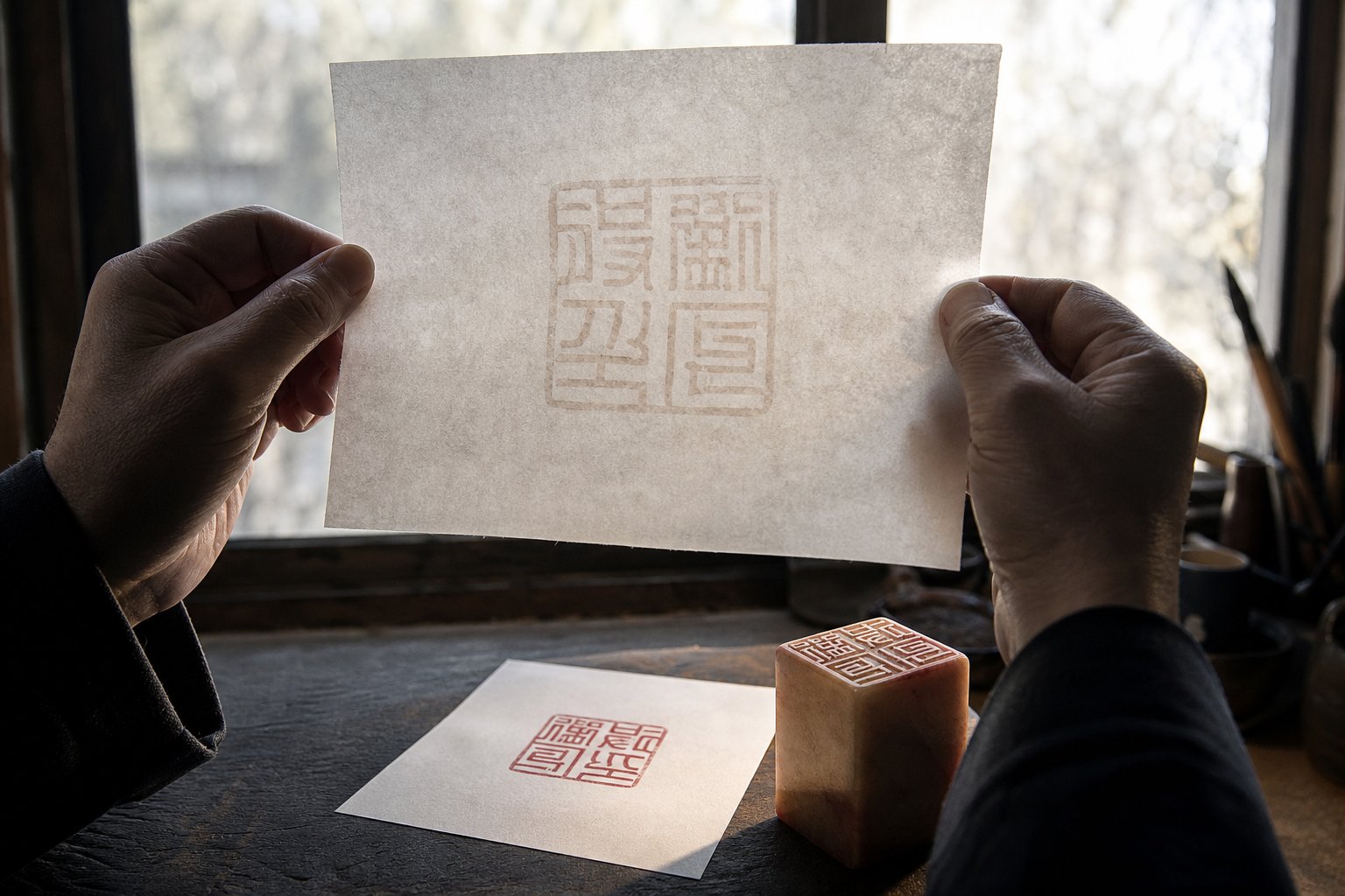
- Hold your design up to a mirror or light source. The simplest check. If you drew your composition on paper, hold it up to a window or place it against a mirror. The reflected or backlit image shows you what the final impression will look like. If the characters read correctly in the reflection, your mirror layout is accurate.
- Trace onto translucent paper, then flip. Draw your finalized composition on tracing paper or thin gampi paper. Flip the sheet over. The reversed image on the back is your carving template. This method, used in traditional seal engraving preparation, allows you to transfer the design directly onto the stone face using ink or pencil pressure.
- Use digital flip tools. If you designed your seal in any image editor or vector software, use the horizontal flip function to mirror the entire composition. Print both versions side by side. The flipped version is your carving guide; the original is your expected impression. Compare them to confirm nothing was accidentally asymmetrical in a way that only reveals itself when reversed.
- Traditional ink-transfer method. Write or paint your design onto thin paper using wet ink. While the ink is still damp, press the paper face-down onto the prepared stone surface. The ink transfers in mirror, giving you a reversed guide directly on the material. This is the technique professional carvers have used for centuries because it combines mirroring and transfer into a single action, eliminating one source of error.
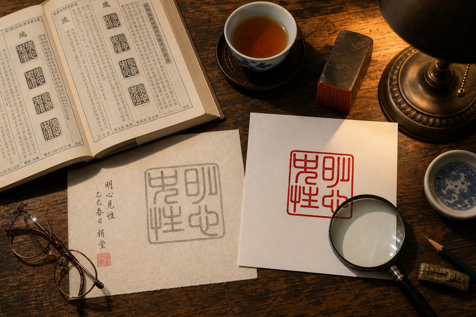
A practical tip: after flipping your design, check each character individually against a seal script dictionary. Some characters have subtle asymmetries, a hook that extends left rather than right, a dot positioned on one specific side, that become errors when mirrored incorrectly. Characters that appear symmetrical at a glance often are not. The character zhong (middle) looks symmetrical but its internal strokes in seal script may lean slightly. Catching these details before you stamp the chop saves you from printing a permanent mistake.
If you have followed each step to this point, your design exists as a verified mirror-image layout ready for fabrication. What separates a confident result from a nervous one is knowing where the common pitfalls hide, the mistakes that trip up beginners even after they have made all the right structural decisions.
Step 6 Avoid Common Beginner Design Mistakes
Every pitfall in chinese chop design leaves a visible trace in the final impression. Unlike a digital file you can quietly revise, a stamped seal broadcasts its flaws every time red ink meets paper. The mistakes below show up repeatedly in beginner work, and each one undermines either authenticity, legibility, or both. Treat this as a pre-flight checklist before you commit your design to stone, wood, or any other material.
Character and Script Mistakes That Break Authenticity
These errors signal to knowledgeable viewers that the designer did not understand the cultural and historical conventions behind seal making. A custom chinese chop loses its credibility the moment an informed eye spots an anachronism or a character-level blunder.
- Mistake: Using simplified characters in a seal script design. Simplified characters date from the 1950s. Placing them inside Xiaozhuan or Dazhuan script is a historical contradiction that any educated Chinese speaker will notice immediately. Correction: Always use traditional (full-form) characters when working in seal script styles. Reserve simplified characters for Kaishu or modern stylized seals where they belong chronologically.
- Mistake: Choosing a script style that conflicts with the chop type. A formal name seal carved in a playful modern style looks unserious. A leisure chop rendered in rigid Xiaozhuan feels stiff and humorless. Correction: Match formality to function. Xiaozhuan for name seals, Lishu or Kaishu for studio chops, and creative freedom only for leisure seals.
- Mistake: Using incorrect character variants for the chosen script era. Each script style has its own historically attested forms. A character written in its modern Kaishu structure but dressed up with curvy strokes to "look like" seal script is not actual seal script. Correction: Look up each character in a seal script dictionary such as the Shuowen Jiezi or a dedicated zhuanzi reference. Use the attested historical form, not a modern character with decorative styling.
- Mistake: Mixing script styles within a single seal. One character in Xiaozhuan and another drifting toward Lishu creates visual incoherence. Correction: Commit to one script style for all characters. Consistency signals intentionality.
Composition Errors That Weaken Visual Impact
Even with the right characters in the right script, a chinese stamp chop can still fall flat if the spatial arrangement is poorly handled. These composition mistakes reduce legibility and make the impression look amateurish regardless of how carefully the characters were selected.
- Mistake: Ignoring stroke density balance between characters. A one-stroke character sitting next to a sixteen-stroke character without any compensation creates a lopsided impression, one cell looks empty while the other looks congested. Correction: Thicken strokes on simple characters, allow slight grid shifts, or elongate strokes decoratively so all characters carry comparable visual weight.
- Mistake: Making borders too thin relative to character strokes. A hairline border around bold strokes looks fragile and accidental, as if the frame cannot contain its contents. Correction: Match border width to average stroke width. The border should feel like it belongs to the same visual family as the characters inside it.
- Mistake: Making borders too thick relative to character strokes. An overly heavy border steals space from the characters, cramping them and making the seal feel like a picture frame that overwhelms the painting. Correction: If your border dominates, reduce it until the characters have room to breathe. The content should command attention, not the frame.
- Mistake: Failing to verify the mirror image before fabrication. Designing in correct reading orientation and then forgetting to flip, or flipping incorrectly, produces a seal that prints backward. This is the most expensive beginner error because it wastes material entirely. Correction: Use at least two independent verification methods (mirror check, digital flip, translucent paper) before transferring your design to the carving surface.
- Mistake: Incorrect reading order in the grid layout. Placing characters left to right instead of the traditional right to left, top to bottom sequence. A four-character seal read in the wrong order spells a different phrase or nonsense. Correction: Always arrange characters top to bottom, right column first. Double-check by reading your mirrored design in the traditional direction.
Notice a pattern? Most of these mistakes stem from applying modern assumptions to a traditional art form. Modern text reads left to right, uses simplified characters, and treats all fonts as interchangeable. Seal design operates under older rules. The fix is almost always the same: slow down, consult historical references, and verify before you commit.
Catching these errors yourself is valuable, but a second pair of eyes, especially one trained in Chinese calligraphy or seal carving, catches what self-review misses. The question becomes where to find that feedback and how to evaluate whether your design is truly ready for production.
Step 7 Validate Your Design Before Fabrication
You have a complete design on paper or screen: characters verified, script style consistent, composition balanced, mirror image confirmed. It feels ready. But here is the thing about seal design: you are too close to it. After hours of adjusting stroke weight and grid proportions, your eyes stop catching what a fresh viewer would notice in seconds. Validation is not a sign of uncertainty. It is how skilled practitioners have always worked.
Verification before fabrication is how professionals work regardless of skill level. Even master carvers with decades of experience seek a second opinion on character accuracy before blade touches stone.
Where to Get Expert Feedback on Your Design
A personalized chinese chop carries your identity every time it meets paper. Getting feedback from the right people protects that identity from embarrassing errors. Not every source of feedback is equally useful, though. You want reviewers who understand both the linguistic and the aesthetic dimensions of seal design.
- Chinese calligraphy and seal-carving forums. Online communities dedicated to chinese seal carving are surprisingly welcoming to learners. Post your design with context about your intent, the script style you chose, and what the characters mean. Experienced members will flag character errors, awkward combinations, or composition issues you missed. Reddit communities like r/ChineseCalligraphy and dedicated WeChat groups serve this purpose well.
- University East Asian studies departments. Faculty and graduate students in Chinese language, art history, or classical studies programs can evaluate your character choices for accuracy and cultural appropriateness. Many departments have bulletin boards or informal channels where you can request a quick review. This is especially valuable for catching connotation problems that dictionaries do not surface.
- Native Chinese speakers with classical literacy. A bilingual coworker might catch a typo, but seal validation requires someone familiar with traditional characters, seal script forms, and naming conventions. Seek out calligraphy practitioners, Chinese literature scholars, or older native speakers educated in traditional script.
- Professional seal carvers (even if you plan to self-fabricate). Many carvers offer design consultation separately from carving services. Paying for a fifteen-minute review of your layout is far cheaper than recarving a ruined stone. A good carver will assess character accuracy, script consistency, and compositional balance in a single pass.
When presenting your design for review, provide both the correct-reading version and the mirrored version. Explain which script style you used and why. The more context you give reviewers, the more specific and useful their feedback will be.
How to Evaluate and Commission a Professional Carver
Maybe you have validated your design and feel confident about the characters and composition but want a professional hand for the actual carving. Or maybe you want to commission a chinese seal from scratch, handing off both design and fabrication. Either way, choosing the right carver matters enormously. A high-quality seal, as seal carving experts note, shows precise and balanced contrast between engraved and relief areas, reflecting deep knowledge of scholarship and aesthetics.
Here is what to look for when evaluating a carver:
- Portfolio depth: Review their past work across multiple script styles and seal types. Look for consistency in stroke quality, clean negative space, and balanced compositions. A carver who only shows one style may lack range.
- Communication about script choices: A reputable carver asks questions before cutting. They want to know your purpose, your preferred script style, and whether you have verified your characters. If someone accepts your order without any discussion, treat that as a warning sign.
- Willingness to explain design rationale: Good carvers can articulate why they recommend a particular layout, border weight, or character variant. They educate you during the process rather than treating the commission as a black box.
- Proof or draft stage: Professional carvers typically provide a design proof, either a hand-drawn sketch or a digital rendering, before carving begins. This gives you one final chance to catch errors or request adjustments. Carvers who skip this step are cutting corners.
- Material knowledge: Ask what stone they recommend and why. A carver who discusses stone hardness, grain direction, and how material affects line quality demonstrates craft awareness beyond just lettering.
Whether you self-fabricate or commission the work, your design is ready for production when it passes three gates: an independent reviewer has confirmed character accuracy, the composition holds up in both mirrored and correct-reading orientations, and you can articulate why you made each design choice. If someone asks why you chose Xiaozhuan over Kaishu, or why your border is that particular width, you should have a clear answer. That clarity is the difference between a seal you stamp with confidence and one that makes you hesitate every time you reach for the ink paste.
With validation complete, the entire design workflow stands behind you as a series of deliberate, informed decisions. What remains is translating that validated design into a physical object, a process that varies by fabrication method but rests on the same foundation you have built step by step.
Step 8 Bring Your Chinese Name Chop Design to Life
Seven deliberate decisions now stand between you and a seal that embarrasses you in ink. Character selection, script style, Yin or Yang, grid composition, mirror verification, error checking, and expert validation. None of these required artistic talent. They required informed choices, patience, and a willingness to consult people who know more than you do. That is the real lesson here: good seal design is a research and decision-making process, not a drawing exercise.
Your Complete Design Workflow at a Glance
Whether you plan to make a chinese chop by hand-carving soapstone in your studio, send a vector file to a CNC router, export an STL for 3D printing, commission a laser engraving service, or hire a professional chinese chop maker to handle everything, the upstream design work is identical. Fabrication methods differ in tooling and material. They do not differ in what constitutes a well-designed seal. Here is the full workflow condensed into a single reference list:
- Choose your seal type. Name chop, studio chop, or leisure chop. This determines formality, shape, and content expectations.
- Select your characters. Full name, art name, or transliterated name. Verify meaning, connotation, and cultural appropriateness with a knowledgeable native speaker.
- Pick a script style. Xiaozhuan for traditional name seals, Kaishu for legibility, or other styles matched to your chop type. Use traditional character forms when working in historical scripts.
- Decide Yin or Yang. White characters on red for formal weight, red characters on white for elegance and legibility. Consider designing a matched pair for artwork use.
- Compose the layout. Assign characters to a grid based on count. Balance stroke density, manage negative space, and set border thickness to match stroke weight.
- Mirror and verify. Flip the entire design. Confirm accuracy using at least two independent methods before transferring to any material.
- Check for common mistakes. Scan for simplified characters in seal script, mismatched styles, incorrect reading order, and unbalanced borders.
- Validate with outside eyes. Get feedback from calligraphy communities, native speakers, or professional carvers. Confirm the design passes all three gates: character accuracy, compositional integrity, and clear design rationale.
Taking Your Design From Paper to Finished Chop
Treat this workflow as iterative, not linear. Learning more about script styles might send you back to reconsider your character choices. Seeing your composition in mirror might reveal a balance problem you want to fix at the grid stage. A diy chinese seal project benefits from this looping. Each pass through the steps refines your understanding and tightens the result.
The fabrication method you choose is a separate decision entirely, and it does not change what makes a design good. A hand-carved seal and a laser-engraved seal are judged by the same criteria: correct characters, appropriate script, balanced composition, and cultural coherence. The tool that removes material is just the last mile. Everything that matters happened before you picked it up.
Frequently Asked Questions About Designing a Chinese Name Chop
1. What is the difference between a Yin seal and a Yang seal?
A Yin seal (Baiwen) carves the characters into the stone so the background prints red and the characters appear white. A Yang seal (Zhuwen) carves away the background, leaving raised characters that print red on a white surface. Yin seals carry more visual weight and are traditionally used for formal name chops, while Yang seals feel lighter and suit art names or leisure seals. Many artists use a matched pair of both styles on their artwork for visual balance.
2. Can I use my English name on a Chinese chop?
You cannot use English letters on a traditional Chinese chop, but you can transliterate your English name into Chinese characters that approximate its sound. For example, 'Michael' might become characters pronounced 'Mai-ke-er.' Alternatively, you can choose a meaningful Chinese name with characters selected for their meaning and tonal beauty rather than phonetic similarity. The meaningful name approach produces a more culturally authentic result but requires guidance from a native speaker familiar with Chinese naming conventions.
3. What script style should I use for my first Chinese name seal?
Xiaozhuan (lesser seal script) is the recommended choice for a first name seal. It has been the standard seal script since the Qin Dynasty and is immediately recognizable as traditional seal carving. Its uniform character sizes and flowing curves look unmistakably like a seal impression. If legibility is your priority and you want modern readers to easily read your name, Kaishu (regular script) is a solid alternative. Avoid using simplified characters in seal script styles, as this creates a historical anachronism.
4. How many characters should a Chinese name chop have?
Most name chops contain two to four characters. A full Chinese name (surname plus given name) typically uses two or three characters. Many seal designers add conventional filler characters like 'yin' (seal) or 'zhi yin' (seal of) to reach four characters, which fits the classic 2x2 square grid layout perfectly. Studio chops and leisure chops can contain more characters, with six-character seals using a 2x3 rectangular grid. The character count determines your grid configuration and seal shape.
5. Why does a Chinese chop design need to be mirrored?
The carved surface of a chop contacts ink paste and transfers the image onto paper, just like a rubber stamp. If the characters on the carving surface read normally, they will print backward on paper. Every chop must be carved as a mirror image so the final stamped impression reads correctly. You can verify your mirror layout by holding the design up to a mirror, tracing it on translucent paper and flipping it, using a digital horizontal flip tool, or applying the traditional wet-ink transfer method directly onto the stone.