Planning Your Bilingual Chinese-English Business Card
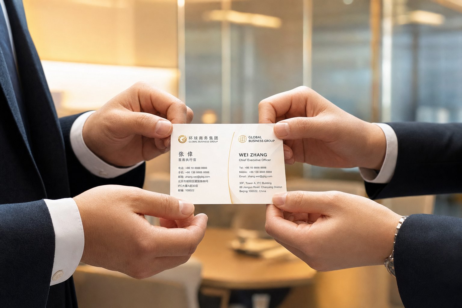
Imagine handing your business card to a potential partner in Shanghai, only to watch them politely flip it over, find nothing they can read, and tuck it away without a second glance. In Chinese business culture, a card is far more than contact details on paper. It represents "face" (mianzi), a concept tied to honor, respect, and social standing. A bilingual Chinese-English business card signals that you take the relationship seriously enough to meet your counterpart in their own language.
Why You Need a Bilingual Chinese-English Business Card
China remains one of the world's largest trading economies, and cross-border business interactions happen daily across industries from real estate to manufacturing. A professionally translated card demonstrates commitment to building lasting relationships. One Australian business delegation discovered this firsthand at a trade fair in Guangdong, where competitors with professionally translated bilingual cards made noticeably stronger impressions on potential Chinese partners. After investing in their own Chinese-English dual language business card, the team forged several valuable partnerships that led to successful market expansion.
The practical benefits are straightforward. Your Chinese counterparts can read your name, title, and company without guessing. They can pronounce your name correctly. And they can immediately understand your seniority and role, something Chinese decision-makers prioritize when evaluating whether they are meeting the right person.
Who This Guide Is For
This bilingual Chinese English business card guide serves two primary audiences. First, Western professionals preparing for doing business in China who need a card that Chinese contacts will respect and actually use. Second, Chinese professionals creating bilingual cards for international contexts, where English-language details need to sit comfortably alongside Chinese text.
Regardless of which side you are coming from, the creation process involves the same core decisions. Here is what you will work through in this guide:
- Choosing between Simplified and Traditional Chinese characters based on your target region
- Translating your name, title, and company details accurately
- Selecting a layout architecture (dual-sided, side-by-side, or vertical)
- Pairing Chinese and English fonts for visual balance
- Applying culturally appropriate colors and design elements
- Formatting contact details and integrating digital tools like WeChat QR codes
- Preparing print-ready files and proofing for errors
Most resources on this topic stop at general advice: "get a translator" or "use red for good luck." They skip the actual workflow. This guide walks you through every step from planning to print-ready file, regardless of whether you design in Canva, Illustrator, or hand it off to a print shop. The first decision you will face, and one that shapes everything else on the card, is which Chinese script to use.

Step 1 – Decide Between Simplified and Traditional Chinese
Which Chinese characters should appear on your business card? This is not a stylistic preference. It is a regional and cultural signal that tells your recipient whether you understand their market. Use the wrong script, and you risk looking uninformed before the conversation even starts.
Chinese has two written forms in active use today: Simplified and Traditional. Both convey the same language, but they differ in stroke complexity, regional adoption, and cultural associations. Your choice depends entirely on where your business contacts are located.
Simplified Chinese vs Traditional Chinese Regional Guide
Simplified Chinese was introduced in Mainland China during the 1950s and 1960s to boost literacy rates. The reform reduced the number of strokes in 2,238 characters, making them faster to write and easier to learn. This effort was remarkably successful. As Guildhawk notes, the simplification helped elevate China's literacy rate from roughly 20% to 98%. Simplified Chinese is the standard script in Mainland China and Singapore, used across government, media, education, and business.
Traditional Chinese preserves the intricate character structures that date back centuries. These characters carry strong cultural and historical significance in the regions that use them: Taiwan, Hong Kong, and Macau. Many people in these areas view traditional characters as a direct link to their heritage and identity. If you are building relationships in Taipei or meeting investors in Hong Kong, Traditional Chinese is what they expect to see on your card.
Here is a quick comparison to clarify the differences:
| Region | Character Style | Example Characters | When to Use |
|---|---|---|---|
| Mainland China | Simplified | 商业 (business), 翻译 (translate) | Primary contacts in the PRC; trade fairs, manufacturing, tech partnerships |
| Singapore | Simplified | 开 (open), 闭 (close) | Business dealings in Singapore's Chinese-speaking community |
| Taiwan | Traditional | 商業 (business), 翻譯 (translate) | Partnerships, conferences, or clients based in Taiwan |
| Hong Kong | Traditional | 開 (open), 閉 (close) | Finance, legal, and trade contacts in Hong Kong |
| Macau | Traditional | 龜 (turtle), 髮 (hair) | Hospitality, gaming, and business contacts in Macau |
| Overseas Chinese communities | Mixed | Varies by community origin | Research the specific community; older diaspora often prefers Traditional, newer immigrants from Mainland China use Simplified |
Notice the visual difference between the two scripts. The Traditional character for "translate" (翻譯) uses significantly more strokes than its Simplified counterpart (翻译). On a business card where space is limited, this also affects how much room your Chinese text needs.
How to Choose the Right Script for Your Audience
Think of this as a decision tree. Ask yourself one question: where are the people I am handing this card to?
- If your primary contacts are in Mainland China or Singapore, use Simplified Chinese. This is the script used in government documents, corporate communications, and everyday business there.
- If your primary contacts are in Taiwan, Hong Kong, or Macau, use Traditional Chinese. Using Simplified characters in these regions can come across as tone-deaf to local cultural identity.
- If your contacts span both regions, consider printing two versions of your card. One set with Simplified for Mainland contacts, another with Traditional for Taiwan and Hong Kong. The cost difference is minimal compared to the impression it makes.
One important nuance: the American Translators Association points out that even within the same script, regional differences exist. Traditional Chinese in Taiwan can differ slightly from Traditional Chinese in Hong Kong because different spoken dialects influence word choice and terminology. A card designed for Taiwanese contacts might use slightly different phrasing than one for Hong Kong, even though both use Traditional characters. If precision matters for your business context, work with a translator native to your specific target region.
Also keep in mind that this choice affects more than just the characters on your card. It determines which fonts you can use, how your translator approaches the work, and even subtle differences in how your job title gets phrased. Getting the script right at this stage saves you from costly reprints and awkward corrections later. With your character set locked in, the next challenge is deciding how your name, title, and company details will read in Chinese, a process with more options than you might expect.
Step 2 – Translate Your Name and Professional Details
Your name is the centerpiece of any business card. But putting a Western name in Chinese characters is not as simple as running it through a translation app. Chinese is a tonal language where every character carries meaning, so the characters chosen to represent your name will inevitably say something beyond just the sound. Pick the wrong ones, and you could end up with a name that sounds awkward, carries negative connotations, or even provokes a quiet laugh from your Chinese counterpart.
Three Approaches to Chinese Name Translation
When figuring out how to translate an English name to Chinese for a business card, you have three distinct paths. Each has its place depending on your relationship with the Chinese market and how deeply you want to localize.
1. Transliteration (phonetic rendering)
This is the most common approach: selecting Chinese characters whose pronunciation approximates the sound of your English name. For example, "Thomas" becomes 托马斯 (tuo ma si) and "Jack" becomes 杰克 (jie ke). The result is recognizable to English speakers who see the pinyin, and Chinese readers can pronounce something close to your original name.
The catch? As Yoyo Chinese explains, Chinese can only represent syllables as concrete blocks of sound, not as fluid combinations of letters. This means transliterated names often sound neither like the original nor like authentic Chinese names. They immediately mark you as foreign, which is fine for short-term business trips but less ideal if you want to build long-term relationships where a more natural-sounding name helps.
2. Semantic translation (meaningful characters)
This technique involves choosing characters with positive meanings that may loosely relate to your original name's sound or meaning. Think of how Western brands approach the Chinese market: Long Advisory notes that some companies select characters with good meanings related to their product or values, independent of phonetic similarity. The same principle applies to personal names. A translator might select characters that sound vaguely like your name while also conveying qualities like wisdom, trustworthiness, or prosperity.
This approach works well for professionals who spend significant time in China and want a name that feels natural in conversation. The downside is that it requires cultural expertise to get right. Choosing characters based on a dictionary alone can backfire spectacularly, as one language learner discovered when he named himself "Golden Skill Universe" (金才宇) based on characters he liked individually, only to face awkward reactions at every introduction.
3. Keeping the romanized name as-is
Some professionals simply print their English name on both sides of the card without any Chinese character equivalent. This is perfectly acceptable for initial business contacts, especially if you do not yet have a professionally chosen Chinese name. Your Chinese counterparts will use your English name or create their own informal transliteration when referring to you.
When is this the right call? If you are unsure about character choices and do not have access to a native speaker for guidance, leaving your name in Roman letters is far better than printing an embarrassing or meaningless transliteration. You can always add a Chinese name to future card printings once you have one properly selected.
Always have a native Chinese speaker review your name translation before printing. Every character carries centuries of cultural weight, and combinations that look fine in a dictionary can carry unintended connotations that only a native reader would catch.
Translating Job Titles and Company Names
Your name is only one piece of the puzzle. Job titles, company names, and taglines all need careful translation, and the way you arrange them matters just as much as the words themselves.
Here is a key cultural difference to understand: Chinese business cards typically present information in the order of Company, then Title, then Name. Western cards usually lead with the individual's name, followed by title and company. This reflects a deeper cultural value. In Chinese business culture, your organization and your role within it establish your credibility before your personal identity does. Your business card should include your title, and if your company holds a notable distinction like being the oldest or largest in its sector, that information carries weight too.
How do you reconcile these two hierarchies on a bilingual card? The most practical solution is to let each language side follow its own cultural convention. On the English side, lead with your name. On the Chinese side, lead with your company name. This way, each audience reads the card in the order that feels natural to them.
For translating job titles into Chinese, keep these points in mind:
- Common titles have well-established translations. "CEO" is typically 首席执行官, "Marketing Director" is 市场总监, and "Vice President" is 副总裁.
- Niche or creative titles (like "Growth Hacker" or "Chief Happiness Officer") may not have standard Chinese equivalents. A translator will need to convey the role's function rather than translate literally.
- Company names can follow the same three approaches as personal names: transliteration, semantic translation, or a combination. Many multinational companies already have established Chinese names. Check whether yours does before creating a new one.
- Taglines and slogans should be adapted for meaning, not translated word-for-word. Idioms and wordplay rarely survive direct translation.
The translation work you invest here directly shapes how your card reads and feels to a Chinese professional. A well-translated title communicates competence. A poorly translated one raises doubts. With your content finalized in both languages, the next decision is how to physically arrange all of this information on the card itself.
Step 3 – Choose Your Card Layout Architecture
Two languages, one small rectangle. How you arrange Chinese and English text on that limited real estate determines whether both sides of your audience can read the card comfortably or whether one language ends up feeling cramped and secondary. The best layout for a two language business card depends on how you plan to use it, who receives it first, and how much visual breathing room each script needs.
There are three primary bilingual business card layout options, each with distinct advantages and trade-offs. Let's break them down.
Dual-Sided Layout for Maximum Readability
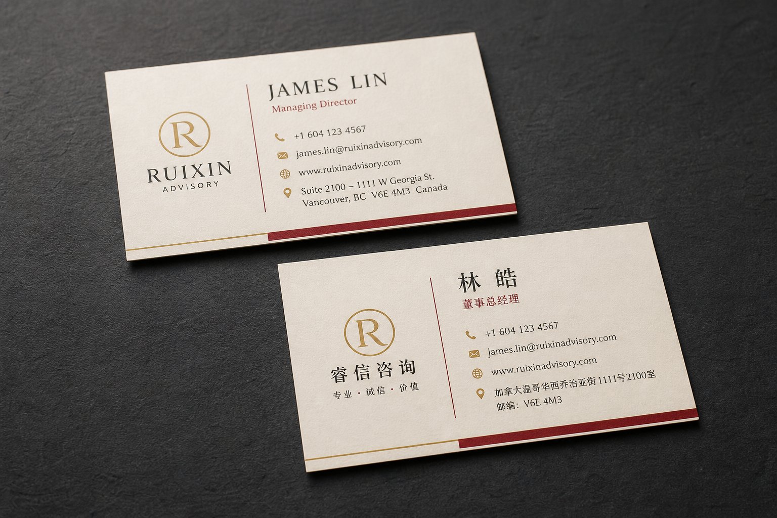
The most popular approach for a dual sided Chinese English card design is straightforward: English on one face, Chinese on the other. Each language gets the full card surface to itself, which means no compromises on font size, spacing, or information density.
Why does this work so well? Chinese characters are visually denser than Latin letters. They occupy more vertical and horizontal space per unit of meaning. When you give each language its own side, you can optimize the typography, alignment, and hierarchy independently. The English side follows Western conventions (name first, left-aligned or centered). The Chinese side follows Chinese conventions (company first, potentially different alignment). Neither language competes with the other for attention.
The trade-off is practical: your recipient has to flip the card to see the other language. In a fast-paced networking event, that extra motion means one side gets seen first and the other might not get seen at all. Still, this is the layout most professionals choose, and the one most print services default to.
Side-by-Side and Vertical Layout Options
Side-by-side on one face
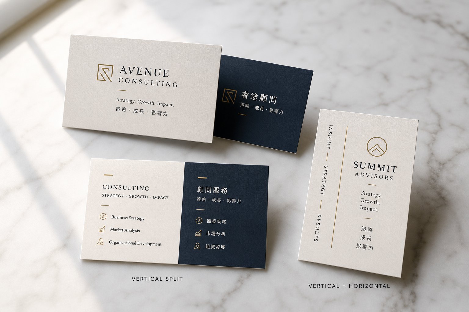
Imagine splitting the card vertically down the middle. English on the left, Chinese on the right (or vice versa). Both languages are visible at a glance without flipping. This works well for professionals who frequently hand cards to bilingual audiences or in settings where both languages need immediate visibility, like international conferences with mixed attendees.
The downside? You are cutting your usable space in half for each language. Font sizes shrink, and you may need to trim secondary details like taglines or secondary phone numbers. If your job title is long in either language, things get tight fast.
Vertical Chinese paired with horizontal English
Traditional Chinese text can be written vertically, reading top to bottom and right to left. Pairing vertical Chinese columns with horizontal English text creates a visually striking card that immediately signals cultural sophistication. You will occasionally see this on cards from creative industries, luxury brands, or professionals who want their card to stand out in a stack.
However, this layout is the most complex to execute well. Vertical Chinese text requires careful character spacing, and aligning it harmoniously with horizontal English demands strong design skills. It also feels less familiar to younger Chinese professionals who are accustomed to horizontal text in digital contexts. Reserve this option for situations where visual impact matters more than universal readability.
Here is a comparison to help you decide:
| Layout Type | Pros | Cons | Best For |
|---|---|---|---|
| Dual-sided (English front, Chinese back) | Full space for each language; independent typography optimization; clean and professional | Recipient must flip card; one side may go unread | Most business contexts; first-time visitors to China; formal corporate settings |
| Side-by-side on one face | Both languages visible simultaneously; no flipping needed | Reduced space per language; smaller font sizes; limited room for details | Bilingual conferences; multicultural offices; professionals who network across both markets daily |
| Vertical Chinese + horizontal English | Visually distinctive; signals cultural awareness; artistic appeal | Complex to design; less familiar to younger readers; harder to align elements | Creative industries; luxury sectors; professionals prioritizing memorable first impressions |
Getting the Card Dimensions Right
Before you commit to a layout, you need to settle on physical dimensions. This is where many people trip up, because Chinese and Western standards are not identical.
The standard US and Canadian business card measures 3.5 x 2 inches (89 x 51mm). The Chinese standard is slightly larger at 3.56 x 2.15 inches (approximately 90 x 54mm). The difference is small, just a couple of millimeters in each direction, but it matters for two reasons.
First, if your card is destined for Chinese cardholders and wallets, a card cut to the smaller US size will sit loosely and look slightly undersized next to local cards. Second, those extra millimeters give you meaningful breathing room for Chinese characters, which need more space than Latin text to remain legible at small sizes.
Here is the practical recommendation: if your primary audience is in China, use the Chinese standard dimensions (90 x 54mm). If you need the card to work equally well in both markets, the Chinese standard still works. It fits comfortably in Western cardholders and does not look oversized. The US standard, on the other hand, can feel slightly cramped when you are fitting two languages worth of content onto it.
For dual-sided layouts, dimensions matter less because each side has full space. For side-by-side layouts, every millimeter counts. Going with the slightly larger Chinese business card dimensions and size gives your designer more room to balance both languages without sacrificing readability.
With your layout architecture and dimensions locked in, the visual personality of your card comes down to one of the most underestimated decisions in bilingual design: which fonts carry your words in each language, and how to make them look like they belong together.
Step 4 – Pair Chinese and English Fonts Effectively
Fonts do the heavy lifting on a business card. With so little space, every character needs to be instantly legible and visually cohesive. The challenge with bilingual card typography and spacing is that Chinese and Latin scripts are fundamentally different writing systems. They were never designed to sit side by side, yet that is exactly what your card demands. Choosing the right pairing makes both languages feel intentional and unified. A poor pairing makes one language look like an afterthought.
Recommended Chinese and English Font Pairings
The simplest principle for pairing Chinese and English fonts? Match the structural mood. As justfont explains, MingTi (the serif-like category in Chinese type) pairs naturally with Latin serif fonts, while HeiTi (the sans-serif equivalent) works well with Latin sans-serif typefaces. This "like with like" approach is a reliable starting point that almost always produces a professional result.
For business cards specifically, you want fonts that remain crisp and readable at small sizes. Here are the best Chinese fonts for business cards and their ideal English companions:
- Noto Sans CJK + Helvetica Neue — A clean, modern pairing that works across industries. Noto Sans CJK covers both Simplified and Traditional characters, making it versatile if you print cards for multiple regions. Helvetica Neue's neutral geometry complements the even stroke weight of Noto Sans.
- Microsoft YaHei + Segoe UI — Optimized for screen use but equally sharp in print. YaHei's slightly rounded strokes give a friendly, approachable feel that pairs well with Segoe UI's humanist proportions. Ideal for tech companies and startups.
- SimSun + Garamond — A formal, traditional pairing. SimSun's structured strokes echo the classic elegance of Garamond's serifs. This combination signals established authority, making it well-suited for law firms, financial services, and government-related roles.
- KaiTi + Baskerville — KaiTi mimics brush-written calligraphy with a refined, literary quality. Paired with Baskerville's transitional serif style, this combination conveys cultural sophistication without feeling overly ornate. Works well for consulting, education, and cultural organizations.
- Source Han Sans + Futura — A geometric, design-forward pairing. Source Han Sans (the Adobe counterpart to Noto Sans CJK) shares the same Pan-CJK coverage and pairs beautifully with Futura's clean geometric shapes. Strong choice for creative agencies and architecture firms.
Notice that several of these Chinese fonts, particularly Noto Sans CJK and Source Han Sans, are Pan-CJK typefaces. They contain glyphs for both Simplified and Traditional scripts, which means you can use the same font family across different regional versions of your card. SimSun and Microsoft YaHei, on the other hand, are designed specifically for Simplified Chinese. If you chose Traditional characters in Step 1, look to Microsoft JhengHei or MingLiU as alternatives in the same stylistic categories.
Sizing and Spacing Rules for Dual-Language Text
Here is where most DIY bilingual cards go wrong. You set both languages at 9pt, export the file, and the Chinese text looks noticeably smaller than the English. What happened?
The issue is structural. CJK fonts are monospaced, meaning each character occupies the same fixed-width square, filling the entire em-square. Latin fonts are proportional, with narrow letters like "i" taking less space than wide ones like "m." When you set both scripts at the same point size, the Latin text's ascenders and descenders create visual height, while Chinese characters sit compactly within their squares. The result is that Chinese appears smaller even though the technical size is identical.
The fix is straightforward: set your Chinese text 1-2 points larger than your English text. If your English name is at 9pt, try the Chinese at 10 or 11pt. This compensates for the optical difference and brings both scripts into visual balance. On a business card where the font size for Chinese characters is already small, this adjustment is the difference between legible and squinting.
Spacing needs attention too. Chinese characters do not use spaces between words, and their uniform square structure means line spacing behaves differently than in English. Typotheque's typesetting research recommends a line-height of around 1.7 for CJK text compared to the standard 1.2 for Latin text. On a business card, you are unlikely to have multi-line paragraphs, but if your address or company name wraps to a second line, give the Chinese version more generous leading than you would for the English equivalent.
A few additional spacing considerations for bilingual cards:
- Chinese characters align along their optical center rather than a baseline, so vertical alignment between the two scripts requires manual adjustment rather than relying on automatic text alignment.
- Because CJK characters are uniformly wide, a Chinese company name with fewer characters can appear visually shorter than its English equivalent, even if both carry the same meaning. Adjust tracking or layout positioning to keep things balanced.
- Avoid mixing Chinese and English text on the same line unless absolutely necessary. Each script reads more naturally in its own text block with its own optimized spacing.
One final recommendation before moving on: print a test copy at actual size. Fonts that look perfectly balanced on a 27-inch monitor can tell a very different story on a 90 x 54mm card. Print on standard paper, hold it at arm's length, and check whether both languages read clearly without effort. If you find yourself tilting the card or squinting at the Chinese characters, bump the size up another point. Your card will be read in conference rooms, dim restaurants, and quick hallway exchanges. Legibility at a glance is non-negotiable.
With your fonts paired and sized correctly, the next layer of visual identity comes from color, a choice that carries far more cultural weight in Chinese business contexts than most Western professionals realize.
Step 5 – Apply Culturally Appropriate Colors and Design
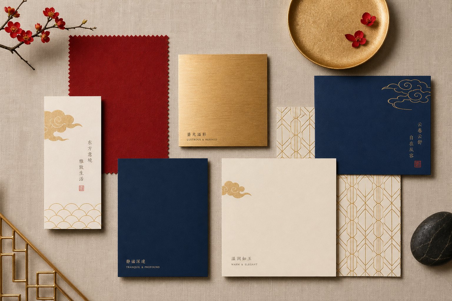
Color is never just decoration on a business card headed for Chinese hands. In Chinese culture, colors function almost like a second language, carrying symbolic meanings passed down through generations that can shape a recipient's first impression before they even read your name. Making cross cultural business card color choices without understanding this symbolism is like writing your title in the wrong script: it signals a lack of awareness.
Chinese Color Symbolism and Card Design
Each major color triggers specific cultural associations in China, rooted in the Five Elements theory (Wu Xing) that links colors to natural forces and philosophical concepts. Here is how the most common card colors read to a Chinese professional:
- Red — Symbolizes joy, good fortune, and prosperity. Linked to the Fire element, red is the most auspicious color in Chinese culture. A red accent on your card signals positive energy and respect for Chinese traditions. Use it for borders, logo highlights, or subtle design elements.
- Gold — Represents wealth, success, and high status. Gold carries imperial associations and conveys premium quality. Even a small gold foil detail or metallic accent communicates prestige and good fortune.
- White — Associated with purity but also with mourning and funerals. An all-white card with no color accents can feel stark or inauspicious. Use white as a background, but pair it with warmer, luckier tones rather than letting it dominate.
- Black — Conveys authority, elegance, and sophistication in modern contexts. However, excessive black without balancing elements can feel somber or cold. Black works well for luxury positioning when paired with gold or red accents.
- Blue — Signals trust, calm, and professionalism. Blue carries almost entirely positive associations in China and is one of the safest colors to use without cultural risk. It works particularly well for finance, tech, and healthcare.
- Green — Represents growth, health, and vitality. Generally positive for business contexts, but avoid using it on any hat-shaped design elements. The phrase "wearing a green hat" implies infidelity in Chinese culture, a taboo that extends to visual associations.
Creating a Color Palette That Works Across Cultures
The goal is not to redesign your entire brand identity around Chinese symbolism. Instead, think of it as adding culturally appropriate colors for your Chinese business card while keeping your existing professional aesthetic intact. A red and gold business card design for China does not mean plastering the card in crimson. A single red rule line, a gold-foil logo, or a deep red accent on the Chinese-language side can be enough to signal cultural respect without overwhelming your Western branding.
Industry context matters here too. Finance and legal professionals tend to gravitate toward navy paired with gold accents, a combination that reads as authoritative in both cultures. Tech companies and startups often do well with clean blues or minimalist black-and-white palettes accented with a single warm tone. Creative industries have more latitude to use bolder reds or rich purples, which carry connotations of nobility and creativity in Chinese culture.
One practical approach: keep your English-facing side aligned with your existing brand colors, then introduce one or two culturally resonant accents on the Chinese-facing side. This lets each audience encounter a palette that feels natural to them. If your brand already uses red, blue, or gold, you are in luck. Those colors translate positively across both markets without any adaptation needed.
Avoid one common misstep: do not use large areas of unbroken white paired with black text as your only design choice. While minimalism is trendy in Western design, a stark white card with black text can inadvertently echo funeral aesthetics in Chinese culture. Even a subtle warm-toned accent, a cream background instead of pure white, or a thin colored border is enough to shift the perception entirely.
With your color palette set, the next layer of your card involves the practical details that make it actually useful: phone numbers formatted for international dialing, addresses in both languages, and the digital networking tools that Chinese professionals increasingly expect to find.
Step 6 – Format Contact Details and Add Digital Elements
A beautifully designed bilingual card loses its purpose if your Chinese contact cannot figure out how to dial your number or connect with you online. Formatting international contact details on a bilingual card requires more than just listing digits. You need to account for country codes, spacing conventions, and the digital networking tools each audience actually uses.
Phone Number and Address Formatting for International Cards
How should you format a phone number for a Chinese business card that works whether someone is dialing from Beijing or Boston? The answer is the E.164 international standard: a plus sign, followed by the country code, area code, and local number. This format ensures your number is dialable from anywhere in the world without guessing at trunk prefixes or exit codes.
Here is what this looks like in practice:
- US number: +1 212 555 0198 (country code +1, area code 212, local number)
- China number: +86 21 6888 8888 (country code +86, area code 21 for Shanghai, local number)
- UK number: +44 20 7946 0958 (country code +44, area code 20 for London)
If you have phone numbers in both countries, list both. Your Chinese contacts will appreciate having a local number they can reach without international dialing fees, and your Western contacts need a number that works from their side. Label them clearly: "China" and "US" (or the relevant countries) next to each number removes any ambiguity.
A few formatting rules to keep consistent:
- Always include the + sign and country code, even for local numbers. Someone receiving your card in a different country needs the full international format.
- Use spaces rather than dashes or parentheses to separate number groups. Spaces are universally readable and avoid confusion with mathematical notation in Chinese contexts.
- Keep the maximum length to 15 digits, which is the international standard ceiling.
- Drop leading zeros from area codes when writing in international format. Beijing's domestic code is 010, but internationally it becomes +86 10.
For addresses, present each version in its culturally correct order. English addresses read from specific to general: street, city, state, country. Chinese addresses read from general to specific: country, province, city, district, street, building number. Let each language side follow its own convention rather than forcing one order onto both.
Email addresses and website URLs stay the same on both sides since they are language-neutral. Position them consistently so recipients know exactly where to look regardless of which side they read first.
Integrating WeChat QR Codes as a Modern Networking Tool
Here is a reality that reshapes how you think about business card design for China: WeChat is not just a messaging app. It is the primary professional networking platform in the country. LinkedIn shut down its networking features in China in 2023, and its replacement InCareer also closed. WeChat filled that gap entirely. Adding a WeChat QR code to your business card for China networking is no longer a nice-to-have. It is what your Chinese contacts expect.
When someone scans your WeChat QR code, they can add you as a contact instantly, no typing required. This matters in fast-moving networking situations where fumbling with character input for a Chinese name or spelling out an email address kills momentum. A quick scan and you are connected.
Placement options for your WeChat QR code on a business card depend on your layout choice:
- Dual-sided cards: Place the QR code on the Chinese-language side, typically in the bottom-right corner or centered below your contact details. Some companies dedicate the entire back of the card to a large QR code for maximum scannability.
- Side-by-side layouts: Position the QR code in the Chinese half, near the bottom where it does not compete with text hierarchy.
- Minimal approach: A small QR code (at least 15 x 15mm) beside your phone number, labeled with the WeChat icon for instant recognition.
Sizing is critical. A QR code smaller than 15mm square becomes difficult for phone cameras to scan reliably, especially in low light. Aim for 20-25mm if your layout allows it. Ensure there is a quiet zone of at least 2mm of blank space around the code so the scanner can distinguish it from surrounding design elements.
To generate a permanent WeChat QR code, open WeChat, go to "Me," tap your profile photo, and select "My QR Code." Save this image at the highest resolution available. One important note: personal WeChat QR codes expire after a set period and refresh automatically. For a printed card, you want a code that remains scannable for months. Using a WeChat Official Account QR code solves this since those do not expire. If you are using a personal account, regenerate and verify your code is current before each print run.
What about your Western contacts who do not use WeChat? Include your LinkedIn URL or a LinkedIn QR code on the English-language side. This gives each audience their preferred networking channel without cluttering either side with irrelevant information. The dual-sided layout works particularly well here: WeChat QR on the Chinese side, LinkedIn details on the English side. Each recipient finds exactly what they need on the face designed for them.
With your contact details formatted and digital elements placed, the remaining steps involve turning all of these decisions into a file that a printer can actually produce cleanly, starting with the technical specifications that ensure nothing shifts, bleeds, or pixelates on press.
Step 7 – Design and Prepare Print-Ready Files
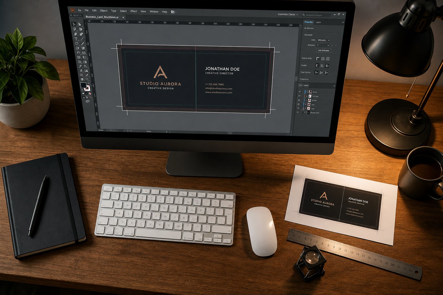
You have your translations finalized, your layout chosen, your fonts paired, and your colors selected. Everything exists as a plan. Turning that plan into a print ready bilingual business card file setup is where many people stumble, not because the design work is difficult, but because the technical requirements for professional printing are unforgiving. A file that looks perfect on screen can come back from the printer with cropped text, shifted colors, or fuzzy characters if the setup is wrong.
The good news? The technical steps are the same regardless of which software you use. Whether you are figuring out how to design a Chinese English business card in Canva, working in Adobe InDesign, or handing specifications to a print service, the underlying requirements do not change.
Setting Up Your Design File Correctly
Every print-ready business card file needs three things configured before you place a single character: correct dimensions, bleed area, and safe zone. Think of these as invisible boundaries that protect your design during the cutting process.
The trim line is your final card size, the exact edge where the cutter slices. If you settled on the Chinese standard dimensions from Step 3, that is 90 x 54mm. The bleed area extends beyond the trim line, giving the printer a margin of error during cutting. The safe zone sits inside the trim line, keeping your text and important elements away from the cut edge.
Why does this matter especially for bilingual cards? Chinese characters are dense and compact. If a character sits too close to the edge and the cut shifts even slightly, you can lose a stroke that changes the meaning entirely. The business card bleed and safe zone for Chinese text needs to be respected rigorously.
Here is the step-by-step file setup process that works across all design tools:
- Set your document dimensions with 3mm bleed on all sides. If your final card size is 90 x 54mm, your document canvas should be 96 x 60mm (adding 3mm to each of the four edges). In InDesign, enter this in the Bleed field during document creation. In Canva, use a custom size set to the full bleed dimensions. In Illustrator, set the artboard to trim size and add bleed in Document Setup. Standard bleed for business cards is 0.125 inches (3mm) per side.
- Create guides for the safe zone at 3mm inside the trim line. This means your usable design area shrinks to 84 x 48mm. All text, logos, QR codes, and critical elements must stay within this boundary. In InDesign, set Margins to 3mm during setup. In other tools, manually drag guides or use ruler measurements to mark this inner boundary.
- Place text elements for both languages in their designated areas. If you are using a dual-sided layout, set up two pages or artboards, one for each language. Position your Chinese text blocks and English text blocks according to the hierarchy decisions from earlier steps. Keep Chinese characters at least 5mm from any edge to account for their visual density.
- Embed fonts or convert text to outlines. This is critical for Chinese fonts, which may not be installed on your printer's system. In Illustrator, select all text and go to Type > Create Outlines. In InDesign, the PDF export process embeds fonts automatically when configured correctly. In Canva, fonts are embedded in the downloaded PDF by default. If you skip this step with Chinese typefaces, your carefully chosen characters could render as blank boxes or substitute fonts on the printer's end.
- Export as a print-ready PDF with correct settings. Use CMYK color mode, 300 DPI minimum resolution, and include crop marks and bleed marks. The preferred format for professional printing is PDF/X-1a, which flattens transparency and embeds all fonts, eliminating variables that could cause output errors.
For dual-sided cards, export the front and back as separate pages within the same PDF file, or as two individual files if your printer requires it. Label them clearly: "Front-English" and "Back-Chinese" (or whichever arrangement you chose) to avoid any mix-up during production.
Design Tools and Template Options
Your choice of design software does not change the print specifications, but it does affect how easily you can meet them. Here is how the most common tools handle bilingual card creation:
Adobe InDesign is the professional standard for print layout. It handles CJK text natively, offers precise control over bleed and margins, and exports PDF/X-1a directly. If you have access to it and some familiarity with layout software, this is the most capable option for bilingual typography.
Adobe Illustrator works well for single-page designs and gives you full control over text outlines and vector elements. It supports CJK fonts and exports print-ready PDFs with bleed. The main limitation is that multi-page documents (for front and back) require separate artboards.
Canva is the most accessible option for non-designers. You can set custom dimensions, upload your own Chinese fonts (on Pro plans), and download as PDF Print with crop marks and bleed. The trade-off is less precise typographic control. You cannot adjust CJK-specific spacing or baseline alignment with the same granularity as professional tools. Still, for a straightforward dual-sided layout, Canva produces perfectly usable results.
Microsoft Word can technically produce a business card, but it is not designed for print production. It defaults to RGB color, offers no bleed controls, and handles CJK font embedding inconsistently. If Word is your only option, design at the trim size and ask your printer whether they can add bleed during prepress. Many local print shops will accommodate this.
Professional print services with in-house design are worth considering if you want to skip the file preparation entirely. Many online printers that specialize in bilingual cards offer design services where you provide your translated content and they handle layout, typography, and file preparation. You review a proof, approve it, and they print. This adds cost but eliminates technical risk.
Regardless of your tool, these export settings for bilingual business card printing remain constant:
| Specification | Required Setting | Why It Matters |
|---|---|---|
| Color Mode | CMYK | RGB colors shift unpredictably when converted at the printer. Setting CMYK from the start ensures the red accents and gold tones you chose in Step 5 print as intended. |
| Resolution | 300 DPI minimum | Lower resolution causes fuzzy edges on Chinese characters, where every stroke must be crisp to remain legible. QR codes also need high resolution to scan reliably. |
| File Format | PDF/X-1a | This format embeds all fonts, flattens transparency, and eliminates variables. It is the universal standard accepted by professional printers worldwide. |
| Bleed | 3mm (0.125") all sides | Prevents white edges from appearing if the cut shifts slightly during production. |
| Safe Zone | 3mm (0.125") inside trim | Keeps text and critical elements safe from the cutter. Especially important for dense Chinese characters near edges. |
| Crop Marks | Included | Guides the cutter to the exact trim position. Most printers require these in the exported file. |
One more consideration: where you print matters as much as how you prepare the file. Local print shops offer the advantage of seeing a physical proof before committing to a full run. You can check whether your Chinese characters are sharp, your colors match expectations, and your QR code scans cleanly. Online services that specialize in bilingual or CJK printing often have prepress teams familiar with Chinese typography issues, like ensuring proper stroke rendering and character spacing, that a general-purpose local shop might miss. If your local printer has not handled Chinese-language cards before, ask for a single test print before ordering a full batch.
With your file exported and your printer selected, one critical step remains before you approve that final run: a thorough proofing process designed to catch the mistakes that most commonly undermine bilingual cards.
Step 8 – Proof Your Card and Avoid Common Mistakes
A single wrong character can undo every careful decision you have made up to this point. Common mistakes on Chinese English business cards range from subtle translation errors that native speakers notice immediately to obvious formatting problems that make your card look rushed. The frustrating part? Most of these mistakes are invisible to someone who does not read Chinese, which means they slip through unless you build a deliberate proofing process into your workflow.
Critical Mistakes That Undermine Your Professional Image
Some errors are cosmetic. Others are career-damaging. Here are the most frequent problems that show up on bilingual cards, ranked roughly by how much damage they cause:
Using the wrong script for your target region. Handing a Simplified Chinese card to a Taiwanese executive, or a Traditional Chinese card to a contact in Shanghai, signals that you did not research their market. It is the equivalent of addressing a letter to the wrong country. This mistake is entirely preventable if you locked in your script choice in Step 1, but it still happens when people reuse a template without checking which character set it contains.
Machine translation errors. Google Translate and similar tools produce Chinese text that is grammatically awkward at best and nonsensical at worst. Job titles are particularly vulnerable. A "Managing Director" run through machine translation might come back as something closer to "Director Who Manages" in phrasing that no Chinese professional would ever use on a card. As Japan Printing notes, poorly translating a business card can ruin a valuable business opportunity, and machine translators simply lack the cultural context needed for professional materials.
Font sizing that makes Chinese unreadable. Remember the optical sizing issue from Step 4? If you set Chinese and English at the same point size without compensating, your Chinese text will appear noticeably smaller. On a business card where characters are already tiny, dropping even one point below the legibility threshold means your recipient is squinting at your name. Print a test copy and check readability at arm's length before approving the final run.
Cultural color missteps. An all-white card with black text might look sleek and minimal to Western eyes, but it can evoke funeral associations for Chinese recipients. Similarly, large areas of solid black without any warm accent can feel somber rather than authoritative. These are not deal-breakers on their own, but they create an unconscious negative impression that works against you.
Incorrect stroke order in custom-designed characters. If your designer hand-draws or modifies Chinese characters for a logo or stylistic element, incorrect stroke order produces characters that look "off" to native readers even if they cannot immediately articulate why. Chinese calligraphy follows strict stroke sequences that affect the visual weight and balance of each character. Always have custom character work reviewed by someone trained in Chinese calligraphy or typography.
Missing or incorrect country codes on phone numbers. Listing a phone number without the international dialing prefix renders it useless to anyone outside your country. This is a small detail that communicates whether you actually thought about the person receiving the card.
Final Proofing Checklist Before Printing
Before you send your file to the printer, walk through every item on this bilingual business card proofing checklist. Print a physical proof at actual size and review it alongside a native Chinese speaker.
- Verify the correct script. Confirm that every character matches your target region: Simplified for Mainland China and Singapore, Traditional for Taiwan, Hong Kong, and Macau. Check for accidental mixed scripts, where one or two Traditional characters sneak into an otherwise Simplified card (or vice versa).
- Read every Chinese character aloud with a native speaker. Have them confirm that your name translation sounds natural, your job title uses standard professional phrasing, and your company name reads correctly. Ask specifically whether any character carries unintended negative or humorous connotations.
- Check font rendering at print size. Hold the physical proof at arm's length. Can you read every Chinese character without effort? Are strokes crisp and distinct, or do fine details blur together? If any character looks muddy, increase the font size or switch to a typeface with bolder stroke weight.
- Confirm phone numbers include country codes and correct formatting. Dial each number from a phone to verify it connects. Check that the spacing follows international conventions (spaces between groups, no parentheses or dashes).
- Scan the QR code. Use at least two different phones to scan your WeChat QR code from the printed proof. Test in both bright and dim lighting. If the code does not scan reliably, increase its size or add more quiet zone around it.
- Verify text stays within the safe zone. No character, stroke, or design element should sit closer than 3mm to the trim edge. Pay special attention to Chinese characters near corners and edges, where even a slight cut shift could clip a stroke.
- Check color accuracy. Compare the printed proof against your intended CMYK values. Reds can shift toward orange or magenta depending on the printer's calibration. Gold metallic effects need to be verified on the actual paper stock you are using.
- Review information hierarchy on each side. Does the Chinese side lead with company name and title before the personal name? Does the English side follow Western conventions? Each language should feel natural to its intended reader.
- Confirm alignment and spacing between languages. If using a side-by-side layout, check that both columns are visually balanced. If dual-sided, ensure the front and back are oriented consistently so the card does not need to be rotated when flipped.
- Run a final spell-check on the English side. It sounds obvious, but after spending hours perfecting the Chinese translation, people often overlook a typo in their own email address or a misspelled street name on the English face.
Never send a bilingual card to print without a native Chinese speaker reviewing it first. Translation errors, awkward phrasing, and culturally inappropriate character choices are invisible to non-readers but immediately obvious to anyone who grew up with the language. This single step prevents more embarrassing mistakes than every other check combined.
Paper Stock Weight for Chinese Business Cards
One final detail that affects how your card is perceived the moment it touches someone's hand: paper weight. In Chinese business culture, a flimsy card signals a lack of seriousness. Card thickness communicates prestige, permanence, and respect for the recipient.
The standard weight for a quality business card is 350-400gsm, and this is the range most Chinese professionals expect. Cards printed on 300gsm or lighter feel insubstantial by comparison. Some luxury cards push to 600gsm or higher, creating a substantial, almost rigid feel that makes an immediate tactile impression.
Here is a practical framework for choosing your paper stock weight for Chinese business cards:
- 350gsm — The baseline for professional cards in China. Feels solid and credible. Suitable for most business contexts.
- 400gsm — A step up that signals premium positioning. Works well for senior executives, financial services, and luxury brands.
- Above 400gsm — Considered thick and very high quality. Reserved for situations where the card itself is part of the brand experience, such as creative directors, architects, or high-end consultants.
- Below 300gsm — Not recommended for Chinese business contexts. As China Best Printing's paper weight guide states, using 300gsm or less for a business card is inadvisable if you want to project quality.
Beyond weight, consider finish. A matte lamination protects the card from fingerprints and scuffing while adding a subtle tactile quality. Soft-touch lamination creates a velvety feel that Chinese recipients often associate with premium brands. Glossy finishes show fingerprints quickly but make colors pop. For cards with gold foil accents or embossed elements, heavier stock (400gsm+) holds these treatments better without warping.
The card your Chinese counterpart receives will be examined, held, and often stored in a dedicated cardholder. Its weight, texture, and print quality all contribute to the impression you make in those first few seconds of exchange. Investing in heavier stock and quality finishing is one of the simplest ways to ensure your bilingual card communicates the same level of professionalism that you put into every other step of its creation.
Frequently Asked Questions About Bilingual Chinese-English Business Cards
1. Should I use Simplified or Traditional Chinese on my business card?
Your choice depends entirely on where your business contacts are located. Use Simplified Chinese if your primary audience is in Mainland China or Singapore, where it serves as the standard script for government, media, and commerce. Use Traditional Chinese for contacts in Taiwan, Hong Kong, or Macau, where traditional characters carry strong cultural and historical significance. If you regularly network across both regions, printing two separate versions of your card is a cost-effective way to show cultural awareness to each audience.
2. What is the best layout for a bilingual Chinese-English business card?
The dual-sided layout with English on the front and Chinese on the back is the most popular and practical choice for most professionals. It gives each language full space for optimized typography and information hierarchy without crowding. A side-by-side layout works well for bilingual conferences where both languages need immediate visibility, though it reduces space per language. Vertical Chinese paired with horizontal English is visually striking but complex to execute and best reserved for creative industries.
3. How do I translate my English name into Chinese for a business card?
You have three options: transliteration (selecting Chinese characters that approximate your name's sound), semantic translation (choosing characters with positive meanings that may loosely relate to your name), or keeping your romanized English name as-is on both sides. Transliteration is most common for short-term business interactions, while semantic translation works better for professionals building long-term relationships in China. Whichever approach you choose, always have a native Chinese speaker review the final characters to avoid embarrassing or negative connotations.
4. Should I add a WeChat QR code to my business card for China?
Yes, including a WeChat QR code is increasingly expected by Chinese business contacts. WeChat is the dominant professional networking platform in China, especially after LinkedIn shut down its networking features there in 2023. Place the QR code on the Chinese-language side of your card at a minimum size of 15x15mm for reliable scanning, with 20-25mm being ideal. Ensure at least 2mm of blank quiet zone surrounds the code. Note that personal WeChat QR codes expire periodically, so verify yours is current before each print run.
5. What paper weight should I use for a business card intended for Chinese business contacts?
Use 350-400gsm paper stock as the standard for professional cards in Chinese business culture. Card thickness communicates prestige and respect for the recipient, so anything below 300gsm feels insubstantial and may undermine your professional image. Senior executives and luxury brands often opt for 400gsm or higher. Pair the heavier stock with a matte or soft-touch lamination to protect against fingerprints and add a premium tactile quality that Chinese recipients associate with high-end brands.