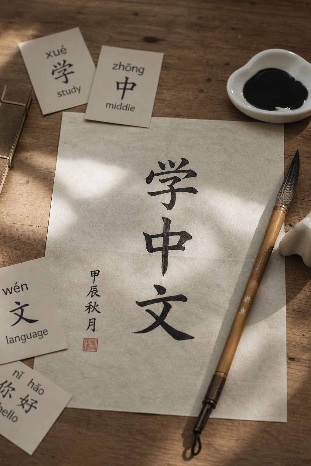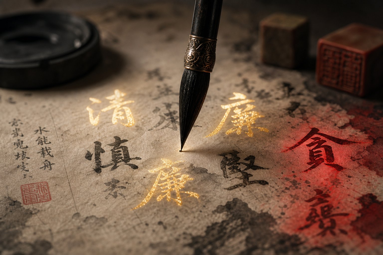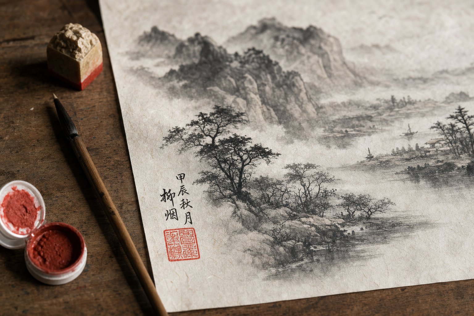
Why Your Signature Is Part of the Artwork
Imagine spending hours perfecting a Chinese calligraphy artwork, only to scrawl your name in the corner like a footnote on a term paper. That single misstep can throw off the entire visual balance you worked so hard to achieve. In Chinese painting tradition, the signature is never an afterthought. It is a compositional element as deliberate as the first brushstroke.
Chinese painters have understood this for centuries. The same brush, ink, and paper that form the painting also form the signature, and the same aesthetic criteria that judge the vitality and expressiveness of brushstrokes in the painting apply equally to the characters in the signature. The rhythmic movement of the line, the harmony of the whole composition, these principles govern everything on the surface, including how you sign it.
The Three Elements of a Complete Signature
When you look at Chinese painters' signatures on classical works, you'll notice they rarely consist of a name alone. A complete signing involves three distinct components working together as a unified visual element:
- The Artist's Signature (Luokuan): Your name written in Chinese characters, often a studio name or courtesy name rather than a legal name. This anchors your identity to the work.
- The Inscription (Tiba): Additional text that may include the date, a poem, a dedication, or a note about the occasion. This adds literary depth and context to the painting.
- The Chinese Seal (Yinzhang): A carved stamp pressed in red cinnabar paste, providing a bold color accent and formal authentication. The seal functions as both a visual punctuation mark and a mark of authority.
These three elements share a visual relationship. The black ink of the signature and inscription echoes the painted brushwork, while the red seal creates a deliberate contrast that draws the eye and anchors the composition. Together, they form a triangle of text, calligraphy, and color that completes the artwork.
Why Placement and Style Matter as Much as the Painting Itself
Here is the aesthetic philosophy at work: the signature adds visual weight to the composition. A painting heavy on the left side might need a signature on the right to restore balance. A sparse, minimalist landscape might call for a short, restrained inscription, while a lush, expressive piece can support a longer poetic text. The signature does not simply identify the artist. It participates in the same rhythmic harmony that defines the painting itself.
In Chinese painting, the harmonious rhythm of the whole composition determines the quality of the work, and the signature is part of that whole.
Most guides treat these three elements separately, forcing you to piece together information from multiple sources. This guide walks you through the entire signing workflow on a single page, from gathering your tools to pressing your seal, so every element lands exactly where it should. The goal is simple: your signature should look like the composition was designed with it in mind from the start.
Getting there starts with having the right materials ready before your brush touches the finished painting.
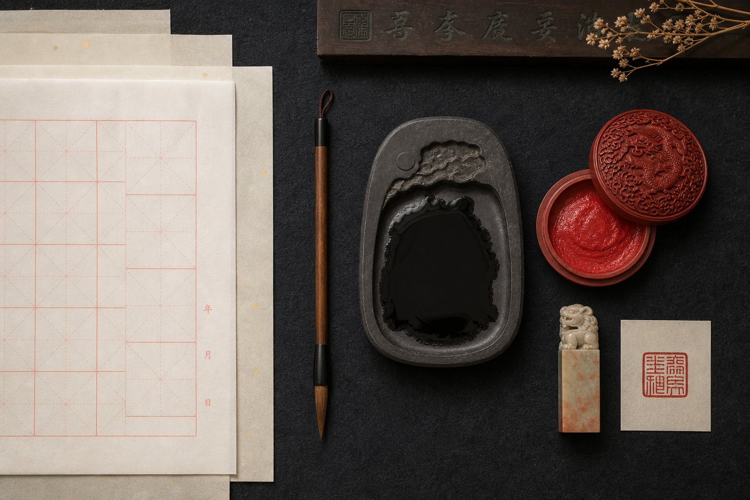
Step 1: Gather Your Chinese Signature Stamp and Signing Tools
Signing a painting is a continuous, flowing act. You cannot pause mid-character to grind more ink or hunt for your seal stone without breaking the rhythm that makes the signature feel alive. Every tool needs to be within arm's reach, prepared and tested, before your brush touches the finished work.
Ink and Brush Selection for Signing
You'll typically use the same ink you used for the painting itself, which keeps the tonal quality consistent across the entire surface. The difference lies in the brush. Painting a sweeping mountain range calls for a large, loaded brush, but writing your name in small characters demands a fine-tip brush with a sharp point that holds its shape through multiple strokes.
Look for a brush labeled "small regular script" or "xiao kai" in Chinese art supply stores. These brushes have shorter, stiffer bristles that give you precise control over thin lines and tight turns within characters. A brush that splays or loses its tip will produce fuzzy, uncertain strokes that look out of place next to confident painted elements.
Ink consistency matters just as much as brush choice. When you grind your ink stick on the stone, aim for a slightly thicker consistency than you might use for washes or shading. You want the ink dense enough to produce crisp, fully saturated strokes on the first pass. Watery ink bleeds on absorbent xuan paper, turning clean characters into blurry shapes. Test a few strokes on scrap paper before committing. The ink should flow smoothly off the brush without pooling or feathering at the edges.
Seal Paste and Seal Stone Essentials
The Chinese red stamp that appears below your signature gets its vivid color from cinnabar seal paste, called yinni in Chinese. Not all seal paste is equal. Quality varies dramatically, and the difference shows up in the impression.
Higher-grade yinni uses finely ground cinnabar mixed with castor oil and silk fibers, producing a rich, lasting red that stays vibrant for centuries without fading or bleeding through the paper. Budget pastes often substitute synthetic pigments and coarser binders, resulting in impressions that look flat, dry out quickly, or leave oily halos around the characters over time. For finished artwork you intend to keep or sell, invest in a mid-to-high quality paste from a reputable supplier.
Your chinese stamp seal itself is carved from stone, and the material affects both the carving quality and the impression clarity. Traditional seal stones include Shoushan, Qingtian, Changhua, and Balin stone, each prized for different qualities of hardness, color, and texture. Qingtian stone, for example, is softer and easier to carve, making it a practical choice for artists who carve their own seals. If you're commissioning a seal rather than carving one yourself, any of these stones will produce clean impressions when paired with good paste.
Before you begin, stir your seal paste gently with the small bone spatula that typically comes with the container. This redistributes the oil evenly through the cinnabar, preventing dry or patchy impressions. Press your seal face lightly and evenly into the paste, rotating slightly to ensure full coverage without overloading.
Your Complete Materials Checklist
Lay everything out on a clean, flat surface before you start. Once the signing process begins, it should flow without interruption from first character to final seal impression.
- Fine-tip brush: A small kaishu or xiao kai brush with a firm, pointed tip for writing characters.
- Prepared ink: Freshly ground ink at a slightly thick consistency, or high-quality bottled ink tested for density.
- Seal stone: Your carved chinese signature stamp, cleaned and free of old paste residue.
- Cinnabar seal paste (yinni): Stirred and ready, with even oil distribution throughout.
- Practice paper: Scrap xuan paper or newsprint for testing brush strokes and seal impressions.
- Clean flat surface: A felt pad or smooth table free of debris that could dent the paper during seal application.
Think of this preparation step the way a surgeon lays out instruments before an operation. Everything visible, everything accessible, nothing left to chance. The signing itself should feel like a single unbroken gesture, and that only happens when your materials are ready to support the flow from the first brushstroke of your name through the final press of red onto paper.
Step 2: Assess Where to Sign a Chinese Painting Before You Commit
Your tools are ready, your ink is ground, and your seal paste is stirred. The temptation now is to pick up the brush and start writing. Resist it. The most critical step in the entire signing process happens before any ink touches the finished painting, and it requires nothing more than your eyes and a few minutes of careful observation.
Every Chinese painting carries its own internal logic of weight, movement, and space. A signature placed without reading that logic can feel like a piece of furniture shoved into the wrong corner of a room. It disrupts rather than completes. The goal here is to identify exactly where your inscription of information, your name, and your seal will strengthen the composition rather than compete with it.
When to Sign Relative to Completing the Painting
Timing matters more than most beginners realize. There is a correct order of operations, and skipping ahead creates problems that are difficult or impossible to fix.
First, allow the painting to dry completely. This sounds obvious, but xuan paper absorbs moisture unevenly, and areas that appear dry on the surface may still hold dampness beneath. If you write characters over a section that hasn't fully dried, the new ink can bleed into the underlying wash, creating muddy edges where you need crisp strokes. For heavily layered works with multiple ink washes or color applications, waiting several hours or even overnight is not excessive. Touch the surface lightly with the back of your hand. If it feels cool, it's still drying.
Second, step back and assess the composition for visual balance. Pin the painting to a wall or prop it upright at viewing distance. You'll notice things from five feet away that you missed while hunched over the table. Ask yourself these questions:
- Which side of the painting carries more visual weight?
- Where does the eye naturally travel, and where does it come to rest?
- Are there areas that feel too empty or too crowded?
- Does the composition lean in one direction, creating an imbalance that text could correct?
Third, identify where the signature will add to the work rather than detract from it. This is the judgment call that separates a thoughtful signing from a careless one. As one student of traditional Chinese painting described after months of study, choosing the right placement for calligraphy on a painting is something you develop a "feel" for over time. It is not purely formulaic. You build this intuition by looking at many paintings and paying attention to how the signature interacts with the painted elements.
Reading the Negative Space in Your Composition
Chinese painting composition balance depends on the relationship between painted elements and the empty space surrounding them. In Western art, empty space is often just background. In Chinese painting, it is an active compositional force. The blank areas of the paper represent mist, sky, water, distance, or silence. They give the painted elements room to breathe and the viewer's eye a place to rest.
In Chinese painting, empty space is as important as painted space. It is not absence but presence, carrying the same compositional weight as ink on paper.
Your signature belongs in this negative space, but not just any empty area will do. You're looking for a spot that feels intentional, as if the composition was designed with the inscription in mind from the very beginning. Here's how to read the space effectively:
Imagine the painting divided into zones. Dense, active areas with heavy brushwork form the "full" zones. Open, unpainted areas form the "empty" zones. Traditional Chinese painting theory requires that dense and scarce areas coordinate to balance the painting, and that one corner must be left blank. Your chinese inscriptions should occupy a portion of an empty zone that is large enough to accommodate text without crowding the nearest painted element.
Pay attention to the directional flow of the composition. If a branch extends from right to left, the eye follows that movement and arrives at the left side of the painting. Placing your signature there catches the viewer's gaze at the natural endpoint of the visual journey. If a bird perches in the upper right and looks downward, the lower left becomes a natural resting point for text.
Size matters here too. A large empty area can support a longer inscription with multiple lines of text. A small pocket of space calls for a brief signature, perhaps just your name and a single seal. Match the volume of text to the volume of available space. Cramming a long poem into a tight gap looks forced. Dropping two characters into a vast open area looks lost.
The key test is simple: if you squint at the painting and imagine a block of dark text in your chosen location, does the overall composition feel more balanced or less? Does the added visual weight settle the piece, or does it tip it off-center? Trust that instinct. It is the same sense of chinese painting composition balance that guided your brushwork during the painting itself.
With your placement decided, the next question becomes practical: which specific position on the paper suits the format you're working in? A hanging scroll, a horizontal scroll, and a round fan each follow different conventions for where the signature lives relative to the painted image.
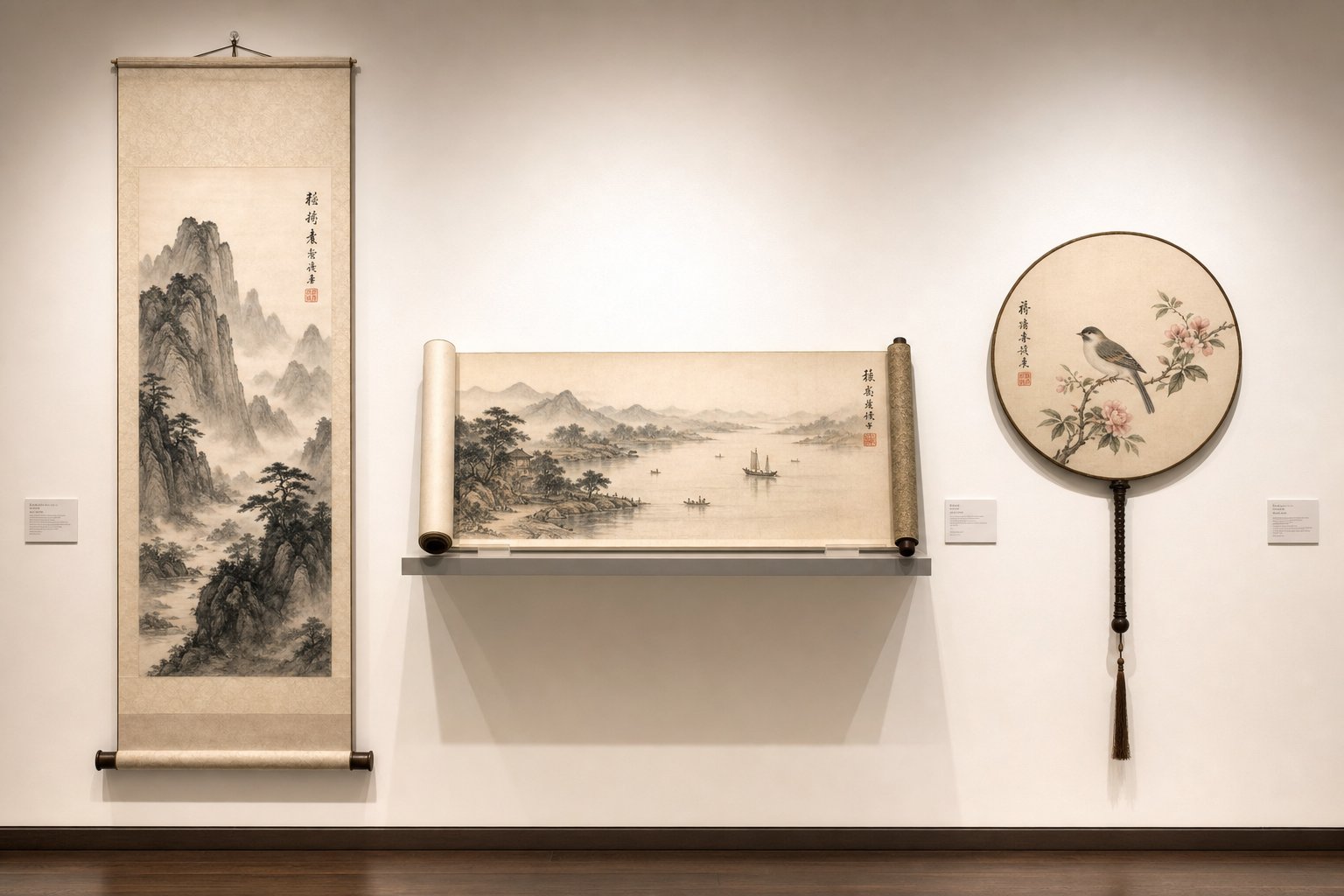
Step 3: Choose the Right Chinese Scroll Signature Placement for Your Format
Different Chinese painting format types follow different rules. A vertical hanging scroll and a folding fan are not just different shapes. They carry different visual rhythms, different reading directions, and centuries of convention about where text belongs. Placing your signature in the "wrong" spot for a given format doesn't just look awkward. It signals unfamiliarity with the tradition to anyone who knows what to look for.
The good news? These conventions are consistent and learnable. Once you understand the logic behind each format's placement rules, you'll make confident decisions without second-guessing yourself.
Placement Conventions for Hanging Scrolls and Horizontal Scrolls
Vertical hanging scrolls are the most common format for Chinese calligraphy artwork displayed on walls. The viewer's eye enters at the top right and travels downward, then sweeps left. This reading direction is the key to understanding why the signature almost always appears on the left side of the composition, typically in the lower-left area. Your name and inscription land where the eye naturally finishes its journey through the painted image.
Within that left-side convention, you still have flexibility. If the painting's subject matter occupies the upper portion of the scroll, leaving generous space below, the signature can sit in the mid-left or lower-left without competing with the main image. If the composition fills most of the vertical space, a compact signature tucked into the bottom-left corner keeps things clean. The chinese silk painting seals that accompany your name typically appear directly below the last character of your signature, reinforcing that lower-left anchor point.
Horizontal scrolls, called shoujuan, work differently. These long, narrow formats are meant to be unrolled and read from right to left, like a book. The painting's narrative unfolds across the horizontal plane, and the signature traditionally appears at the far left end, which is the final point the viewer reaches. Think of it as the closing line of a visual story. In some cases, a brief title inscription appears at the far right, the "opening" of the scroll, while the full signature and seals close the composition on the left.
For horizontal scrolls, chinese art stamps are often placed in a line below the signature text rather than stacked vertically, respecting the format's lateral orientation. If you're adding a leisure seal at the beginning of the scroll, position it in the upper-right corner as a visual "opening mark" that signals the start of the viewing experience.
Signing Album Leaves, Fans, and Round Formats
Smaller and non-rectangular formats demand a different approach. Space is limited, proportions are unusual, and the signature must work within tighter constraints without overwhelming the painted image.
Album leaves are small, roughly square paintings collected in bound albums. Because the surface area is compact, inscriptions tend to be short, often just a name, a date, and a single seal. Placement follows the same left-side principle as hanging scrolls, but the signature sits closer to the painted elements simply because there's less room to separate them. A single small seal below the name is usually sufficient. Stacking multiple chinese art stamps on an album leaf can crowd the composition quickly.
Folding fans present a unique challenge: the surface is a wide arc, broader at the top and tapering toward the bottom. The curved shape means vertical columns of text must be written along the fan's ribs, radiating outward from the base. Signatures typically appear on the left side of the fan face, written in shorter columns that follow the narrowing shape. Seal placement requires extra care because the paper surface curves, making even pressure difficult. Position your seal in a flatter area near the left edge where the paper lies most smoothly.
Round fans, or tuanshan, are circular formats that create a self-contained composition with no dominant directional flow. The signature can appear on either side, depending on where the painted subject leaves open space. A common approach places the inscription along the left or right edge of the circle, following the curve slightly, with the seal nestled just below. Because the round format has no "bottom corner" in the traditional sense, you'll rely more heavily on the composition's internal balance to guide placement rather than defaulting to a fixed position.
Format Placement at a Glance
| Format Type | Typical Signature Position | Seal Position |
|---|---|---|
| Hanging Scroll (vertical) | Lower-left side, below or beside the main image | Directly below the last character of the signature |
| Horizontal Scroll | Far left end (the final viewing point) | Below or beside the signature in a horizontal line |
| Album Leaf | Left side, close to the painted elements | Single small seal below the name |
| Folding Fan | Left side, written along the fan ribs in short columns | Near the left edge in a flat area of the paper |
| Round Fan | Left or right edge, following the circular curve | Just below the final character, inside the circle's boundary |
How Subject Matter Influences Your Decision
Format conventions give you a starting framework, but the painting's subject matter can override the default. A bamboo stalk growing from the lower right and leaning toward the upper left creates strong diagonal movement. Placing the signature on the lower left, where the bamboo's energy points away from it, gives the composition room to breathe. But if you painted a bird perched on the left side of a hanging scroll, the standard lower-left position might crowd the subject. In that case, shifting the signature to the right side, or even tucking it into the upper-left corner above the bird, respects the image's needs over rigid convention.
Landscapes with deep recession into distance often leave open sky or mist in the upper portions. A signature placed in that atmospheric space can feel like it floats naturally within the scene. Flower-and-bird paintings with a single branch extending across the surface tend to leave pockets of space on the opposite side, and that's where your text belongs.
The principle is consistent across all formats: the subject tells you where it needs space, and the signature fills the space the subject doesn't claim. Convention points you in the right direction, but the painting itself always gets the final word.
Knowing where to place your signature is one thing. Knowing what to write there, starting with your artist name in Chinese characters, is the next practical question to solve.
Step 4: Write Your Chinese Artist Signature in the Right Style
You've identified the perfect spot on your painting. The space is waiting. But what exactly do you write there? For many artists, especially those working outside China, this is the most intimidating part of the entire process. How to write name in chinese characters for a painting signature involves more than translation. It involves choosing an identity that fits the tradition.
Creating Your Chinese Name for Signing
Here's something that surprises many beginners: traditional Chinese painters rarely signed their legal birth name. Instead, they used a studio name (hao), a courtesy name (zi), or an art name that reflected their creative identity. These names were deeply personal constructions, linking the artist to ideas, places, or philosophical ideals.
The painter Huang Binhong (1865-1955), one of the greatest Chinese landscape painters of the twentieth century, used dozens of names throughout his life. His primary art name, Binhong, meaning "Rainbow at the water's edge," derived from a pavilion in his ancestral village. Li Keran (1907-1989) cycled through six studio names over his career, each reflecting a shift in his artistic philosophy. His most famous, "Hut Where I Learn from the Buffalo" (Shi Niu Tang), emerged from years of painting water buffalo and meditating on their qualities of patience and labor.
These names weren't random. They alluded to Confucian virtues like modesty, to Buddhist or Daoist thought, to beloved landscapes, or to historical figures the artist admired. A studio name functions as an artistic persona, a declaration of what kind of artist you aspire to be.
So what does this mean for Western artists? You have three practical options for creating a chinese art name for western artists:
- Phonetic transliteration: Your name is converted into Chinese characters that approximate its sound. "Thomas" becomes something like 托马斯 (tuo ma si). The problem? As language educators have noted, transliterated names often sound neither like the original nor like authentic Chinese names, because Chinese syllables work as concrete blocks of sound rather than fluid letter combinations.
- Adopted Chinese name: A native Chinese speaker helps you select characters that sound pleasant together, carry auspicious meaning, and follow natural Chinese naming conventions. This is the strongest option for a chinese artist signature that feels genuine on a painting.
- Studio name (hao): You create a poetic name tied to your studio, your artistic philosophy, or a place meaningful to you. This sidesteps the translation problem entirely and follows the same tradition that Chinese painters themselves have used for centuries.
Whichever path you choose, have a knowledgeable native speaker review your characters before you commit them to a seal or a painting. Every character carries connotations shaped by thousands of years of use, and combinations that look fine in a dictionary can carry unintended meanings in practice.
Brush Technique for Writing Your Signature
Your name is chosen. The characters are set. The next decision is style: which chinese calligraphy signature style matches your painting?
Three main script styles appear in painting signatures, each carrying a different visual energy:
- Regular script (kaishu): Clear, structured, with each stroke distinctly separated. Kaishu is defined by precise structure and controlled execution, making it highly readable. Use it for formal works, meticulous gongbi paintings, or when you want the signature to feel restrained and dignified.
- Running script (xingshu): Semi-cursive, with strokes that connect and flow into each other. Xingshu balances clarity and efficiency, offering elegance without sacrificing legibility. It suits most ink wash paintings and is the most common choice for signatures because it feels natural and unhurried.
- Cursive script (caoshu): Highly expressive, with dramatically simplified and connected strokes. Caoshu works for bold, spontaneous paintings in the xieyi (freehand) style, where the energy of the brushwork demands an equally energetic signature. Be aware that caoshu can be difficult to read, so reserve it for contexts where visual expression matters more than legibility.
The guiding principle is harmony. A tightly controlled gongbi painting of flowers paired with a wild caoshu signature creates visual dissonance. A loose, splashed-ink landscape paired with rigid kaishu characters feels equally mismatched. Let the painting's energy dictate the signature's energy.
Before your brush touches the finished painting, practice. The signature must look confident and fluid, not hesitant or labored. Here's the process:
- Write your signature characters on scrap paper at the same size you plan to use on the painting. Repeat until the strokes feel automatic rather than deliberate.
- Practice the full sequence: name, any additional inscription text, and the spatial relationship between lines. Get comfortable with the vertical column format, writing top to bottom, right to left.
- Test with the same brush and ink you'll use on the painting. Different brushes produce different line qualities, and switching tools at the last moment introduces unpredictability.
- Write the signature at the intended speed. Kaishu is slow and measured. Xingshu flows at a moderate pace. Caoshu moves quickly. Match your practice speed to the style you've chosen.
- Do a final full rehearsal on practice paper, including pauses where you'll reposition the brush between characters. Only when this rehearsal feels natural and unforced should you move to the actual painting.
Think of this practice the way a musician rehearses before a performance. The goal isn't perfection in isolation. It's building enough muscle memory that the signature flows out naturally when it counts, without the hesitation marks and uneven pressure that betray uncertainty.
Your name and your script style are ready. The remaining question is what else to write alongside them, because a traditional inscription carries more than just a name. It tells the viewer when, why, and for whom the painting was made.
Step 5: Compose Your Traditional Chinese Inscription Template
A name alone tells the viewer who made the painting. An inscription tells them everything else: when it was created, where, why, and for whom. The chinese painting inscription meaning goes beyond simple documentation. It transforms a signed painting into a personal artifact with a story embedded in its surface.
Sounds complex? It doesn't have to be. Traditional inscriptions follow predictable formulas that you can learn, adapt, and reuse across dozens of paintings. Once you internalize the structure, composing an inscription becomes as natural as writing a return address on an envelope, just with more poetic possibilities.
What to Include in Your Inscription
The standard inscription contains up to four elements, arranged in a specific order. Not every painting requires all four, but understanding the full structure lets you choose what to include based on the occasion.
The traditional order, as described by Asian Brushpainter's knowledge base, follows this sequence:
- Dedication (optional): If the painting is a gift, the recipient's name and an honorific come first. This tells the viewer immediately for whom the work was made.
- Date: When the painting was completed, expressed using the traditional Chinese cyclical calendar, a seasonal reference, or both.
- Artist's name: Your given name or art name, often followed by the character 写 (xie, "painted this") or 书 (shu, "wrote this").
- Location (optional): Where the work was created, ordered from general to specific (country, province, city, studio).
You'll notice the dedication comes before everything else. This isn't accidental. Placing the recipient's name at the top of the inscription signals respect, positioning them above the artist in the visual hierarchy. If you include a dedication, it's also common to add a humble phrase inviting the recipient to offer corrections or feedback. Two classic formulas are 雅正 (ya zheng, "please offer your elegant corrections") and 指正 (zhi zheng, "please point out my errors"). These appear after the recipient's name and title.
The Traditional Chinese Calligraphy Date Format
Dating your work in the traditional Chinese system adds authenticity and connects your painting to centuries of convention. The full system uses a sixty-year cycle built from ten Heavenly Stems (天干, tiangan) and twelve Earthly Branches (地支, dizhi). Each year receives a unique two-character combination that repeats every sixty years.
Here's how it works in practice. The ten Heavenly Stems are: 甲 (jia), 乙 (yi), 丙 (bing), 丁 (ding), 戊 (wu), 己 (ji), 庚 (geng), 辛 (xin), 壬 (ren), 癸 (gui). The twelve Earthly Branches are: 子 (zi), 丑 (chou), 寅 (yin), 卯 (mao), 辰 (chen), 巳 (si), 午 (wu), 未 (wei), 申 (shen), 酉 (you), 戌 (xu), 亥 (hai). Paired together, they produce combinations like 甲子 (jiazi) or 乙丑 (yichou).
The year 2025, for example, is 乙巳 (yi si) in the cyclical system. You'd write this as 乙巳年 (yi si nian, "the year yi si"). Online conversion tools make finding the correct pairing straightforward if you don't want to calculate it manually.
That said, you don't need the full date. Most artists inscribe only what feels appropriate for the piece. Common approaches include:
- Year only: 乙巳年 (yi si nian)
- Year and season: 乙巳年春 (yi si nian chun, "spring of the yi si year")
- Year and month: 乙巳年三月 (yi si nian san yue, "third month of the yi si year")
- Season alone: 仲秋 (zhong qiu, "mid-autumn") or 初夏 (chu xia, "early summer")
Seasonal references carry poetic weight. Writing 梅雨时节 ("plum rain season") instead of a month number evokes atmosphere. Writing 岁暮 ("year's end") instead of "December" adds literary texture. Choose the level of specificity that matches the painting's mood. A quick practice sketch might need only a season. A formal exhibition piece benefits from the full cyclical year.
Inscription Templates by Occasion
Here's where theory becomes practical. The following templates give you ready-to-use formulas for the most common situations you'll encounter. Adapt them freely, but respect the structural order.
Remember that inscriptions in traditional format are read top-to-bottom, right-to-left. When you write multiple columns, the first column is on the right side, and each subsequent column moves leftward. Your name typically appears in the final (leftmost) column.
| Occasion Type | Chinese Text Structure | English Translation |
|---|---|---|
| Personal practice piece | [Date] + [Artist name] + 写 (xie) or 画 (hua) | "[Date], [Name] painted this" |
| Gift to a friend | [Recipient name + title] + 雅正 (ya zheng) + [Date] + [Artist name] + 写 | "For [Name, title], please offer corrections. [Date], [Artist name] painted this" |
| Formal exhibition piece | [Date] + 于 [Location] + [Artist name] + 写 | "[Date], at [Location], [Artist name] painted this" |
| Seasonal work | [Season/occasion reference] + [Date] + [Artist name] + 写于 [Studio name] | "[Season/occasion]. [Date], [Artist name] painted this at [Studio name]" |
| Work with poetic title | [Painting title] + [Date] + [Artist name] + 题 (ti) | "[Title]. [Date], [Artist name] inscribed this" |
Let's see a few of these filled in with real content so you can visualize the final result:
- Personal piece: 乙巳年秋 墨云 写 ("Autumn of the yi si year, Mo Yun painted this")
- Gift: 李先生雅正 乙巳年春 墨云 写 ("For Mr. Li, please offer corrections. Spring of the yi si year, Mo Yun painted this")
- Exhibition piece: 乙巳年仲夏 于纽约 墨云 写 ("Midsummer of the yi si year, at New York, Mo Yun painted this")
Notice how each formula builds from the same core elements, just rearranged and expanded based on context. The chinese painting dedication text for a gift adds the recipient at the front. The exhibition piece adds a location. The seasonal work weaves in atmospheric language. All of them end with the artist's name and a verb confirming authorship.
Keeping Your Inscription in Proportion
One practical consideration that trips up many artists: the inscription should not dominate the painting. Write your inscription characters smaller than the main calligraphic or painted elements. If the inscription sits in its own column beside the painting, it should start slightly lower than the top of the main composition, visually deferring to the artwork itself. This subtle positioning signals that the inscription serves the painting rather than competing with it.
For longer inscriptions that include a poem or extended dedication, plan the column breaks before you start writing. Count your characters, estimate how many fit per column at your intended size, and map out the layout on scrap paper first. Running out of space mid-inscription and having to squeeze the final characters into a shrinking gap is one of the most common and visible mistakes.
Your inscription text is composed and rehearsed. The final physical element, the red seal impression that punctuates everything you've written, brings its own set of rules about type, placement, and technique.
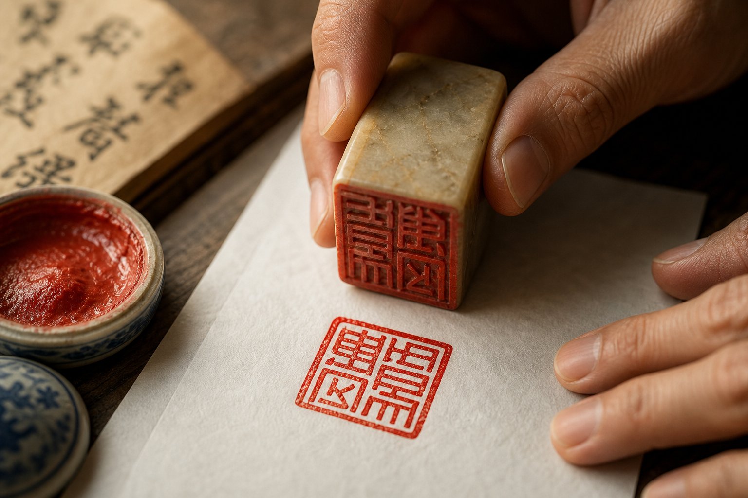
Step 6: Prepare and Apply Your Chinese Artist Stamp
The seal is the last mark you'll make on the painting, and it's permanent. There's no erasing a red impression once it hits the paper. That finality is exactly what gives the seal its power. It functions as a visual exclamation point, a burst of vermilion that anchors the composition and declares the work complete. In monochrome ink paintings, the chinese red signature stamp provides the only color on the entire surface, making its placement a critical compositional decision rather than a mere formality.
Before you press stone to paper, you need to understand which seal to use, where it belongs, and how to apply it cleanly. Each of these decisions carries weight.
Types of Seals and When to Use Each
Not all seals serve the same purpose. Traditional Chinese artists maintained collections of carved stones, each reserved for specific contexts. As Asian Brushpainter's knowledge base explains, the seals applied to Chinese artworks most often fall into three types according to the characters inscribed upon them. If a work has only one seal, it will surely be the name seal. Here's what each type does and when to reach for it:
- Name seal (mingyin): This is your primary chinese artist stamp, carved with your name or art name. Every signed painting should carry at least one name seal. It confirms authorship the way a written signature does in Western art, but with the added visual impact of red ink and carved characters. If you only own one seal, this is the one.
- Studio seal (zhaiguan yin): Carved with the name of your studio or workspace, this seal connects the painting to a specific creative environment. Artists who work from a named studio use this to establish provenance and artistic lineage. It often appears alongside the name seal, either directly above or below it.
- Leisure seal (xianzhang): This seal contains a motto, a poetic phrase, or an auspicious saying rather than a name. Common examples include phrases like "painting from the heart" or "following nature." Leisure seals add philosophical depth and visual interest. They're placed more freely than name seals, often appearing in the upper corner of the composition as a counterbalance to the signature below.
- Chinese family stamp: Carved with a family name or clan identifier, this seal connects the work to a broader lineage. It's less common in contemporary practice but appears frequently on historical works where family identity carried significant cultural weight.
How many seals should you use? One is the minimum. Two is standard for most finished works, typically a name seal paired with either a studio seal or a leisure seal. Three is appropriate for formal or exhibition-quality pieces. More than three risks cluttering the composition unless the painting is large enough to absorb the additional red marks without feeling crowded.
One important rule governs pairing: when two seals appear near each other, they should not be the same type. Specifically, one should be intaglio (white characters on a red field) and the other relief (red characters on a white field). Having two intaglio or two relief seals side by side is considered a poor choice because it violates the principle of variety and balance that governs the entire artwork.
Proper Seal Application Technique
Imagine pressing a rubber stamp onto an envelope. Simple, right? Applying a chinese red signature stamp to a finished painting requires more precision than that, but the physical mechanics aren't complicated once you understand the sequence. The challenge is doing it cleanly, evenly, and in exactly the right spot on the first attempt.
Here's the full process from start to finish:
- Check orientation. Before anything else, confirm that your seal is right-side up. The characters on a seal are carved in mirror image, so look at the face carefully. Imprinting characters upside down or sideways will ruin a good piece. If you're unsure, do a test impression on scrap paper first.
- Prepare the surface beneath your painting. Place several sheets of soft paper or a thin felt pad underneath the area where you'll stamp. This slight give ensures that all of the seal's carved elements register evenly on the paper. A hard table surface can leave gaps where the stone doesn't make full contact.
- Load the seal with paste. Press the seal face lightly and evenly into your prepared cinnabar paste. Use a gentle tapping motion rather than grinding or twisting. Rotate the seal slightly to ensure full, even coverage across the entire carved surface. Don't linger too long or press too hard. Overloading causes paste to well into the carved lines and muddy the resulting impression.
- Position the seal on the paper. Hold the seal above your chosen spot and lower it straight down. Make sure the sides of the seal align with the edges of the paper or the vertical axis of your inscription. A slanted seal is almost as bad as an upside-down one. Take a breath. Commit to the position before making contact.
- Apply firm, even pressure. Press down with steady force, distributing your weight evenly across the entire seal face. Don't rock or shift the stone. Hold for two to three seconds. On absorbent xuan paper, the paste transfers quickly. On sized or semi-sized paper, you may need slightly longer contact.
- Lift cleanly. Pull the seal straight up in one smooth motion. Don't drag or twist as you lift, which can smear the edges of the impression. Set the seal aside face-up so residual paste doesn't transfer to your work surface.
After lifting, inspect the impression immediately. A good stamp shows crisp, fully saturated characters with clean edges and no gaps or blurring. If the impression looks patchy, your paste may be too dry or unevenly distributed. If it looks blobby with filled-in details, you used too much paste or pressed too hard.
Placement Rules That Govern the Final Composition
Where does each seal type actually go on the painting? The conventions are straightforward:
The name seal belongs directly below the last character of your written signature. This creates a visual unit: your brushed name flows downward into the stamped confirmation of identity. If you're using two seals together (name seal plus studio seal), stack them vertically with a small gap between them, roughly equal to the height of one seal impression.
A leisure seal, by contrast, enjoys more freedom. It often appears in the upper-right corner of the composition, sometimes called the "opening seal" position. Placed there, it creates a diagonal relationship with the name seal in the lower left, framing the painted image between two points of red. This diagonal tension adds energy and visual structure to the overall layout.
The red seals of a piece have often been called the "eyes" of a work, gazing back at the viewer and providing a point of entry into the flow of the brush. That metaphor captures something real about how the viewer's eye behaves. Red naturally draws attention on a surface dominated by black ink and white paper. Wherever you place a seal, the viewer's gaze will travel there. Use that pull deliberately. If the lower-left corner of your painting feels visually weak, a seal placed there strengthens it. If the upper-right corner needs an anchor, a leisure seal provides one.
For monochrome works especially, think of your seals as the only color notes in the entire composition. Their placement determines the painting's color rhythm the same way a single red flower in a black-and-white photograph determines where the eye lands first. That's why this final step deserves as much compositional thought as the brushwork that preceded it.
With your seal pressed and the impression drying, the signing process is complete. But how do you know if you've done it well? The best way to calibrate your eye is to study how master painters handled the same decisions on their own works.
Step 7: Study Signatures on Existing Paintings to Build Your Eye
Knowing the rules is one thing. Seeing them in action across hundreds of years of painting history is what transforms mechanical knowledge into genuine visual intuition. The fastest way to develop confidence in your own signing decisions is to spend time reading the signatures, inscriptions, and seals on classical Chinese paintings with the same attention you give to the brushwork itself.
Think of it this way: every museum scroll, every auction catalog image, every reproduction in an art book is a free masterclass in how accomplished painters solved the exact same placement, style, and seal questions you're facing. You just need to know what to look for.
How to Read Signatures on Classical Chinese Paintings
When you stand in front of a Chinese painting, or study a high-resolution reproduction, train yourself to examine four specific elements of the signature area:
Character style relative to the painting. Notice whether the artist chose kaishu, xingshu, or caoshu for the signature, and ask yourself why. A meticulous Song-dynasty bird-and-flower painting will almost always carry a restrained, regular-script signature. A splashed-ink landscape by a Ming-dynasty eccentric will pair with loose, expressive cursive. The signature's calligraphic energy matches the painting's energy. Once you start noticing this pattern, you'll see it everywhere, and it will guide your own style choices instinctively.
Placement relative to the composition. Where did the artist position the text? How much space separates the inscription from the nearest painted element? Does the signature occupy a pocket of negative space, or does it interact directly with the image? On major works by painters like Qi Baishi, you'll notice the seal placement is doing real visual work: a horizontal painting of shrimp will have seals at the right end balancing the leftward swim of the figures, while a vertical landscape will have seals at the lower right or upper left, completing a diagonal axis. The signature isn't punctuation. It's a closing chord.
Number and position of seals. Count the red impressions. A single name seal below the signature is the minimum. Two seals, one intaglio and one relief, is standard. Three or more suggests a formal or important work. Pay attention to spacing between seals and how their collective red mass relates to the composition's visual weight. Also note whether a leisure seal appears in the upper corner, creating that diagonal tension with the name seal below.
Inscription content and length. Some paintings carry a single name and date. Others include full poems, dedications, or philosophical musings that fill an entire column beside the image. The length of the inscription always corresponds to the available space and the painting's formality. Quick sketches get short signatures. Major exhibition pieces get longer inscriptions. Studying this ratio across many works builds your sense of proportion.
Identifying Seal Types and Their Meanings
Here's where chinese artist seal identification becomes genuinely useful. Historical paintings often carry far more seals than the artist originally applied. A famous Song-dynasty work might bear ten or twenty seals accumulated over centuries as the painting passed through notable collections. Learning to distinguish between artist seals, collector seals, and authentication seals tells you the painting's entire ownership history at a glance.
As Kiln & Ink's guide to reading painting seals explains, every authenticated Chinese painting has at least one red seal, and these are not decoration separate from the painting. They are integral compositional elements carved by master seal-carvers who were themselves significant artists. Understanding how to identify chinese artist seals versus later additions sharpens your eye for what belongs on a painting and what was added afterward.
Use these visual clues to distinguish seal types when examining historical works:
- Shape: Artist seals tend to be square or rectangular. Collector seals are more varied, sometimes oval, gourd-shaped, or irregularly contoured. Imperial authentication seals are typically large and rectangular with distinctive border patterns.
- Color intensity: Original artist seals applied at the time of painting often show the same degree of aging as the surrounding ink. Collector seals added decades or centuries later may appear brighter or darker depending on when they were stamped. An ancient chinese stamp from the Song dynasty will look noticeably different in tone from a Qing-dynasty collector's seal on the same painting.
- Position: Artist seals cluster near the signature, usually directly below the last character. Collector seals appear in margins, mounting borders, or open areas away from the main composition. Authentication seals from imperial collections often occupy prominent positions, sometimes overlapping the image itself as a deliberate mark of ownership.
- Character style, relief vs. intaglio: Artist seals are carved in seal script (zhuanshu) and alternate between relief (red characters on white ground, called zhuwen) and intaglio (white characters on red ground, called baiwen). Collector seals follow the same conventions but often use slightly different character styles or more elaborate border designs that reflect their era.
- Size relative to the painting: Artist seals are proportioned to the signature text. Collector seals vary widely. Imperial seals are often conspicuously large, asserting authority through sheer visual dominance.
Spending time with even one painter's seal record builds remarkable diagnostic ability. Qi Baishi, for example, used roughly thirty distinct seals across his career, each associated with specific periods and artistic phases. His catalogue raisonne lists them with date ranges, so studying his seals teaches you not just identification but also dating. After working through one painter's seal vocabulary, you'll recognize his work by the seals alone.
This kind of visual literacy pays dividends beyond appreciation. When you sit down to sign your own painting, you're no longer guessing. You're drawing on a mental library of hundreds of examples, each one showing you how a specific compositional problem was solved by someone who spent a lifetime refining the answer. That accumulated seeing is what separates a signature that feels inevitable from one that feels uncertain.
Of course, even with a trained eye and thorough preparation, mistakes happen. Ink bleeds, seals land crooked, characters come out wrong. Knowing how to prevent and recover from these errors is the final practical skill that completes the signing workflow.
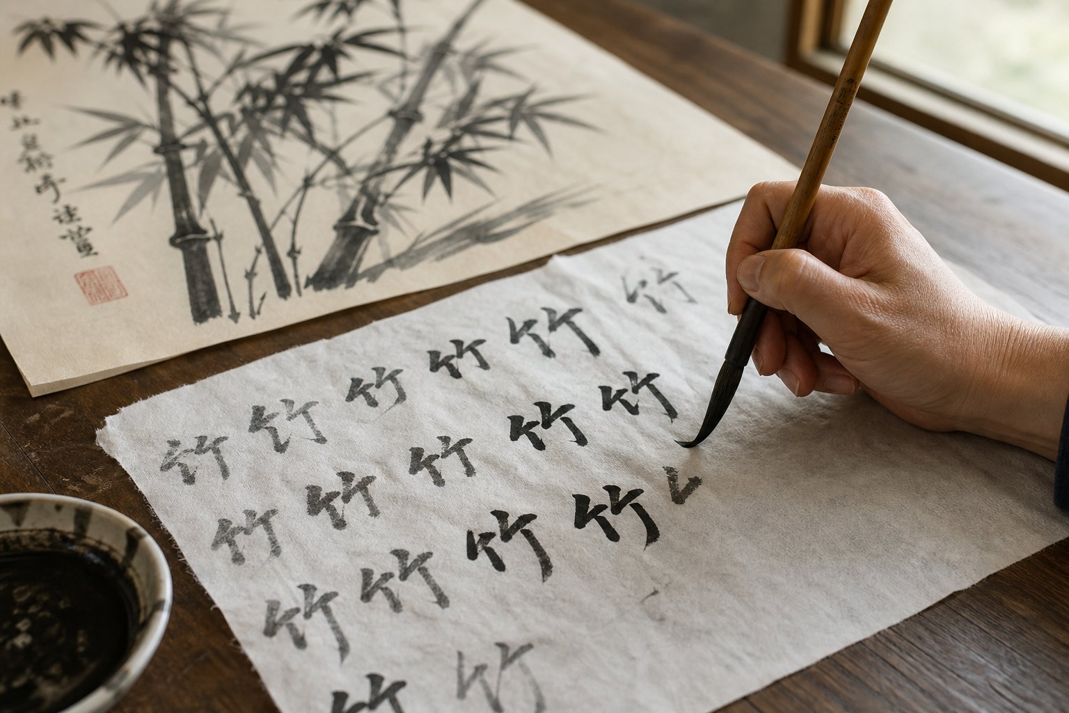
Common Chinese Painting Signing Mistakes and How to Avoid Them
You've studied the masters, practiced your characters, and chosen the perfect placement. Then your brush slips, or your asian seal lands a centimeter too far to the left, or the ink feathers into a damp patch you didn't notice. It happens. Even experienced painters make errors during the signing process, and the frustration is amplified because the painting itself was already finished and successful before the mistake occurred.
The difference between a ruined painting and a recoverable one often comes down to preparation and knowing your options before the problem arises. Let's walk through the most common chinese painting signing mistakes, how to prevent them, and what to do when prevention fails.
Preventing Common Signing Errors
Most signing errors fall into a handful of predictable categories. Recognizing them in advance is the simplest form of defense.
Signing too large relative to the painting. This is the single most common mistake beginners make. Characters that looked perfectly sized on practice paper suddenly overwhelm the composition when placed next to delicate painted elements. The inscription should always be written in characters smaller than the main brushwork of the painting. As Asian Brushpainter's knowledge base notes, the inscription should not dominate the work itself, and using smaller characters than the body is the norm. If you're unsure about scale, err on the side of too small rather than too large. A modest signature reads as confident restraint. An oversized one reads as poor judgment.
Placing the seal while ink is still wet. This creates a smeared mess where the red cinnabar paste mixes with undried black ink, producing a muddy brown stain that's impossible to fix. The signature ink needs to be completely dry before you bring the seal anywhere near it. On absorbent raw xuan paper, this might take only a few minutes. On sized paper or heavily inked areas, wait longer. Touch the edge of the inscription lightly with a clean fingertip. If it feels even slightly cool or tacky, it's not ready.
Seal paste application problems. Too much paste fills the carved channels of the seal, turning fine lines into blobs and making characters illegible. Too little paste produces a faint, patchy impression with gaps where the stone didn't transfer enough pigment. The sweet spot is a thin, even coat that covers the entire carved surface without pooling in the recesses. If you can see paste welling up between the raised characters when you look at the seal face, you've loaded too much. Wipe it back with a soft cloth and try again.
Writing characters in the wrong order. Chinese inscriptions read top-to-bottom, right-to-left. If you're writing multiple columns, the first column goes on the right side, and each subsequent column moves leftward. Western-trained artists sometimes reverse this instinctively, starting on the left. The result is an inscription that reads backward to anyone literate in Chinese. Map out your column order on practice paper before touching the painting.
Misaligning the seal with the signature. A seal that's rotated five degrees off-axis, or stamped so far below the signature that it looks disconnected, disrupts the visual unity of the signing area. The seal should sit directly below the last character with its edges parallel to the text column. Use the vertical line of your inscription as a guide rail.
Recovery Options When You Make a Mistake
Prevention is ideal, but what happens when something goes wrong despite your best efforts? Your options depend on the severity of the error and the type of paper you're working on.
Minor ink bleeds on absorbent paper. If a character's stroke feathered slightly on raw xuan paper, assess whether the bleed is noticeable at normal viewing distance. Pin the painting to a wall and step back five feet. Small feathering that's obvious at arm's length often disappears at gallery distance. If the bleed is minor and the character remains legible, leave it. Attempting to fix calligraphy errors on absorbent paper usually makes things worse because any additional ink or water applied to the area spreads further into the fibers.
Misaligned seals. A seal that landed slightly off-center or at a minor angle is generally not worth trying to fix. The red paste bonds immediately to the paper fibers and cannot be removed without damaging the surface. If the misalignment is subtle, most viewers won't notice. If it's severe, a crooked seal on an otherwise strong painting, you have two choices: add a second seal in the correct position nearby (if the composition can support it), or accept the imperfection as part of the work's history. Historical paintings frequently show seals that aren't perfectly aligned, and they remain masterpieces.
Character errors. Writing the wrong character or omitting a stroke is more serious because it affects meaning, not just aesthetics. If you catch the error immediately and the ink hasn't fully dried, you cannot simply write over it. On raw xuan paper, the damage is done. On sized paper, you may be able to carefully blot excess ink with a dry brush tip, but this rarely produces a clean result. For a significant character error in a prominent position, starting over on a new painting is often the honest choice. A visible correction in the signature area signals carelessness in a tradition that prizes deliberate, confident execution.
When to incorporate versus when to start over. Here's a useful rule of thumb: if the mistake is visible only to you and doesn't affect legibility or meaning, incorporate it. Many historical paintings carry minor imperfections in their inscriptions that scholars note but don't consider flaws. If the mistake changes the meaning of a character, makes the inscription unreadable, or creates an obvious visual disruption at normal viewing distance, start over. A fresh painting with a clean signature is always better than a good painting with a botched one.
Preventive Practices That Protect Your Work
The best recovery strategy is never needing one. Build these habits into every signing session:
- Always practice on scrap paper first. Write your full inscription at the intended size, with the same brush and ink, on the same type of paper as your painting. Do this at least three times before approaching the finished work. Muscle memory built on practice paper translates directly to confidence on the painting.
- Test your seal impression before applying it to the painting. Stamp scrap paper to check paste coverage, orientation, and pressure. Inspect the test impression for gaps, blobs, or uneven ink distribution. Adjust your paste loading until the test looks crisp and complete.
- Work in proper lighting. Dim or uneven light hides wet spots, makes it harder to judge character proportions, and increases the chance of misaligning your seal. Use bright, even overhead lighting that illuminates the entire painting surface without casting shadows from your hand or brush.
- Keep a clean, dry cloth within reach. If you overload your seal with paste, you need to wipe it immediately. If a drop of ink falls from your brush, a quick blot within the first second can prevent a spreading stain.
- Never rush. The signing process should feel calm and deliberate. If you're anxious, tired, or distracted, step away. The painting will wait. Your signature won't improve under pressure.
Signing Collaborative Works and Paintings in the Style of a Master
Two special situations require additional care. Collaborative works, where two or more artists contribute to the same painting, follow a specific signing protocol. Each artist signs only the portion they painted, and the signatures are arranged to reflect the hierarchy of contribution. The primary artist's signature typically occupies the most prominent position, while secondary contributors sign in smaller characters or in less central locations. If you contributed only the inscription or colophon to another artist's painting, your seal goes near your text, not near the main image.
Paintings done in the style of a master, a common practice in Chinese painting education, require transparency. The traditional convention is to include a phrase like 仿 (fang, "in the style of") or 临 (lin, "copied from") followed by the master's name, then your own signature below. This acknowledges the source openly and distinguishes your work from the original. Signing a painting done in another artist's style without this attribution isn't just poor etiquette. In the context of Chinese painting tradition, it's a serious breach of artistic integrity.
Whether you're signing your first practice piece or a painting destined for exhibition, the same principle holds: the signature is your final creative act on the surface. It deserves the same attention, preparation, and respect you gave to every brushstroke that came before it. Get it right, and the signature disappears into the composition, feeling as inevitable as the painting itself. That's the goal. That's what makes the difference between a painting that's merely finished and one that's truly complete.
Frequently Asked Questions About Signing Chinese Calligraphy Paintings
1. Where do you put your signature on a Chinese painting?
The signature placement depends on the painting's format and composition. For vertical hanging scrolls, the signature typically goes on the lower-left side. Horizontal scrolls place it at the far left end, which is the final viewing point. Album leaves, folding fans, and round fans each follow their own conventions, but the guiding principle remains consistent: place your signature in an area of negative space where it balances the composition rather than competing with the painted elements.
2. What are the three elements of a Chinese painting signature?
A complete Chinese painting signature consists of three components working together: the artist's signature (luokuan), which is your name written in Chinese characters; the inscription (tiba), which may include the date, a dedication, or a poem; and the seal (yinzhang), a carved stamp pressed in red cinnabar paste. The black ink of the signature and inscription echoes the painted brushwork, while the red seal creates a deliberate color contrast that anchors the composition.
3. How do Western artists create a Chinese name for signing paintings?
Western artists have three main options: phonetic transliteration of their name into Chinese characters, adopting a proper Chinese name selected with help from a native speaker, or creating a studio name (hao) tied to their artistic philosophy or workspace. The studio name approach is often strongest because it follows the same tradition Chinese painters have used for centuries and sidesteps awkward transliteration issues. Whichever method you choose, have a knowledgeable native speaker review the characters for unintended meanings before committing them to artwork.
4. What type of seal paste should I use for signing Chinese paintings?
Use cinnabar seal paste (yinni) made from finely ground cinnabar mixed with castor oil and silk fibers. Higher-grade paste produces rich, vibrant red impressions that remain stable for centuries without fading or bleeding through paper. Budget pastes with synthetic pigments tend to look flat and may leave oily halos over time. Before each use, stir the paste gently with a bone spatula to redistribute the oil evenly, which prevents dry or patchy impressions on your finished work.
5. Can you fix a mistake when signing a Chinese calligraphy painting?
Recovery depends on the error's severity and your paper type. Minor ink feathering on absorbent xuan paper often becomes invisible at normal viewing distance and is best left alone. Misaligned seals cannot be removed without damaging the surface, so slight misalignment is typically accepted. For significant character errors that affect meaning or legibility, starting over on a new painting is usually the honest choice. The best strategy is prevention: always practice your full inscription on scrap paper first, test seal impressions before applying them, and never rush the signing process.