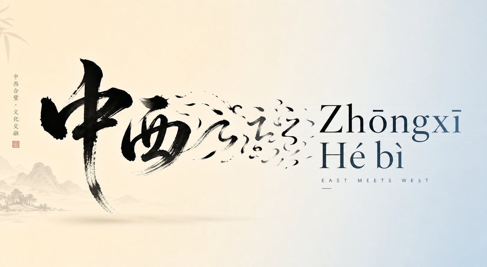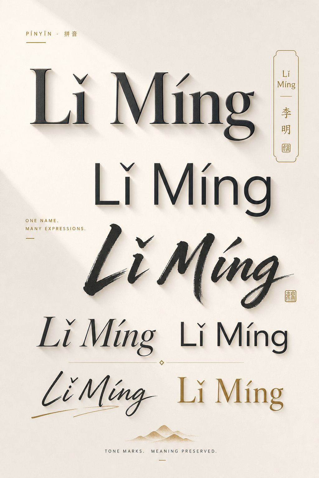
What Are Pinyin Name Font Styles and Why They Matter
Imagine you want your Chinese name rendered in Latin letters, complete with tone marks, and you need it to look good on a business card, a wedding invitation, or a personal logo. That's where pinyin name font styles come in. They're the typographic choices you make when displaying a romanized Chinese name so it reads correctly and carries visual personality.
What Is Pinyin and How Does It Relate to Font Styling
Pinyin is the official romanization system for Standard Mandarin Chinese. Published in 1958, it uses Latin letters plus diacritical marks to represent the four tones of Mandarin. Billions of people interact with it daily as an input method on computers and phones, and it remains the primary way to present Chinese pronunciation to both native and foreign speakers.
When you compare pinyin vs hanzi, the difference is fundamental. Hanzi are logographic characters. Pinyin translates those sounds into the Latin alphabet. This distinction matters for font styling because a standard Chinese language font is built around square character grids, while pinyin relies on proportional-width Latin letterforms with accent-like tone marks sitting above vowels. A mandarin typeface designed for hanzi and pinyin together often treats the romanized text as secondary annotation, but when your name stands alone in pinyin, the font needs to do much heavier lifting.
Why Font Choice Matters for Pinyin Names
Not every chinese font handles tone marks gracefully. Some clip them, misalign them, or render them so thin they vanish at small sizes. Your name deserves better than that. The right font preserves the diacriticals that distinguish meaning, like the difference between mā (mother) and mǎ (horse), while also projecting the aesthetic you want.
Pinyin occupies a unique space in typography: it carries Chinese linguistic identity through Latin letterforms, making font selection a bridge between two entirely different writing traditions.
Choosing a mandarin font for standalone pinyin names is a different challenge than picking one for body text or character annotation. You're balancing legibility of diacriticals, visual style, and cultural resonance all at once. Yet almost no resources address this directly, leaving designers and individuals guessing.
The typographic demands only multiply when you factor in weight, spacing, and capitalization conventions, each of which interacts with tone mark rendering in ways that can make or break readability.
Typographic Challenges Unique to Pinyin Names
Standard Latin text rarely asks much of a font beyond basic letter shapes and common punctuation. Pinyin names, however, push fonts into territory most English-centric typefaces were never stress-tested for. The diacritical marks that indicate Mandarin tones sit directly above vowels, and they need precise vertical positioning, consistent stroke weight, and enough breathing room to remain legible. When a font stumbles on any of these points, your name pays the price.
Tone Mark Rendering and Diacritical Challenges
Mandarin has four tones, each represented by a specific diacritical mark placed over the primary vowel of a syllable. Here's what each tone mark looks like and what it demands visually:
- First tone (macron): ā, ē, ī, ō, ū - A flat horizontal bar above the vowel. It needs enough vertical clearance so it doesn't merge with the top of tall letters like "l" or "h" on the same line.
- Second tone (acute accent): á, é, í, ó, ú - A rising diagonal stroke. Familiar from French and Spanish, but in pinyin it appears far more frequently, making even minor positioning errors visually repetitive and distracting.
- Third tone (caron/háček): ǎ, ě, ǐ, ǒ, ǔ - A small "v" shape above the vowel. This is the most problematic mark because many fonts either lack it entirely for lowercase vowels or render it identically to a breve (˘), creating confusion.
- Fourth tone (grave accent): à, è, ì, ò, ù - A falling diagonal stroke. Generally well-supported, but inconsistent stroke weight compared to the acute accent can make a name look unbalanced.
The third-tone caron deserves special attention. When you type in chinese using a hanzi pinyin font that doubles as a text display face, the ǎ and ǔ characters often pull from Unicode code points that some typefaces simply skip. The result? A missing glyph box or a fallback substitution from a mismatched system font. You'll notice this most in names like "Zhǎng" or "Lǚ," where the caron or dieresis-plus-caron combination exposes gaps in a font's character coverage.
Under the hood, these tone marks can be encoded two ways: as precomposed characters (a single Unicode code point like U+01CE for ǎ) or as combining diacriticals (the base letter plus a separate combining mark). Fonts that only support one method may render the other incorrectly. For chinese typesetting that involves pinyin, you want a font with full support for both the Latin Extended-A block (U+0100 to U+017F) and the Combining Diacritical Marks block (U+0300 to U+036F). Without both, you're gambling on whether your name displays correctly across platforms.
Capitalization and Syllable Spacing in Pinyin Names
Pinyin personal names follow specific conventions that differ from how English names behave typographically. According to standard pinyin spelling rules, the surname is capitalized and the given name is capitalized, but a two-syllable given name is written as one word with no space, no intercaps, and no hyphen. So a name like "王小明" becomes "Wáng Xiǎomíng," not "Wáng Xiǎo Míng" or "Wáng Xiǎo-míng."
This creates a typographic challenge that doesn't exist in English names. A chinese english font needs to handle longer unseparated strings like "Xiǎomíng" gracefully, with multiple tone marks stacked across consecutive syllables without colliding or creating uneven rhythm. Tight default kerning, common in display fonts, can cause the caron on "ǎ" to visually crash into the acute on the following "í."
Spacing between the surname and given name also matters more than you'd expect. Because pinyin syllables can be longer than typical English words (think "zhuāng" or "shuǎng"), the word space needs to be wide enough to clearly separate family name from given name without fragmenting the visual unity of the full name. Fonts with narrow word spacing designed for compact English paragraphs often make pinyin names look like a single run-on word at a glance.
These aren't abstract concerns. Every time someone sets a pinyin name for a logo, a certificate, or a social media handle, these rendering details determine whether the name reads as intended or collapses into visual noise. The font categories that handle these challenges well, and those that don't, reveal clear patterns worth understanding before you commit to a typeface.
Categories of Pinyin Font Styles Explained
Font style categories aren't just aesthetic labels. Each one handles tone marks, letter spacing, and stroke weight differently, which means the category you pick directly shapes whether your pinyin name reads clearly or falls apart. Think of it as choosing between a tailored suit and a costume: both cover you, but only one fits properly.
One important distinction to keep in mind: many fonts with pinyin support were designed for annotation, meaning tiny romanized text sitting above hanzi characters in textbooks or children's materials. Fonts like the Hanzi Pinyin Font or Fangzheng Kaiti Pinyin are built for this purpose. They render pinyin at small sizes relative to the Chinese characters below. When you use these for a standalone pinyin name at display size, the proportions can feel off: letter spacing too tight, tone marks too compact, and overall rhythm designed for supporting text rather than starring as the main event. Standalone pinyin names need fonts built for Latin text at full size, with diacritical support as a core feature rather than an afterthought.
Serif and Sans-Serif Styles for Pinyin Names
Serif fonts bring a sense of tradition and formality. The small finishing strokes at the ends of letters give pinyin names a grounded, literary quality. For tone marks, serifs generally perform well because their stroke variation provides natural visual anchors. The caron on "ǎ" reads distinctly from a breve, and macrons maintain clear horizontal weight. Serif styles suit formal documents, wedding invitations, and academic contexts where your pinyin name needs to feel authoritative.
A sans serif chinese font, on the other hand, strips away those finishing strokes for a cleaner, more contemporary look. Sans-serif styles project modernity and simplicity. The challenge? Uniform stroke weight can make thin tone marks harder to distinguish at smaller sizes, especially the difference between a macron and a caron. However, at display sizes for logos or headers, sans serif chinese typefaces offer excellent clarity because their geometric consistency keeps diacriticals visually balanced. They're the go-to for personal branding, tech-adjacent identities, and minimalist design.
Handwritten and Calligraphic Pinyin Styles
Handwritten fonts mimic casual penmanship. A chinese handwriting font applied to a pinyin name creates warmth and approachability, perfect for informal branding, social media profiles, or creative projects. Tone marks in these fonts tend to feel organic, flowing naturally from the letterforms. The risk is legibility: overly stylized scripts can blur the distinction between tone marks, especially when the caron starts looking like a casual squiggle.
Calligraphic styles take this further. A chinese calligraphy font brings dramatic stroke variation and artistic flair, echoing the brush-based tradition of Chinese writing while using Latin letterforms. Imagine a chinese brush font adapted for pinyin: sweeping strokes, variable thickness, and an unmistakable asian style font personality. These work beautifully for art prints, tattoo references, and decorative pieces where the name functions as visual art. Just verify that the calligraphic flourishes don't swallow your tone marks whole.
Decorative and Display Pinyin Font Styles
Decorative fonts are the wild cards. This category includes everything from a retro chinese font with vintage flair to playful options sometimes compared to chinese comic sans for their rounded, informal energy. Display fonts prioritize visual impact over body-text readability, which means they can be stunning at large sizes but catastrophic for tone mark clarity when scaled down.
The key question with decorative styles: does the font's personality enhance your name or compete with it? A well-chosen display font makes "Lǐ Měilíng" feel like a brand. A poorly chosen one turns it into an unreadable puzzle.
| Style Type | Visual Character | Tone Mark Clarity | Best Use Cases |
|---|---|---|---|
| Serif | Traditional, formal, literary | High - stroke variation distinguishes marks clearly | Wedding invitations, certificates, academic documents |
| Sans-Serif | Modern, clean, minimal | Medium to high - uniform weight can reduce distinction at small sizes | Personal branding, logos, digital profiles, business cards |
| Handwritten | Warm, casual, approachable | Medium - organic strokes can blur mark differences | Social media, informal branding, greeting cards |
| Calligraphic | Artistic, dramatic, culturally resonant | Low to medium - flourishes may obscure diacriticals | Art prints, tattoo references, decorative pieces |
| Decorative/Display | Bold, expressive, attention-grabbing | Variable - depends heavily on specific font design | Posters, headers, merchandise, creative projects |
Each category carries trade-offs between personality and precision. The visual identity you want for your pinyin name narrows the field, but within any category, individual fonts vary wildly in how they handle the technical demands of diacriticals. That technical layer, the Unicode support and glyph positioning under the hood, ultimately determines whether a beautiful-looking font actually works for pinyin or just pretends to.
Technical Requirements for Proper Pinyin Display
A font can look gorgeous in a specimen sheet and still butcher your pinyin name the moment you type a third-tone caron. The difference between a font that works and one that fakes it comes down to what's happening beneath the surface: character set coverage, glyph positioning tables, and kerning logic built for accented text. Understanding these technical layers helps you filter out fonts that will fail before you invest time designing around them.
Unicode and Character Set Requirements
Every character your computer displays maps to a specific Unicode code point. Pinyin tone marks rely on two key areas of the Unicode standard, and a font needs solid coverage in both to render your name correctly.
The first is the Latin Extended-A block (U+0100 to U+017F). This contains precomposed characters like ā (U+0101), ǎ (U+01CE), ǖ (U+01D6), and ǚ (U+01DA). These are single code points that combine a base letter with its diacritical mark into one glyph. Most pinyin input methods produce these precomposed characters by default, so if a font lacks them, your name simply won't display.
The second is the Combining Diacritical Marks block (U+0300 to U+036F). This includes standalone accent marks like the combining caron (U+030C) and combining macron (U+0304) that attach to whatever base letter precedes them. Some software normalizes pinyin text into this decomposed form, meaning your "ǎ" gets split into a plain "a" plus a separate combining caron. If the font doesn't support combining marks, you'll see the accent floating off to the side or sitting in the wrong position entirely.
Fonts for chinese characters often include extensive CJK Unified Ideographs coverage but skip these Latin Extended blocks because their primary audience doesn't need them. Conversely, many popular English-language fonts cover basic Latin and Western European accents (acute, grave, circumflex) but stop short of the caron-over-vowel combinations that pinyin demands. The ǚ character, essential for names containing "lǚ" or "nǚ," sits in Latin Extended-B and trips up even well-regarded typefaces.
A chinese characters font designed for simplified or traditional chinese fonts may bundle pinyin annotation support, but that support often covers only the annotation-sized glyphs rather than full standalone Latin Extended characters. You'll want to verify coverage independently rather than assuming a font's CJK credentials guarantee pinyin readiness.
Glyph Positioning and Kerning for Tone Marks
Character coverage gets your tone marks to appear. Glyph positioning determines whether they appear in the right place. This is where OpenType's GPOS table becomes critical.
The GPOS table controls how glyphs relate to each other spatially. For pinyin, two lookup types matter most. Mark-to-base attachment (LookupType 4) defines anchor points on base letters where combining diacriticals should sit. Each base glyph specifies an attachment coordinate for each class of marks, so the macron lands centered above "a" while the caron lands centered above "u." Without properly defined anchor points, combining marks default to a generic position that often looks wrong, especially on wider or narrower vowels.
Mark-to-mark attachment (LookupType 6) handles the rare but real case where marks stack, like the dieresis-plus-tone combinations on "ǖ, ǘ, ǚ, ǜ." The tone mark needs to position itself relative to the dieresis dots, not the base letter. Fonts missing this lookup type will pile both marks at the same vertical position, creating an illegible collision.
Kerning adds another layer. Standard pair kerning adjusts horizontal spacing between two adjacent letters, like tightening the gap between "A" and "V." When tone marks enter the picture, the effective height of a character increases. A font with aggressive kerning between, say, "o" and "m" might not account for the caron on "ǒ" nearly touching the ascender of the following letter. Contextual positioning (LookupType 7) can solve this by adjusting spacing only when accented characters appear in specific sequences, but few fonts implement it for Latin diacriticals.
Here's a practical checklist for evaluating any font's pinyin compatibility:
- Latin Extended-A coverage: Open the font in a character map tool and confirm that ā, á, ǎ, à, ē, é, ě, è, ī, í, ǐ, ì, ō, ó, ǒ, ò, ū, ú, ǔ, ù all render as designed glyphs, not blank rectangles or fallback substitutions.
- Latin Extended-B coverage: Check for ǖ, ǘ, ǚ, ǜ specifically. These are the most commonly missing pinyin characters.
- Combining diacritical support: Type a base vowel followed by a combining caron (U+030C) and verify the mark centers correctly above the letter without manual adjustment.
- GPOS mark attachment: Look for consistent vertical alignment of tone marks across all vowels. If the macron sits higher on "i" than on "a," the font likely lacks proper anchor definitions.
- Kerning with accented pairs: Type sequences like "ǐn," "ǒu," and "ǎi" and check that the tone mark doesn't collide with adjacent ascenders or other diacriticals.
- Line spacing accommodation: Render a full pinyin name at your target size and confirm that tone marks aren't clipped by the line above in multi-line layouts.
Why do so many popular fonts fail these checks despite looking great for English? Because English uses a narrow slice of the Latin character set. A font designer can ship a beautiful typeface with flawless kerning for the 26 basic letters, common punctuation, and Western European accents without ever testing the caron-over-u combination or defining GPOS anchors for combining marks. The font works perfectly for its intended audience and breaks silently the moment someone types "Zhāng Yǔfēi."
The gap between "looks good for English" and "works for pinyin" is entirely a matter of these under-the-hood technical details. A font's visual style might be perfect for your name, but if the engineering doesn't support the character set and positioning logic pinyin requires, no amount of aesthetic appeal will save it. The good news: once you know what to check, filtering candidates takes minutes rather than hours of trial and error.
These technical foundations also interact with a font's weight and style variants in ways that aren't immediately obvious. A regular weight might handle tone marks beautifully while the bold or italic version introduces new spacing conflicts, making it worth testing every variant you plan to use.
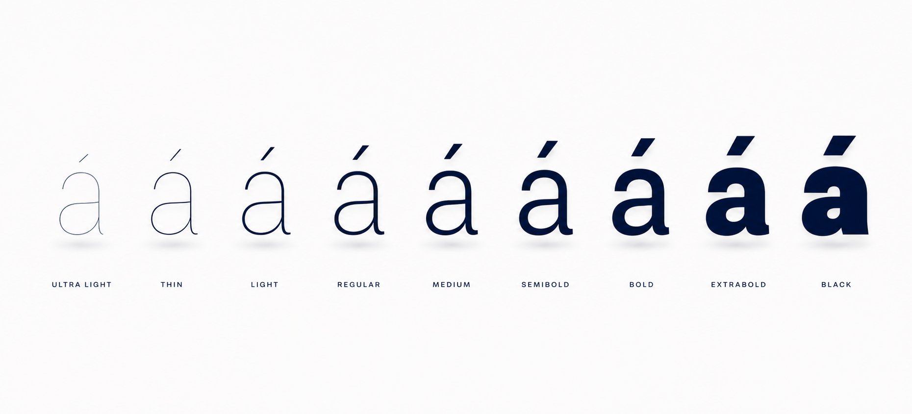
How Font Weight and Style Affect Tone Mark Legibility
A font's regular weight might render your pinyin name flawlessly, but switch to bold or italic and suddenly the caron on "ǎ" merges into the letterform or the macron on "ē" clips against the line above. Weight and style variants aren't cosmetic toggles. They reshape the physical space available for diacriticals, and that space determines whether your tone marks survive or disappear.
How Font Weight Impacts Tone Mark Visibility
Think of font weight as a volume knob for stroke thickness. At the light end, strokes are thin and elegant. The problem? Tone marks share that thinness. A macron rendered at one pixel wide on screen becomes invisible at body-text sizes. The caron fares even worse because its angular shape loses definition when strokes get too delicate. A minimalist chinese font with hairline weights looks stunning for large headlines but can erase diacritical detail the moment you scale down to 12px for a business card or email signature.
At the other extreme, a bold chinese font thickens every stroke, including the tone marks themselves. That sounds helpful until you realize thicker marks need more vertical clearance. A chinese bold font with tight line spacing will crowd the macron into the ascender zone, making "āi" look like the mark is colliding with the letter above. Black and ultra-bold weights compound this by expanding horizontal stroke width too, which can cause the caron's two angled strokes to merge into an indistinct blob at smaller sizes.
The sweet spot for most pinyin name applications sits at regular to medium weight. These weights give tone marks enough stroke presence to remain distinct without demanding extra vertical space that the font's metrics may not provide. If you need emphasis, semibold typically preserves diacritical clarity better than jumping straight to bold.
Italic and condensed variants introduce their own complications. Italic slant shifts the horizontal center of each letter, and since diacriticals are positioned relative to that center, a poorly engineered italic can offset tone marks visibly to the left or right. Microsoft's typography standards note that diacritics should be placed at the visual center of each glyph, with the acute positioned so one-third of its width falls on one side of the centerline and two-thirds on the other. In italic variants, this centering logic needs recalculation, and many fonts skip that step. Condensed styles squeeze horizontal space, which can push adjacent tone marks uncomfortably close in multi-syllable names like "Xiǎomíng."
Readability Across Different Sizes and Contexts
Where your pinyin name appears dictates which weight works. A modern chinese font set at 72px for a poster gives every weight room to breathe. At 9px in a footnote, only carefully engineered regular weights survive with tone marks intact. Chinese font writing for digital screens adds another variable: subpixel rendering can either sharpen or smear thin diacriticals depending on the display technology.
Here's how different weights perform across common size ranges:
| Weight | Tone Mark Clarity at Small Sizes (9-14px) | Tone Mark Clarity at Large Sizes (24px+) | Recommended Applications |
|---|---|---|---|
| Light / Thin | Poor - marks may vanish or lose shape | Excellent - elegant and distinct | Posters, hero banners, large-format prints |
| Regular | Good - reliable baseline for most contexts | Good - balanced and readable | Business cards, documents, email signatures, UI text |
| Medium / Semibold | Good to excellent - added presence without crowding | Excellent - strong without overwhelming | Headings, name badges, social media graphics |
| Bold | Medium - marks thicken and may crowd vertical space | Good - impactful with adequate line height | Logos, signage, display headers |
| Black / Ultra-Bold | Poor - marks merge or collide with adjacent elements | Medium - requires generous spacing | Short display text only, artistic treatments |
A chinese font modern enough to offer a full weight range from thin to black gives you flexibility, but only if you test each variant with your actual name rather than assuming consistency across the family. The difference between a chinese modern font that handles "Zhāng" at semibold and one that doesn't can come down to a single miscalculated anchor point in the heavier weight's GPOS table.
Weight and style choices also interact with the formatting conventions you apply to your name. Whether you capitalize both syllables, hyphenate, or run them together changes how much horizontal real estate tone marks compete for, and that's a decision worth examining on its own terms.
Pinyin Name Formatting Rules and Font Selection
The same pinyin name can look dramatically different depending on how you format it, even before you pick a font. Capitalization, hyphenation, and syllable grouping all change the visual rhythm of a name, and certain font styles amplify or undermine those formatting choices. Getting the formatting right first narrows your font options in productive ways.
Capitalization and Hyphenation Conventions
If you've ever wondered how to spell chinese words as personal names in pinyin, there's an official answer. China's national standard GB/T 16159-2012 and Taiwan's Guidelines for Transliteration of Chinese both establish clear conventions for romanizing personal names.
The surname comes before the given name. Only the initials of the names are capitalized; the rest of the letters are lower-cased and written without a space in between. For example, the name 陳志明 is romanized as "Chen Zhiming."
That means a two-character given name merges into a single word with only the first letter capitalized. No intercaps, no hyphen, no space between syllables. When the second syllable of a given name starts with "a," "o," or "e," an apostrophe separates it from the first syllable to prevent misreading, as in "Xī'ān" versus "Xiān."
In practice, though, you'll encounter several formatting variations. Here's how the name 李美玲 (Lǐ Měilíng) might appear depending on which convention someone follows:
- Standard (GB/T 16159-2012): Lǐ Měilíng - given name as one word, initial cap only
- Hyphenated: Lǐ Měi-líng - hyphen between given name syllables, second syllable lowercase
- Intercaps: Lǐ MěiLíng - each syllable capitalized within the given name
- Fully spaced: Lǐ Měi Líng - each syllable treated as a separate word
The standard form produces the most compact visual unit. Hyphenation adds a visual pause. Intercaps create a camelCase effect familiar to programmers. Full spacing fragments the name into three separate pieces. Each approach changes how a reader's eye tracks across the text in chinese contexts and how much horizontal space the name occupies.
Matching Formatting Rules to Font Style Choices
Formatting and font style interact more than most people realize. A compact format like "Měilíng" benefits from fonts with generous letter spacing because the merged syllables need internal breathing room. A chinese letter font with tight default tracking can make an unspaced given name feel cramped, especially when consecutive tone marks compete for vertical attention. Sans-serif faces with open apertures handle this well because their letterforms don't trap the eye.
Hyphenated formats like "Měi-líng" pair naturally with serif fonts. The hyphen acts as a visual joint, and the structured rhythm of serif letterforms reinforces that segmented cadence. Think of it like a chinese letter template where each element has defined boundaries. Decorative or calligraphic fonts, on the other hand, can make hyphens look awkward because their flowing strokes fight against the hard stop of a dash.
Fully spaced formats work best with heavier weights and display fonts because the extra whitespace between syllables prevents the name from feeling too fragmented. When someone searches for how do chinese people type their names in Latin letters, the answer often involves input methods that produce the standard merged format by default. But for design purposes, you're free to choose whichever formatting approach serves your visual goals, as long as the tone marks remain intact and the name stays readable.
The formatting you settle on also determines how your name performs in specific real-world contexts. A merged format fits neatly on a single line of a business card. A spaced format might wrap awkwardly. These practical constraints, where and how your stylized pinyin name will actually appear, shape the final decision as much as any aesthetic preference.

Where Stylized Pinyin Names Are Used
Formatting rules and font categories are useful in the abstract, but they only matter when applied to something real. A pinyin name doesn't exist in a vacuum. It shows up on paper, on screens, etched into skin, or embossed on cardstock. Each context brings its own constraints: size limitations, printing methods, audience expectations, and how long someone will spend looking at it. The application you're designing for should drive your font and formatting decisions, not the other way around.
Personal Branding and Professional Applications
For designers, entrepreneurs, and professionals building a bilingual identity, a stylized pinyin name often serves as the Latin-script counterpart to a Chinese name logo. It appears on business cards, LinkedIn banners, portfolio sites, and email signatures. In these contexts, the name needs to feel polished and intentional, like it belongs to someone who cares about details.
Sans-serif fonts dominate here because they project the clean, modern confidence that professional branding demands. A medium-weight geometric sans with verified tone mark support gives you a name that reads clearly at business card size (typically 9-11pt) while scaling up gracefully for website headers. The merged formatting standard, like "Zhāng Yǔfēi," keeps the name compact enough to sit alongside a logo mark without competing for space.
Wedding invitations represent a different professional context entirely. Chinese wedding invitations are deeply rooted in cultural symbolism, with red and gold as predominant colors and formal language honoring both families. When couples create bilingual invitations, the pinyin rendering of their names needs to match the formality of the Chinese text. Serif fonts or elegant calligraphic styles work best here, echoing the respectful tone of phrases like "敬邀" (respectfully invite) while keeping diacriticals legible against ornate backgrounds. Some couples pair beautiful chinese letters in hanzi with a matching serif pinyin rendering to create visual harmony across both scripts.
Business cards for bilingual professionals often carry both hanzi and pinyin versions of a name. The font pairing matters: a chinese name calligraphy style for the characters alongside a complementary Latin serif or sans-serif for the pinyin creates cohesion without forcing both scripts into the same typeface. The key is ensuring the pinyin font's x-height and stroke weight feel proportional to the Chinese characters beside it.
Creative and Artistic Uses for Pinyin Names
Beyond professional settings, pinyin name font styles find their most expressive applications in creative work. Here's where people push past readability-first thinking and treat the name as visual art.
Ranked by popularity, these are the most common creative applications:
- Social media profiles and digital graphics - The most accessible use case. Display fonts and handwritten styles thrive here because the name appears at large sizes on screens, giving tone marks plenty of room. A calligraphy generator chinese tool or a chinese calligraphy maker can help produce brush-style renderings, but always verify that the output preserves accurate diacriticals rather than dropping them for aesthetic convenience.
- Tattoo designs - Permanent and personal. People planning pinyin name tattoos need fonts where every tone mark is unambiguous at the size they'll be inked. Calligraphic and brush styles are popular because they echo traditional Chinese aesthetics while using Latin letterforms. A mandarin calligraphy font with clear stroke variation ensures the caron on "ǎ" won't blur into a breve after years of skin aging. Always get a proof printed at actual size before committing.
- Art prints and wall decor - Names rendered as decorative pieces for nurseries, living rooms, or gifts. Parents often create chinese calligraphy fonts styled prints of their children's names, combining the pinyin with hanzi in a framed composition. Display and calligraphic font categories shine here because the viewing distance is generous and the purpose is aesthetic impact.
- Learning materials - Parents making flashcards, worksheets, or wall charts for children learning Mandarin need fonts where tone marks are pedagogically clear. This means high-contrast diacriticals, generous spacing, and no stylistic ambiguity. Fonts like Iansui or Klee One, designed with educational clarity in mind, work well for this purpose. A calligraphy generator chinese tool can also help create chinese calligraphy practice sheets that pair hanzi stroke order with pinyin pronunciation guides.
- Merchandise and personal products - Mugs, tote bags, phone cases, and stickers featuring a pinyin name. These require fonts that reproduce well across printing methods (screen printing, sublimation, embroidery). Bold sans-serifs with thick tone marks survive the resolution loss of textile printing better than thin serifs or delicate scripts.
Each application attracts a different persona. A graphic designer building a client's bilingual brand identity cares about font licensing and scalability. Someone planning a tattoo cares about permanence and cultural authenticity. A parent making learning materials cares about pedagogical clarity. But they all share one non-negotiable requirement: the tone marks must render correctly. A name without accurate diacriticals isn't stylized. It's misspelled.
The variety of these use cases also explains why no single font works everywhere. A chinese calligraphy fonts style that looks breathtaking on a wedding invitation would be illegible on a 16px social media username. A geometric sans perfect for a business card feels sterile on a nursery art print. Matching the font to the context, rather than picking a favorite and forcing it into every situation, is what separates intentional design from guesswork.
With so many possible applications, the risk of making a poor font choice multiplies. Certain mistakes show up repeatedly across all these contexts, and recognizing them before they reach the printer or the tattoo needle saves both money and regret.
Common Pinyin Name Font Mistakes to Avoid
Some font mistakes are obvious the moment you see them. Others hide until your business cards arrive from the printer or your tattoo artist pulls out the stencil. The frustrating part? Nearly all of them are preventable with a few minutes of testing. Here are the errors that trip people up most often, and how to catch them before they become permanent.
Fonts That Drop or Distort Tone Marks
The single most common failure is choosing a font that simply doesn't contain the glyphs pinyin requires. You type "Lǐ Měilíng" and get back "Li Meiling" with blank rectangles, question marks, or completely missing diacriticals. This happens because many chinese style fonts and popular English display typefaces only cover basic Latin characters and a handful of Western European accents. The caron (ǎ, ě, ǐ) and the dieresis-tone combinations (ǖ, ǘ, ǚ, ǜ) are the first casualties.
Distortion is subtler and arguably worse. Some fonts technically include the caron but render it identically to a breve (the rounded "u" shape used in Romanian and Turkish). To an untrained eye, the name looks fine. To anyone who reads pinyin, it's wrong. Other fonts position the macron so close to the top of the letter that it merges with the stroke at small sizes, turning "ā" into what looks like a smudged "a."
People searching for chinese looking fonts or an oriental font with Asian-inspired aesthetics face an elevated risk here. These typefaces prioritize visual novelty over character set completeness. A font designed to make English text look Chinese through stylized strokes rarely invests engineering effort into Latin Extended-A coverage because its target audience isn't typing actual pinyin.
Spacing and Legibility Errors to Avoid
Even when tone marks render correctly, poor spacing can collapse a pinyin name into visual noise. Tight tracking merges syllables like "Xiǎomíng" into an undifferentiated string where the reader can't tell where one syllable ends and the next begins. Overly generous spacing does the opposite, fragmenting the name so it reads as disconnected pieces rather than a unified identity.
Here's a checklist of mistakes to watch for, along with why each one matters:
- Using a font without Latin Extended-A/B support - The font silently substitutes a fallback system font for missing characters, creating a jarring mismatch in style and weight mid-name.
- Choosing decorative fonts at small sizes - Display fonts with ornamental strokes make tone marks indistinguishable from decorative flourishes. The caron becomes just another swirl.
- Relying on chinese font copy and paste results - Copying styled text from a generator often embeds characters as images or uses non-standard Unicode sequences that break when pasted into design software.
- Ignoring the ü combinations - Testing only common vowels like "ā" and "é" while skipping "ǚ" and "ǜ." Names containing "lǚ" or "nǚ" expose gaps that simpler test strings miss.
- Picking chinese fonts in english styling without checking diacritical positioning - Fonts that mimic Asian brush aesthetics using Latin letterforms often lack GPOS anchor definitions, leaving combining marks floating above the wrong part of the letter.
- Not testing italic and bold variants separately - A font family's regular weight may handle pinyin perfectly while its italic shifts tone marks off-center or its bold crowds them into adjacent ascenders.
- Assuming screen rendering matches print output - Subpixel rendering on screens can artificially sharpen thin diacriticals that disappear entirely when printed at the same point size on paper.
Before committing to any font for a pinyin name project, run this quick test: type out your full name with every tone mark it contains, then render it at the exact size and in the exact medium where it will appear. Print it if it's going on paper. Export it at target resolution if it's for screen. Check every diacritical at actual size, not zoomed in. If any mark looks ambiguous, merged, or missing, the font fails regardless of how good it looks in a specimen preview.
For chinese style fonts with decorative flair, apply extra scrutiny. Zoom out to 100% and ask: can someone unfamiliar with your name still distinguish the third tone from the first? If the answer is no, the font is working against you. A beautiful font that obscures meaning isn't stylish. It's a liability.
Avoiding these pitfalls is half the battle. The other half is having a repeatable process for evaluating new fonts so you're not relying on luck or trial and error every time a project calls for a pinyin name in a typeface you haven't used before.
How to Evaluate and Choose the Right Pinyin Font
A static list of "best chinese fonts" goes stale the moment a new typeface ships or an old one updates its character coverage. What you actually need is a repeatable framework, a way to evaluate any font you encounter and determine within minutes whether it deserves a spot in your pinyin name project. This process works whether you're browsing a chinese font generator, downloading free chinese fonts from Google Fonts, or testing a premium family you found through a chinese font type free download trial.
A Step-by-Step Font Evaluation Framework
When you find a font that catches your eye, run it through these steps before committing:
- Type your full name with all tone marks. Don't test with generic placeholder text. Use your actual name, including any tricky combinations like "ǚ" or apostrophe-separated syllables. This immediately reveals whether the font covers the specific characters you need.
- Render at target size and medium. If the name goes on a business card, set it at 10pt and print it. If it's for a social media banner, export at the exact pixel dimensions. Tone marks that look fine at 48px can vanish at 11px.
- Check every tone mark individually. Zoom to 100% (no magnification cheating) and confirm that first tone (macron), second tone (acute), third tone (caron), and fourth tone (grave) are each visually distinct from one another. If the caron and breve look identical, move on.
- Test weight variants you plan to use. Bold for headings, regular for body, italic for emphasis. Each variant needs independent verification because GPOS tables and kerning values often differ across a font family.
- Verify licensing for your use case. A font that's free for personal projects may require a commercial license for client work, merchandise, or app embedding. Check the license file before building a brand around it.
- Assess aesthetic fit within your design context. Place the pinyin name alongside other elements it will live with: a logo, hanzi characters, body text. Does it feel cohesive or like it wandered in from a different project?
Building Your Pinyin Name Font Shortlist
Rather than hunting for the single best font for chinese pinyin names, build a shortlist of three to five fonts that pass the framework above. Good chinese fonts for pinyin share common traits: complete Latin Extended coverage, well-defined GPOS anchors, and at least two usable weight options. Having multiple candidates lets you match font to context rather than forcing one typeface into every situation.
Here's a summary of what to look for and what should raise concern:
| Criterion | What to Look For | Red Flags |
|---|---|---|
| Tone mark rendering | All four marks distinct at target size; caron clearly angular, not rounded | Missing glyphs, caron identical to breve, marks clipped by line spacing |
| Character set coverage | Full Latin Extended-A; Latin Extended-B for ǖ/ǘ/ǚ/ǜ; combining diacriticals supported | Fallback rectangles, system font substitution on any pinyin vowel |
| Weight options | At least regular and one heavier weight with consistent diacritical positioning | Single weight only, or bold variant that crowds tone marks into ascenders |
| Readability at target size | Marks legible without zooming; clear syllable rhythm in merged given names | Marks vanish below 14px, or letter spacing collapses multi-syllable names |
| Licensing | License explicitly covers your use (print, web, app, merchandise) | Ambiguous terms, "personal use only" when you need commercial rights |
| Aesthetic fit | Complements surrounding design elements; matches intended tone (formal, playful, modern) | Clashes with paired hanzi font; feels out of place in the overall layout |
Where do you start looking? Google Fonts filtered by Latin Extended subset gives you a large pool of free chinese fonts and Latin-script typefaces with verified diacritical support. For broader exploration, a chinese font download from foundries like Adobe Fonts or Font Squirrel lets you test premium options with trial licenses. A chinese font generator can help you preview your name quickly across multiple typefaces, but always confirm results in your actual design software since generators sometimes render with browser fallbacks that mask missing glyphs.
The goal isn't to find one perfect font. It's to build the skill of evaluating any font quickly and confidently. Trends shift, new typefaces release constantly, and your needs change across projects. With this framework in hand, you'll never have to guess whether a font will butcher your tone marks. You'll know in under five minutes.
Frequently Asked Questions About Pinyin Name Font Styles
1. What fonts support pinyin tone marks correctly?
Fonts that fully support pinyin tone marks need coverage of the Latin Extended-A Unicode block (U+0100 to U+017F) and ideally the Combining Diacritical Marks block (U+0300 to U+036F). Look for typefaces that include precomposed characters like ǎ, ě, and ǚ as designed glyphs rather than fallback substitutions. Google Fonts filtered by the Latin Extended subset is a reliable starting point, as is Adobe Fonts. Always test your specific name at the intended display size, since many popular English-language fonts cover basic accents but skip the caron-over-vowel combinations pinyin requires.
2. Why do some fonts make pinyin tone marks disappear or look wrong?
Most fonts are designed for English or Western European languages that use a narrow set of diacriticals. The third-tone caron (ǎ) and dieresis-tone combinations (ǖ, ǘ, ǚ, ǜ) sit in Unicode blocks that many typefaces simply skip. Even when a font includes these characters, it may lack proper GPOS anchor definitions, causing combining marks to float off-center. Light font weights compound the problem by rendering already-thin diacriticals at sub-pixel widths where they vanish on screen or in print.
3. How should I format my Chinese name in pinyin for a logo or business card?
The official standard (GB/T 16159-2012) places the surname first with an initial capital, followed by the given name written as one word with only its first letter capitalized. For example, 王小明 becomes Wang Xiaoming. For design purposes, this merged format keeps the name compact and works well with sans-serif fonts at business card sizes (9-11pt). If readability is a concern with longer given names, a hyphenated format like Xiao-ming offers a visual pause without breaking convention entirely.
4. What is the best font weight for pinyin names with tone marks?
Regular to medium weight offers the most reliable tone mark legibility across sizes. Light and thin weights can cause diacriticals to vanish at small sizes (below 14px), while bold and black weights thicken marks to the point where they crowd vertical space or merge into blobs. Semibold is a strong choice when you need emphasis without sacrificing clarity. Always test the specific weight variant you plan to use, since GPOS tables and kerning values often differ across a font family.
5. Can I use decorative or calligraphic fonts for a pinyin name tattoo?
You can, but extra caution is needed. Calligraphic and brush-style fonts echo traditional Chinese aesthetics beautifully in Latin letterforms, making them popular for tattoos. However, ornamental strokes can obscure the distinction between tone marks, especially the caron versus breve difference. Before committing, print the design at actual tattoo size and verify every diacritical is unambiguous. Consider that skin aging will soften fine details over time, so fonts with clear stroke variation and generous mark sizing hold up better long-term.